UI Admin Components
This is a brief overview of the UI Admin components being used in the system today.
Common
The following components customises the modal and the modalForm components to display a modal for creating new data as an admin.
CreateBusinessArea
This component can be used as follows:
<create-business-area
  v-if="state.showCreate"
  @close="state.showCreate = false"
/>
The following is a visual screenshot of the modal: 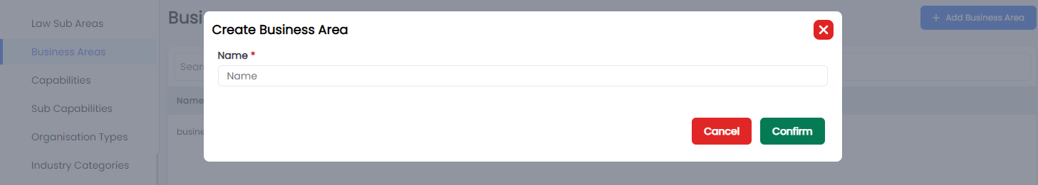
CreateCapability
This component can be used as follows:
<create-capability
  v-if="state.showCreate"
  @close="state.showCreate = false"
/>
The following is a visual screenshot of the modal: 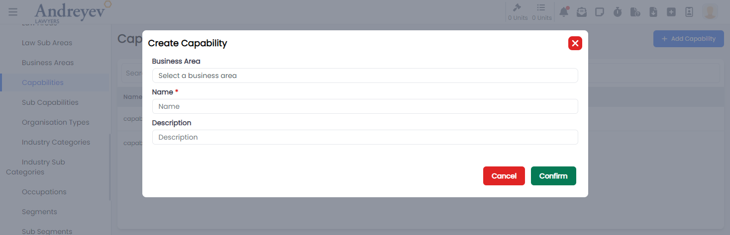
CreateSubCapability
This component can be used as follows:
<create-sub-capability
  v-if="state.showCreate"
  @close="state.showCreate = false"
/>
The following is a visual screenshot of the modal: 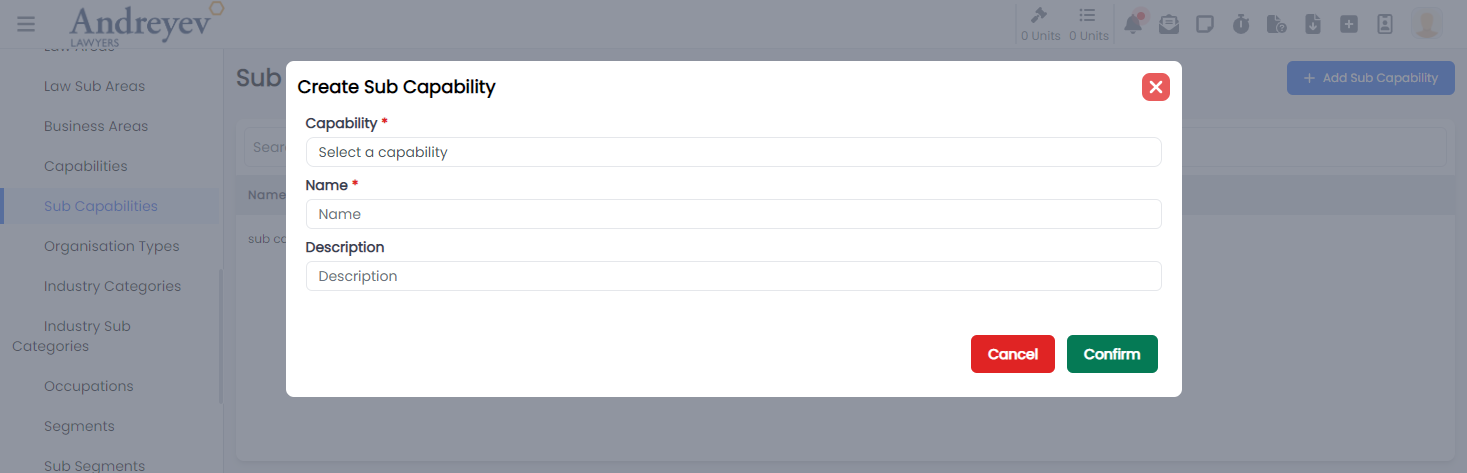
CreateEmailGroup
This component can be used as follows:
<create-email-group
  v-if="state.showCreate"
  @close="state.showCreate = false"
/>
The following is a visual screenshot of the modal: 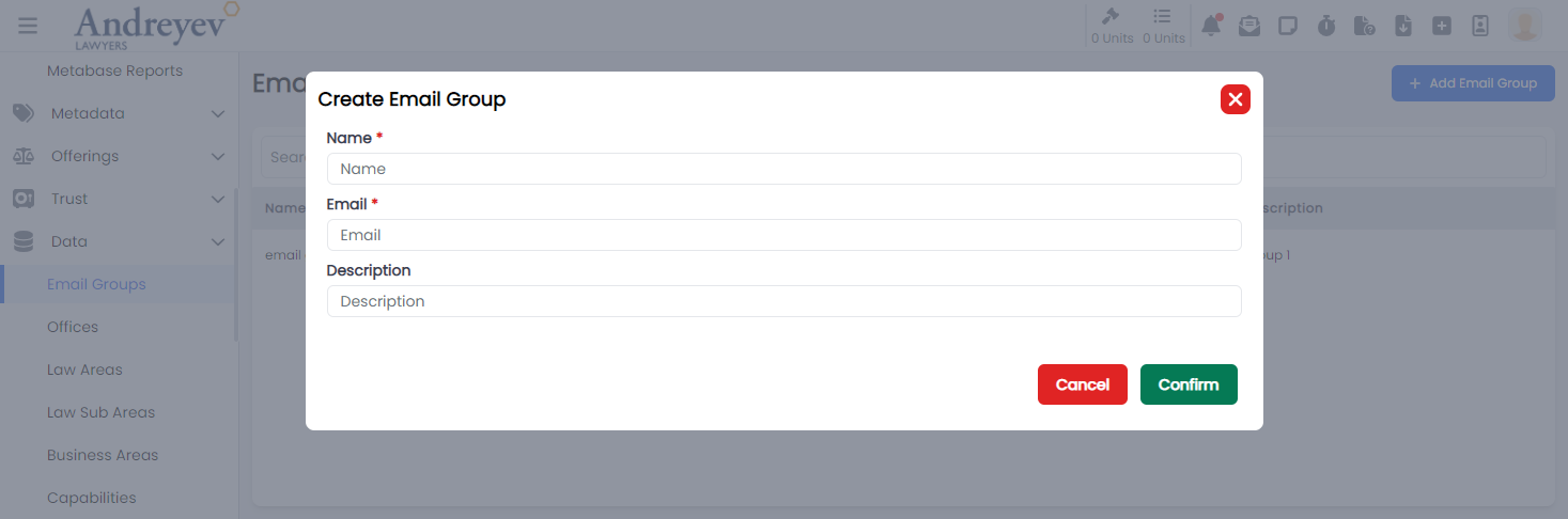
CreateIndustryCategory
This component can be used as follows:
<create-industry-category
  v-if="state.showCreate"
  @close="state.showCreate = false"
/>
The following is a visual screenshot of the modal: 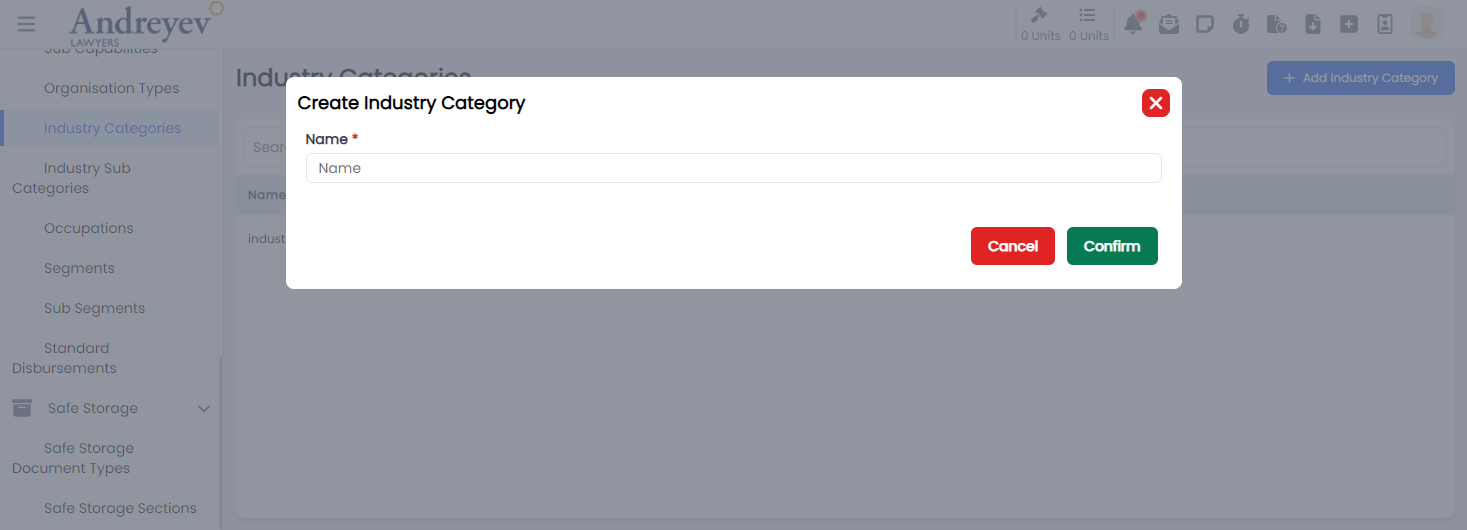
CreateIndustrySubCategory
This component can be used as follows:
<create-industry-sub-category
  v-if="state.showCreate"
  @close="state.showCreate = false"
/>
The following is a visual screenshot of the modal: 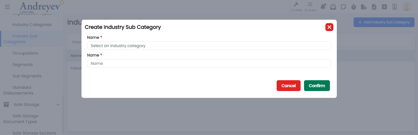
CreateLawArea
This component can be used as follows:
<create-law-area
  v-if="state.showCreate"
  @close="state.showCreate = false"
/>
The following is a visual screenshot of the modal: 
CreateLawSubArea
This component can be used as follows:
<create-law-sub-area
  v-if="state.showCreate"
  @close="state.showCreate = false"
/>
The following is a visual screenshot of the modal: 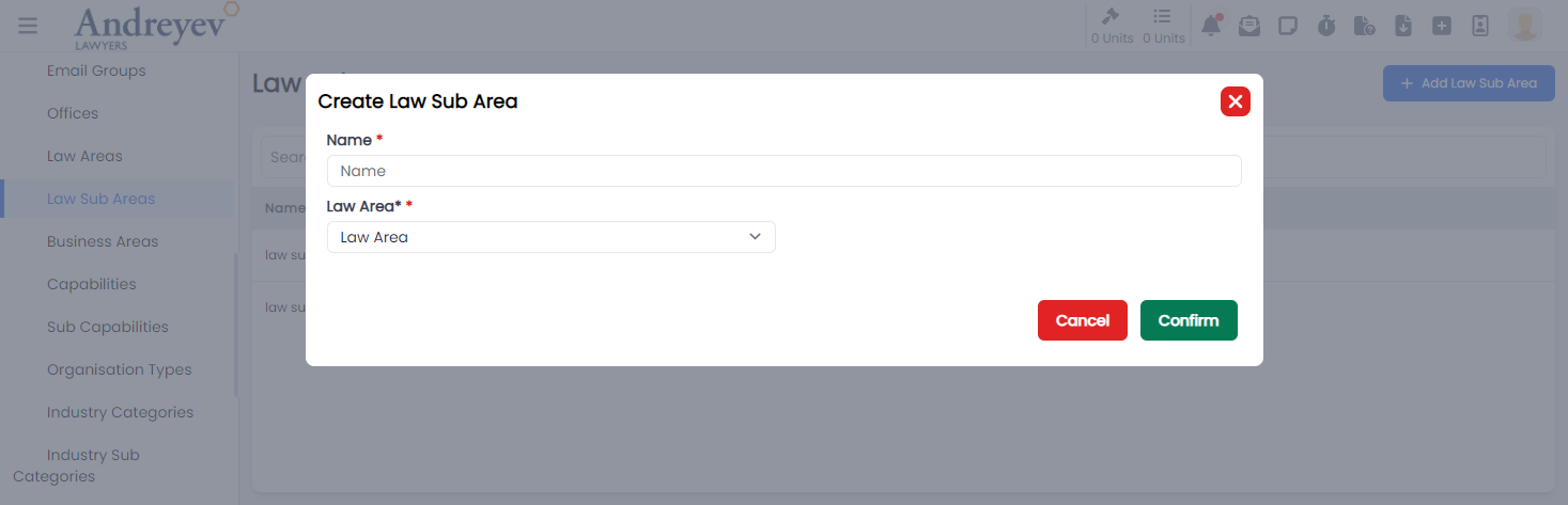
CreateOccupation
This component can be used as follows:
<create-occupation
  v-if="state.showCreate"
  @close="state.showCreate = false"
/>
The following is a visual screenshot of the modal: 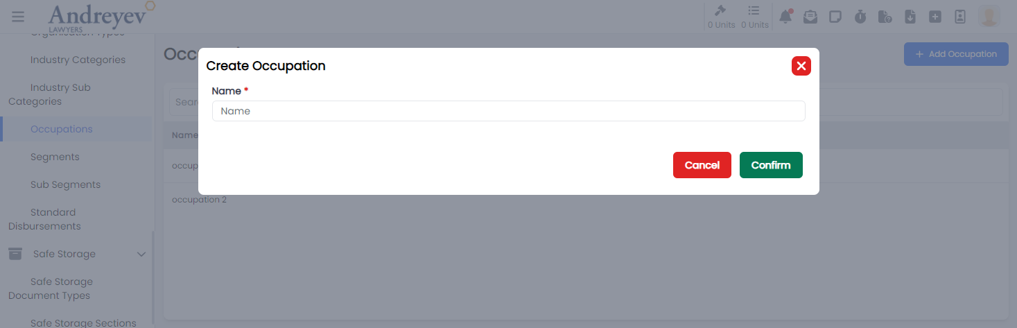
CreateOffice
This component can be used as follows:
<create-office
  v-if="state.showCreate"
  @close="state.showCreate = false"
/>
The following is a visual screenshot of the modal: 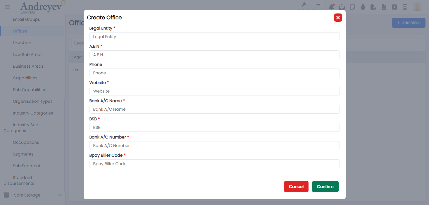
CreateOrganisationType
This component can be used as follows:
<create-organisation-type
  v-if="state.showCreate"
  @close="state.showCreate = false"
/>
The following is a visual screenshot of the modal: 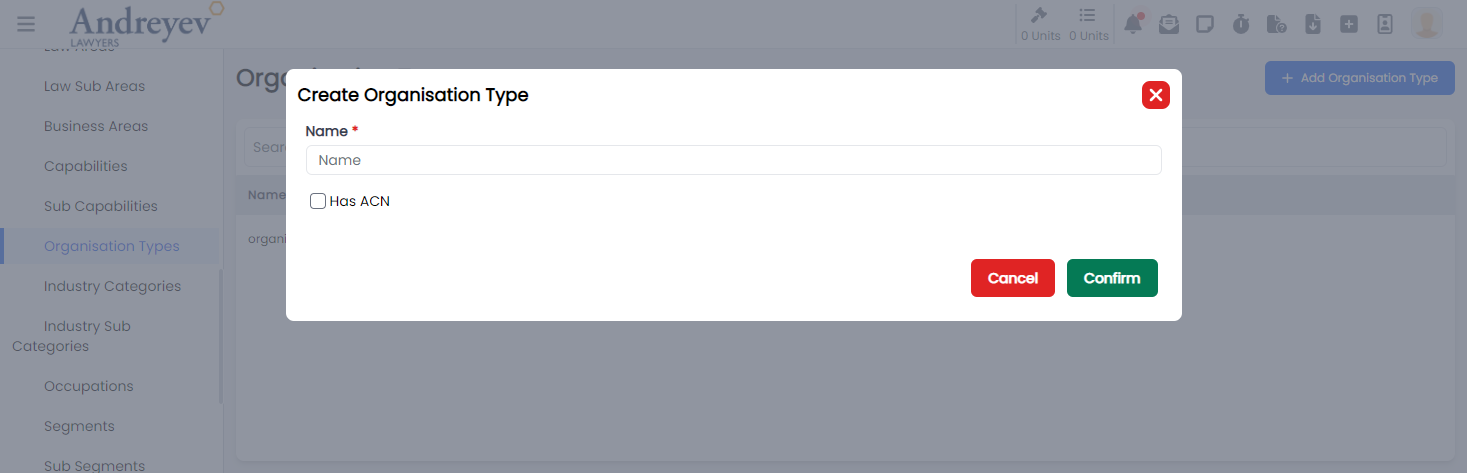
CreateSafeStorageDocumentType
This component can be used as follows:
<create-safe-storage-document-type
  v-if="state.showCreate"
  @close="state.showCreate = false"
/>
The following is a visual screenshot of the modal: 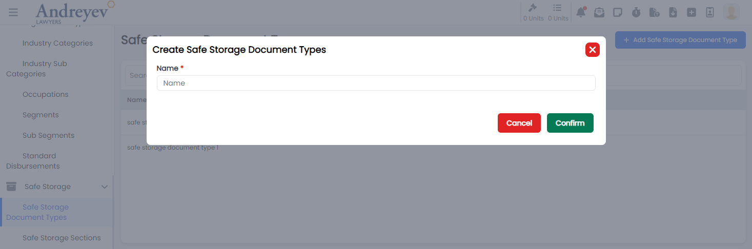
CreateSafeStorageSection
This component can be used as follows:
<create-safe-storage-section
  v-if="state.showCreate"
  @close="state.showCreate = false"
/>
The following is a visual screenshot of the modal: 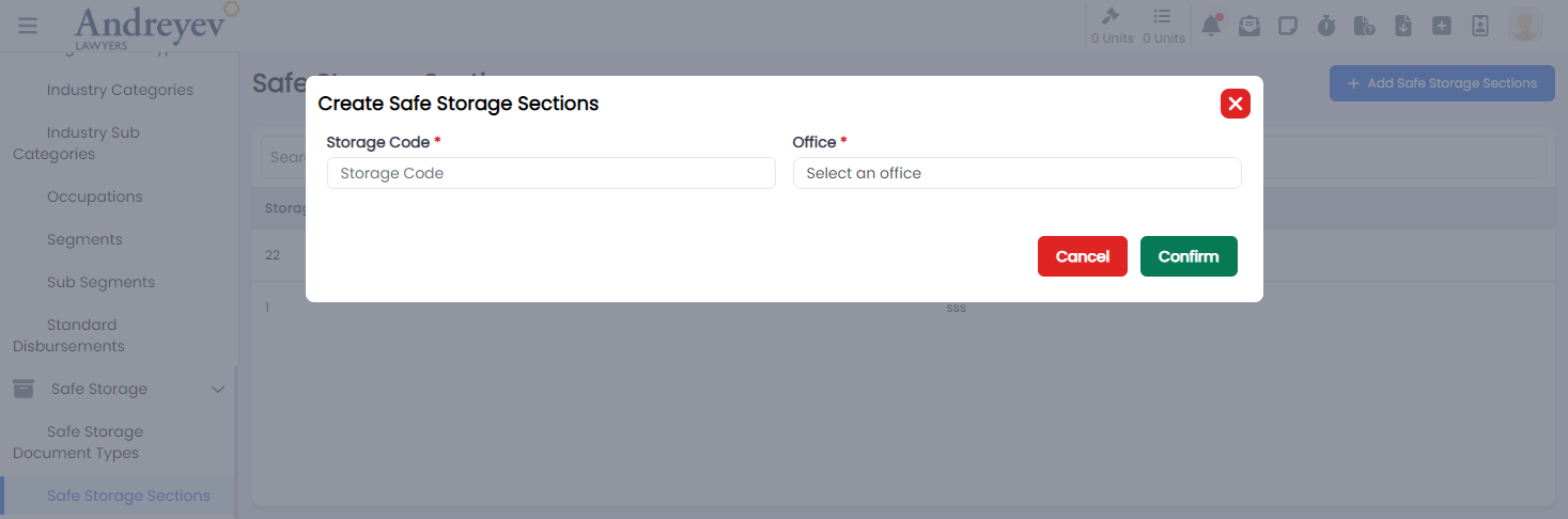
CreateSegment
This component can be used as follows:
<create-segment
  v-if="state.showCreate"
  @close="state.showCreate = false"
/>
The following is a visual screenshot of the modal: 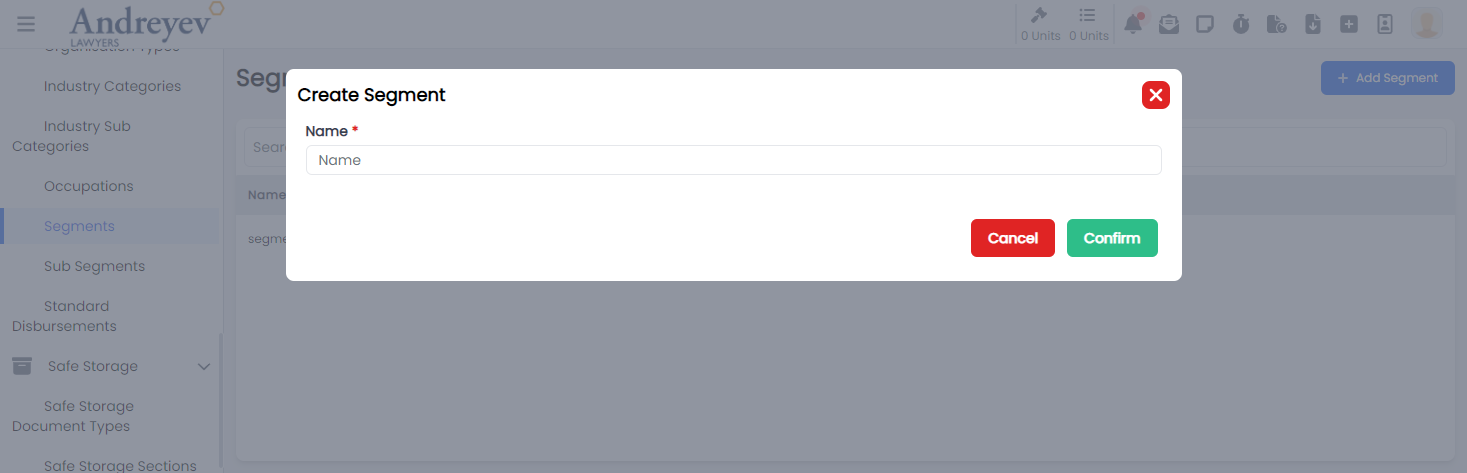
CreateSubSegment
This component can be used as follows:
<create-sub-segment
  v-if="state.showCreate"
  @close="state.showCreate = false"
/>
The following is a visual screenshot of the modal: 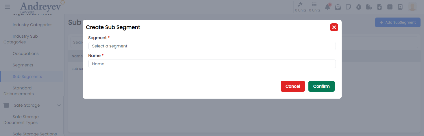
CreateStandardDisbursement
This component can be used as follows:
<create-standard-disbursement
  v-if="state.showCreate"
  @close="state.showCreate = false"
/>
The following is a visual screenshot of the modal: 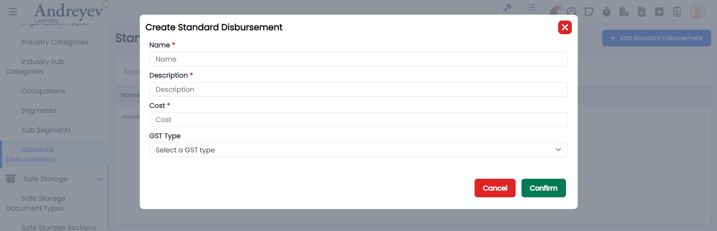
Dynamic-parameters
CreateDynamicParameter
This component customises the modal and the modalForm components to display a modal for creating new Dynamic Parameter.
This component can be used as follows:
<create-dynamic-parameter
  v-if="state.showCreateDynamicParameterModal"
  @close="state.showCreateDynamicParameterModal = false"
/>
The following is a visual screenshot of the modal: 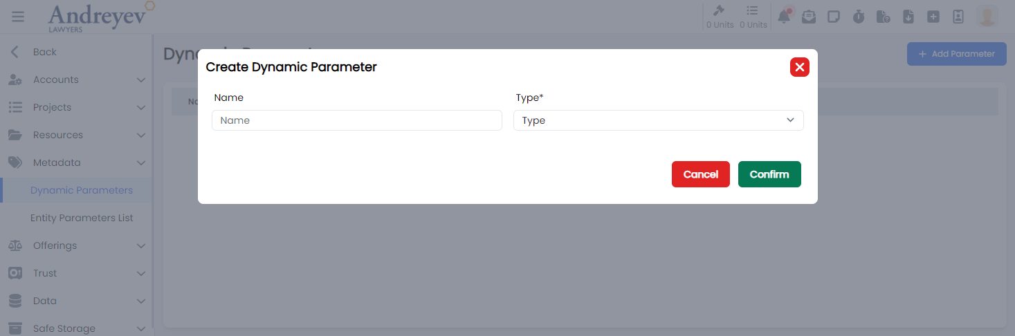
DeleteDynamicParameter
This component customises the modal component to display a confirmation modal for deleting Dynamic Parameter.
This component can be used as follows:
<delete-dynamic-parameter
  v-if="state.showWarningModal"
  :id="state.selectedParameter"
  @close="state.showWarningModal = false"
/>
The following is a visual screenshot of the modal: 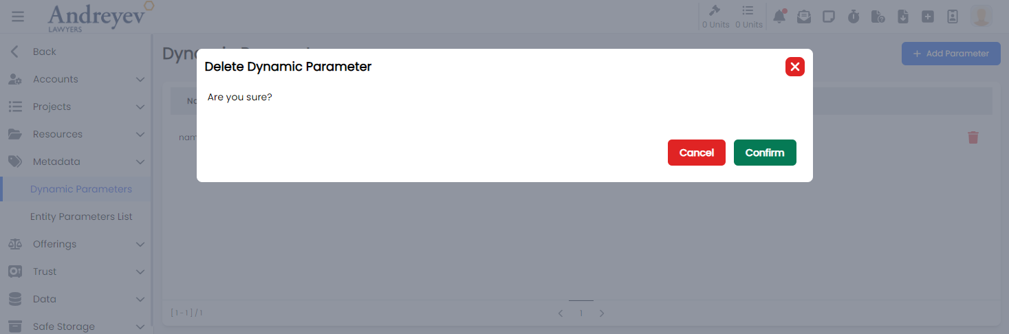
DynamicParameter
Deprecated
Using code in ALP\App\src\views\admin\DynamicParameters.vue
Email-template
CreateEmailTemplate
This component customises the modal and the modalForm components to display a modal for creating new email templates.
This component can be used as follows:
<create-email-template
  v-if="state.showCreate"
  @close="state.showCreate = false"
/>
The following is a visual screenshot of the modal: 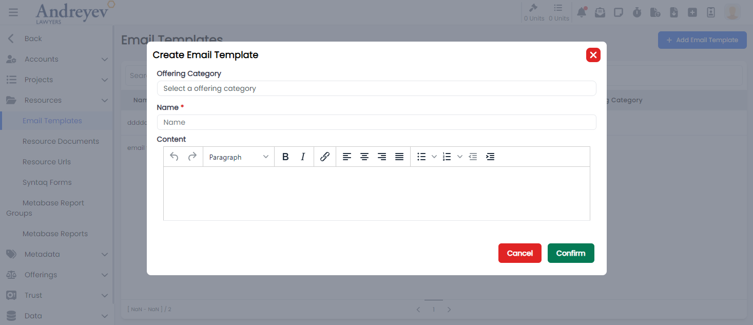
Entity-parameters
CreateEntityParameter
This component customises the modal and the modalForm components to display a modal for creating new entity parameter.
This component can be used as follows:
<create-entity-parameter
  v-if="state.showCreateEntityParameterModal"
  :entityType="entityType"
  @close="state.showCreateEntityParameterModal = false"
/>
The following is a visual screenshot of the modal: 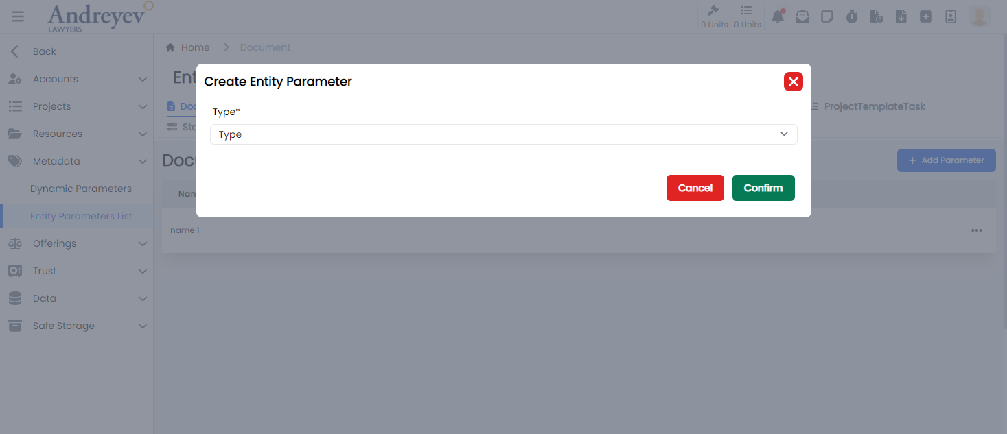
EntityParametersList
This component sets up the page to display list of entity parameters, including the CreateEntityParameter component as an event of a button.
This component can be used directly as a router view:
component: () =>
    import(
        "@/components/ui/admin/entity-parameters/EntityParametersList.vue"
    ),
The following is a visual screenshot of the modal: 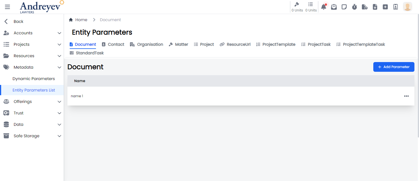
Metabase
CreateMetabaseReport
This component customises the modal and the modalForm components to display a modal for creating new Metabase Report.
This component can be used as follows:
<create-metabase-report
  v-if="state.showCreate"
  @close="state.showCreate = false"
/>
The following is a visual screenshot of the modal: 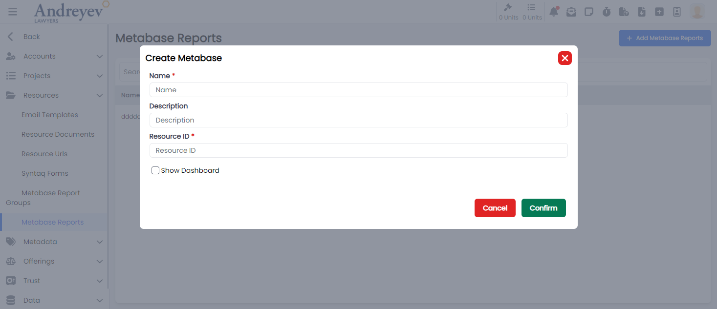
Metabase-groups
CreateMetabaseReportGroup
This component customises the modal and the modalForm components to display a modal for creating new Metabase Report Group.
This component can be used as follows:
<create-metabase-report-group
  v-if="state.showCreate"
  @close="state.showCreate = false"
/>
The following is a visual screenshot of the modal: 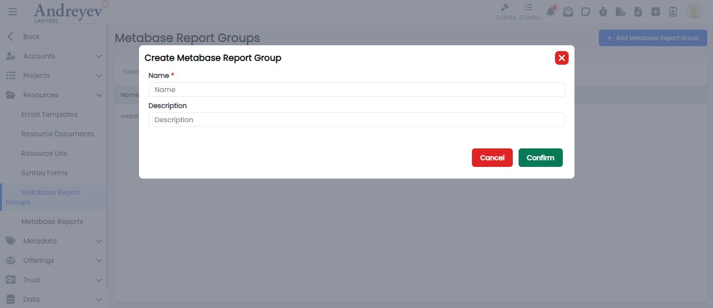
Offerings
ComponentSelector
This component customises the slideOver window for selecting a component. Including ways to add new component or edit current components.
This component can be used as follows:
<component-selector
    v-if="outcomeState.showComponentSelectorFor"
    :key="$route.params.outcomeId"
    :offering-id="id"
    :outcome-id="outcomeState.showComponentSelectorFor"
    @close="outcomeState.showComponentSelectorFor = null"
/>
The following is a visual screenshot of the side bar: 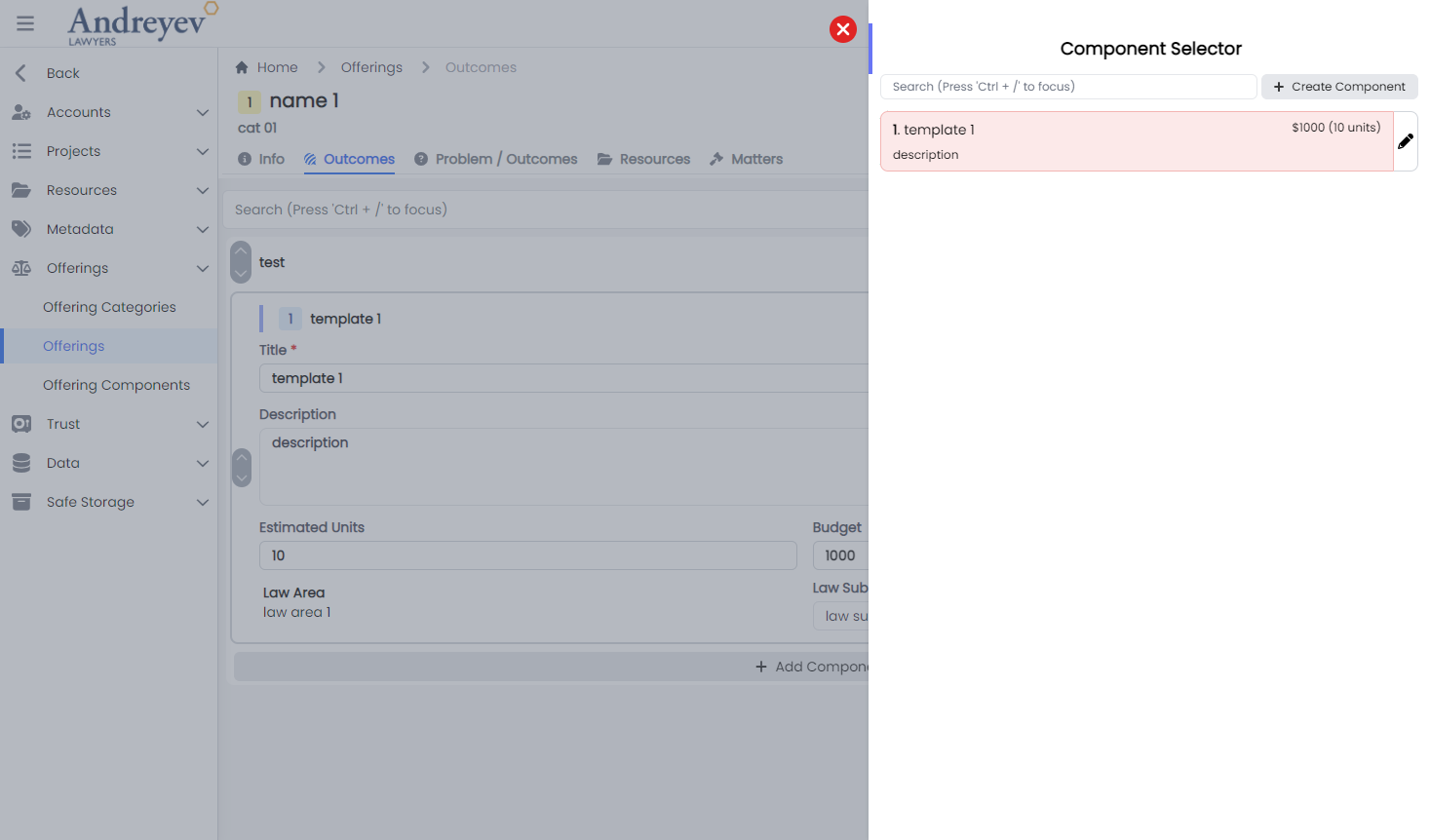
CreateOffering
This component customises the modal and the modalForm components to display a modal for creating new offering.
This component can be used as follows:
<create-offering
    v-if="state.showCreateOffering"
    @close="state.showCreateOffering = false"
/>
The following is a visual screenshot of the modal: 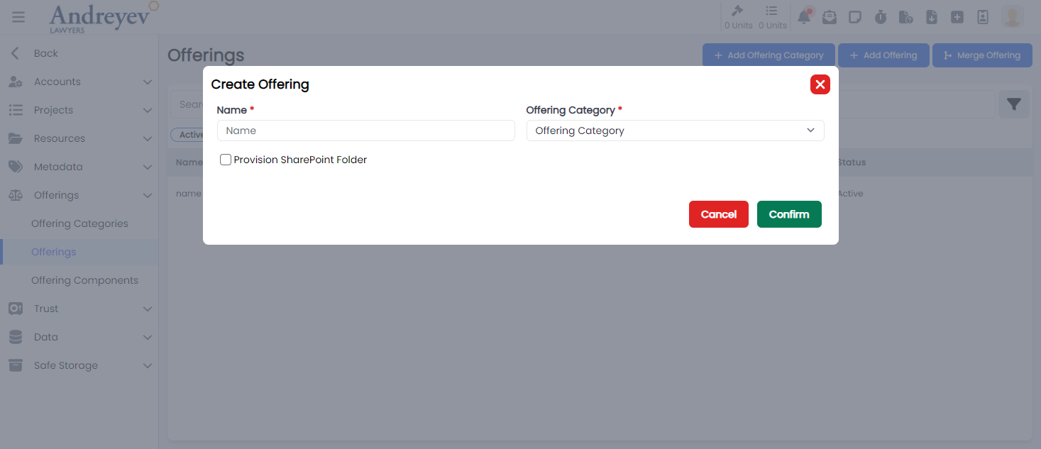
CreateOfferingCategory
This component customises the modal and the modalForm components to display a modal for creating new offering category.
This component can be used as follows:
<create-offering-category
    v-if="state.showCreateOfferingCategory"
    @close="state.showCreateOfferingCategory = false"
/>
The following is a visual screenshot of the modal: 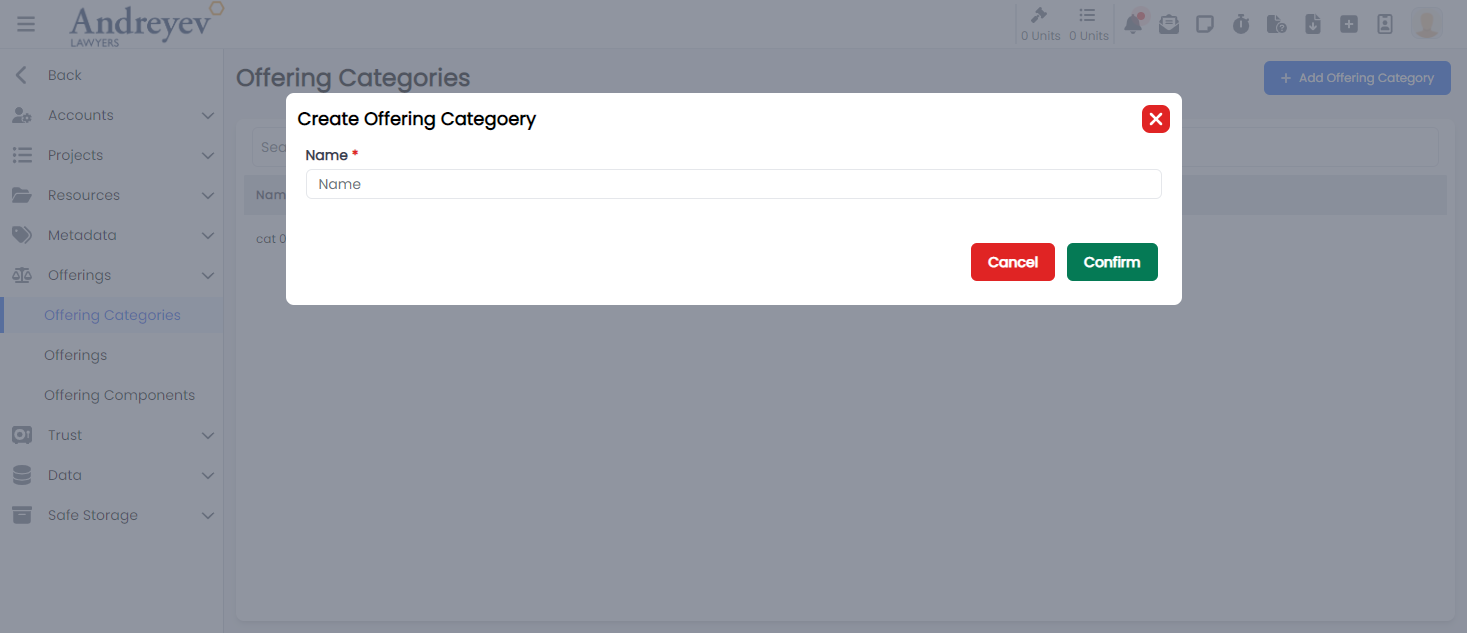
CreateOfferingComponent
This component customises the modal and the modalForm components to display a modal for creating new offering component.
This component can be used as follows:
<create-offering-component
    v-if="state.showCreateComponent"
    @close="state.showCreateComponent = false"
/>
The following is a visual screenshot of the modal: 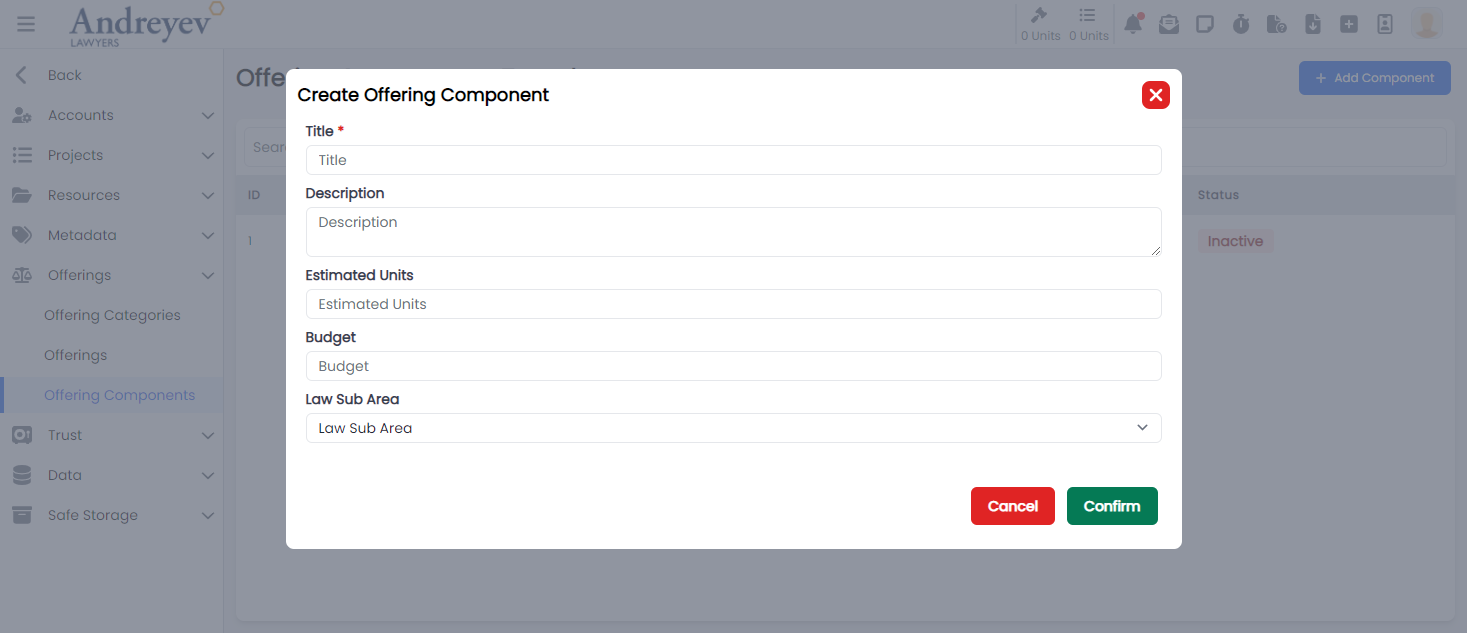
CreateOfferingOutcome
This component customises the modal and the modalForm components to display a modal for creating new offering outcome.
This component can be used as follows:
<create-offering-outcome
  v-if="state.showCreate"
  @close="state.showCreate = false"
/>
The following is a visual screenshot of the modal: 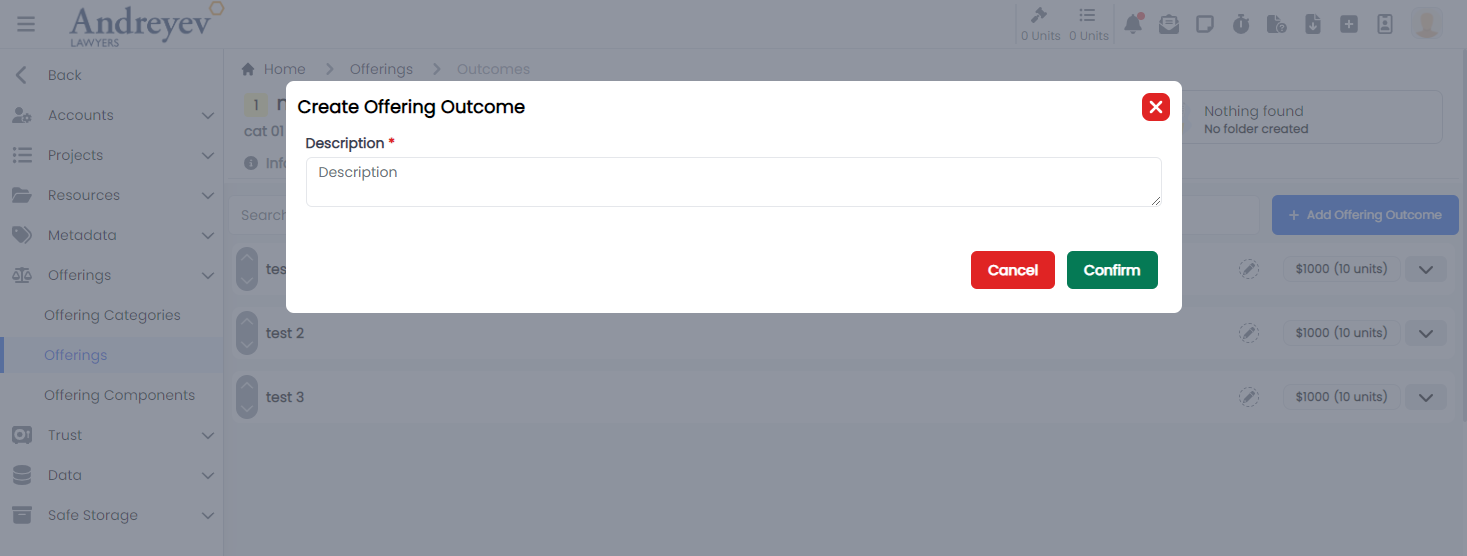
InlineOfferingComponent
This component creates and displays each offering outcome component integrating the UpDownSwitch component and the InlineInput component to allow inline editing functionality.
This component can be used as follows:
<inline-offering-component
  v-for="component in components"
  :key="component.id"
  :offering-id="id"
  :outcome-id="outcome.id"
  :component="component"
/>
The following is a visual screenshot of the component: 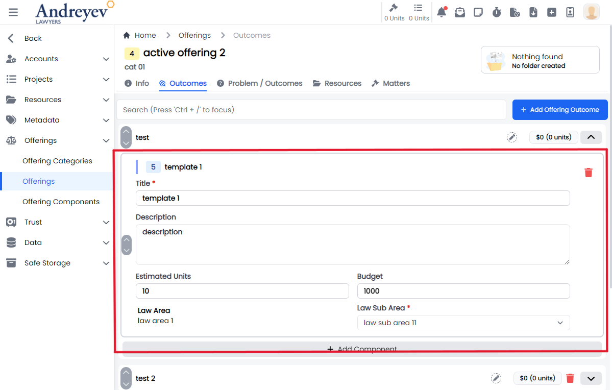
InlineOfferingOutcome
This component creates and displays each offering outcome integrating the UpDownSwitch component and the InlineInput component to allow inline editing functionality.
This component can be used as follows:
<inline-offering-outcome
  :id="id"
  :outcome="item"
  @add-component="outcomeState.showComponentSelectorFor = $event"
/>
The following is a visual screenshot of the component: 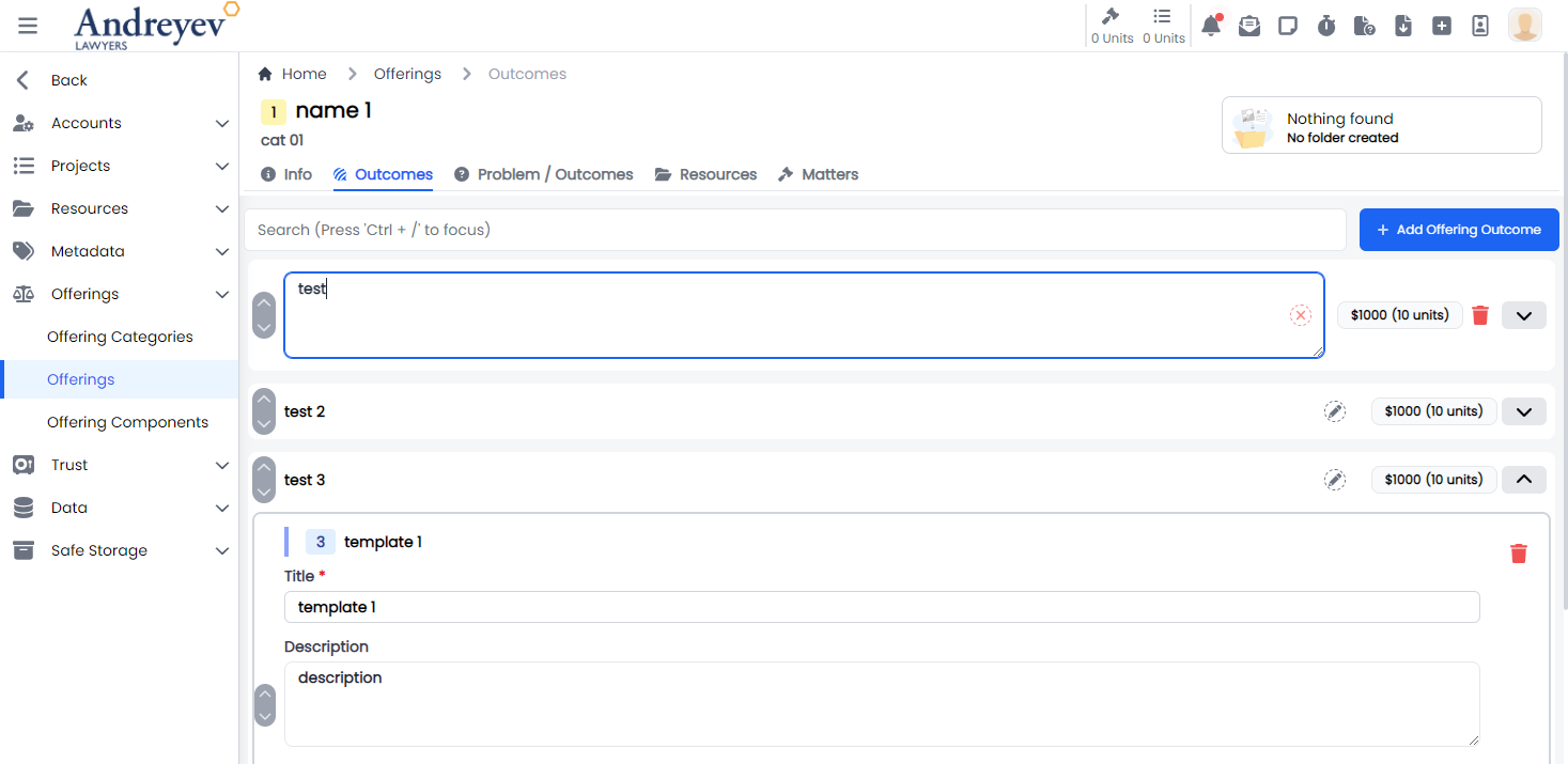
InlineOfferingOutcomeObjectionGuarantee
Deprecated
InlineOfferingProblemOutcome
This component creates and displays each of the offering problem outcome integrating the InlineInput component to allow inline editing functionality.
This component can be used as follows:
<inline-offering-problem-outcome
  v-for="problemOutcome in problemOutcomes.filter(
    (o) => o.type == type.value
  )"
  :key="problemOutcome.id"
  :id="id"
  :problem-outcome="problemOutcome"
/>
The following is a visual screenshot of the component: 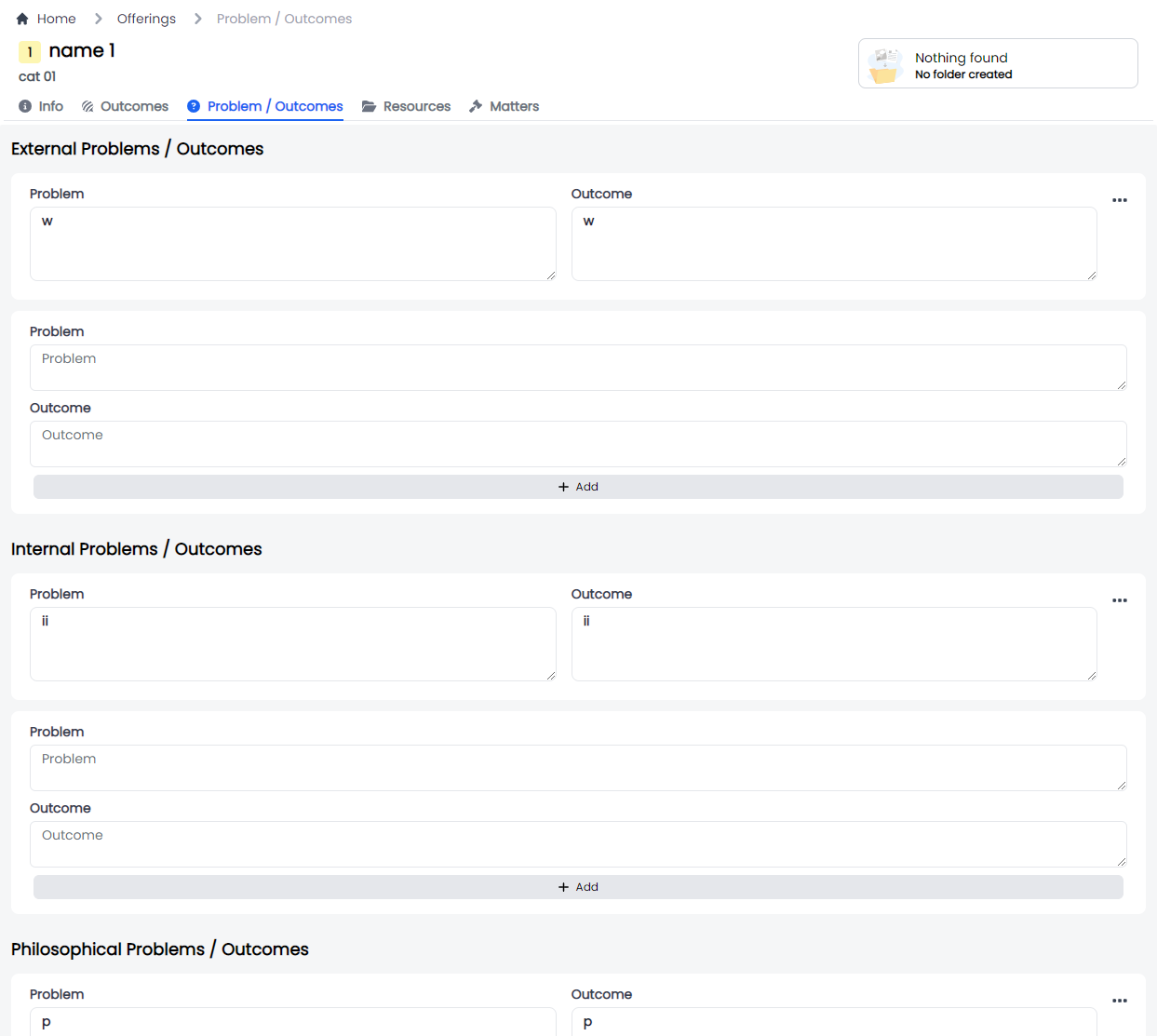
MergeOffering
This component customises the modal, the modalForm and the offeringSelector components to display a modal for merging offerings.
This component can be used as follows:
<merge-offering
  v-if = "state.showMergeOffering"
  @close= "state.showMergeOffering = false"
/>
The following is a visual screenshot of the modal: 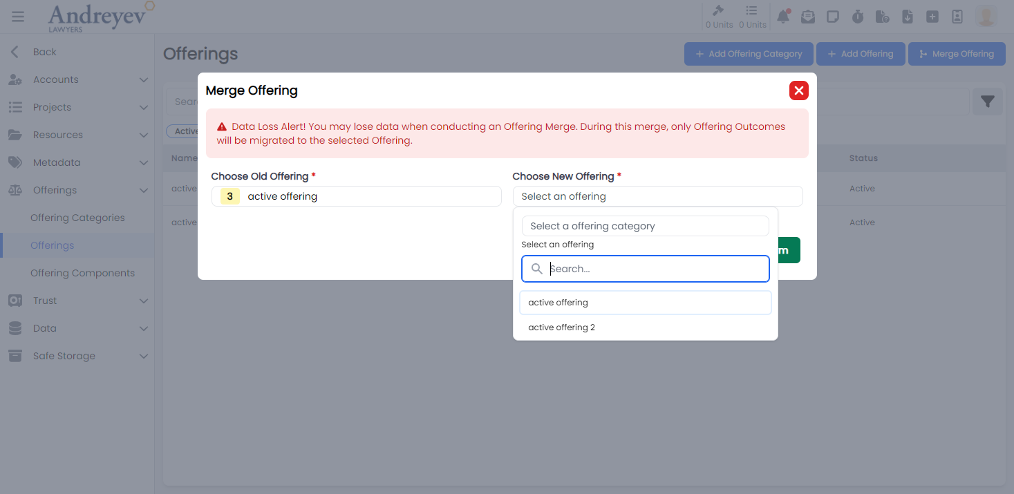
Project-templates
CreateProjectTemplate
This component customises the modal and the modalForm components to display a modal for creating new Project Template.
This component can be used as follows:
<create-project-template
    v-if="state.showCreate"
    @close="state.showCreate = false"
/>
The following is a visual screenshot of the modal: 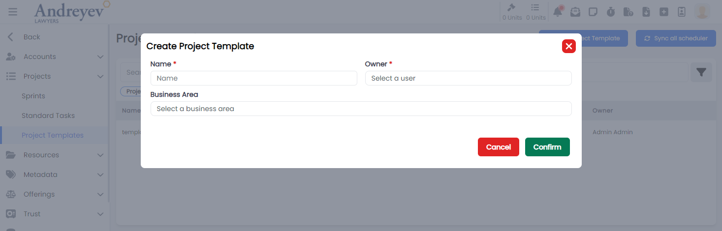
CreateProjectTemplateScheduler
This component customises the modal and the modalForm components to display a modal for creating new Project Template scheduler, which also includes a toggle option for repeats.
This component can be used as follows:
<create-project-template-scheduler
    v-if="state.showCreate"
    :id="id"
    @close="state.showCreate = false"
/>
The following is a visual screenshot of the modal: 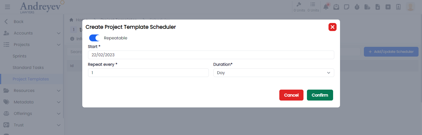
InlineProjectTemplateTask
This component creates and displays each Inline Project Template Tasks, integrating the InlineInput component to allow inline editing functionality, an option to choose from inline input for normal task and search and choosing from standard tasks.
This component can be used as follows:
<inline-project-template-task
  class="mt-1 transition duration-200"
  :key="value.id"
  :project-template-id="id"
  :project-template-task="value"
  @selected="
  taskState.isDisableTasksDragAndDrop = true;
  $router.push({
  name: 'Project Template Task',
  params: { id, taskId: value.id }
  });
  "
/>
The following is a visual screenshot of the component: 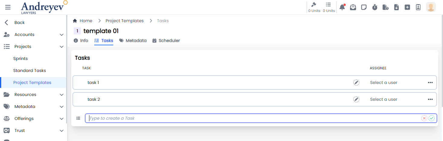
InlineProjectTemplateTaskStep
This component is created using the InlineInput component to allow inline editing functionality for task steps.
This component can be used as follows:
<inline-project-template-task-step
  :project-template-id="projectTemplateId"
  :project-template-task-id="id"
  :project-template-task-step="value"
  class="flex items-center py-2 mb-1 border border-gray-300 hover:border-indigo-300 hover:bg-blue-100 rounded-lg"
  :key="value.id"
  :is-steps-check-list="state.isStepsCheckList"
/>
The following is a visual screenshot of the component: 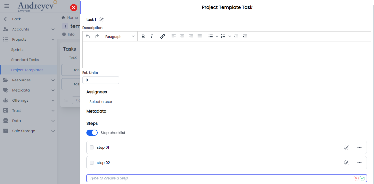
ProjectTemplateTask
This component sets up the page to display the slideOver window for editing the project template task, including the InlineInput and InlineProjectTemplateTaskStep components.
This component can be used directly as a router view:
component: () =>
    import(
        "@/components/ui/admin/project-templates/ProjectTemplateTask.vue"
    ),
The following is a visual screenshot of the component: 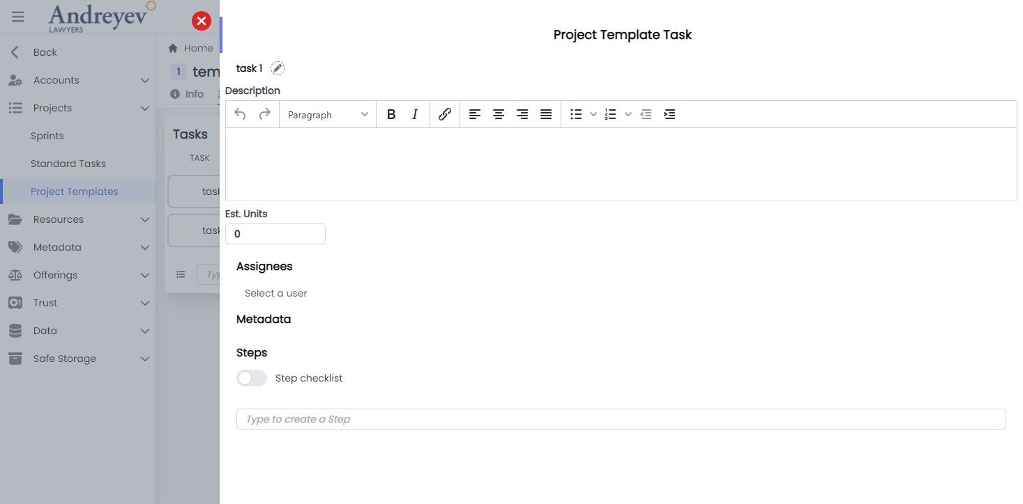
ProjectTemplateTaskMetadata
This component is created using the dynamicInput component to allow inline editing functionality for task steps.
This component can be used as follows:
<project-template-task-metadata
  :project-template-id="projectTemplateId"
  :id="id"
/>
The following is a visual screenshot of the component: 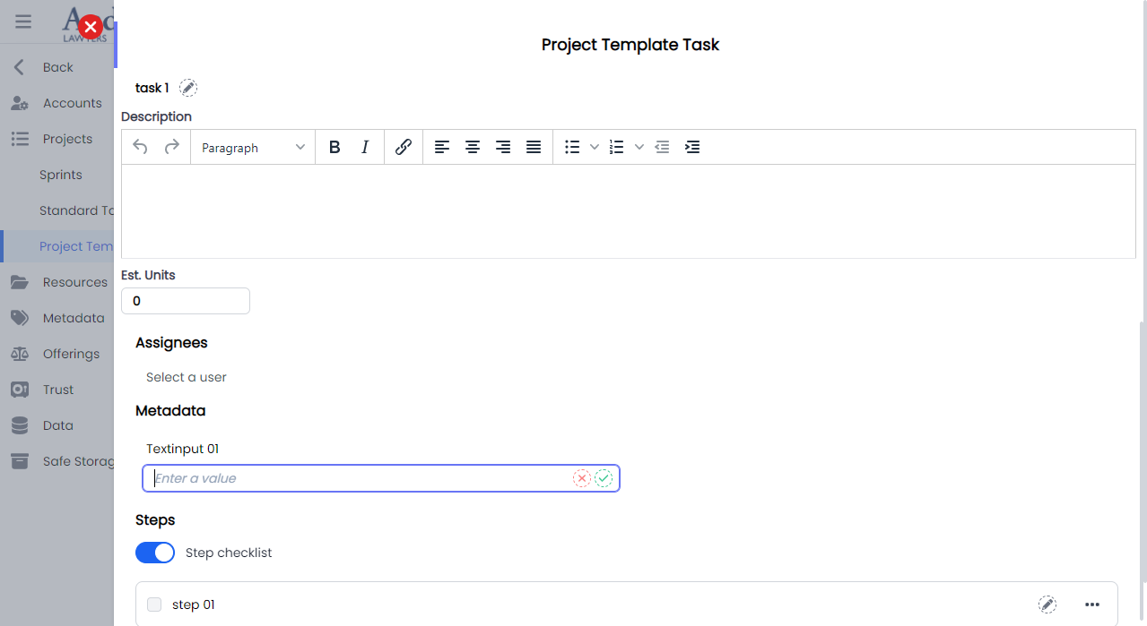
Resource-urls
CreateResourceUrl
This component customises the modal and the modalForm components to display a modal for creating new Resource Url.
This component can be used as follows:
<create-resource-url
  v-if="state.showCreate"
  @close="state.showCreate = false"
/>
The following is a visual screenshot of the modal: 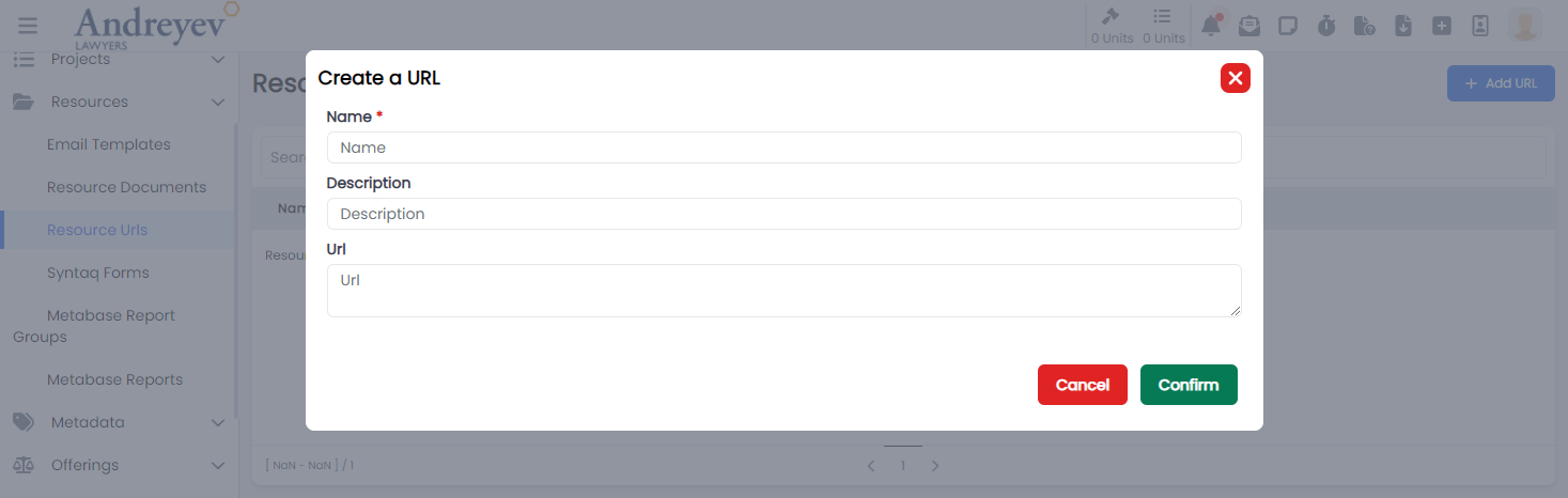
Roles
CreateRole
This component customises the modal and the modalForm components to display a modal for creating new roles.
This component can be used as follows:
<create-role
  v-if="state.showCreate"
  @close="state.showCreate = false"
/>
The following is a visual screenshot of the modal: 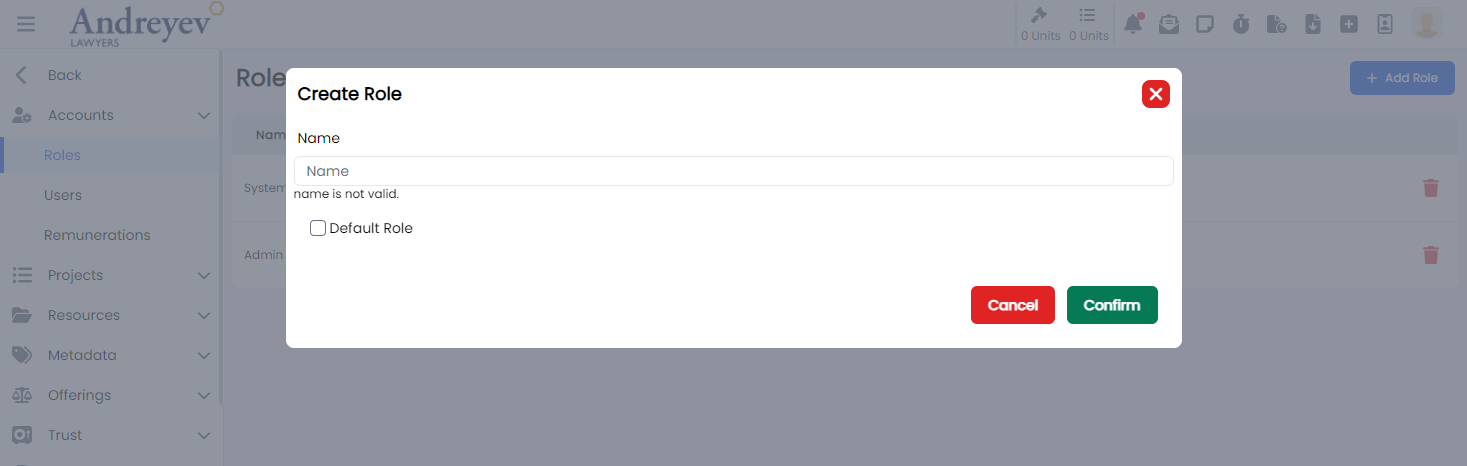
Role
This component customises the slideOver window for managing permissions in the system of a role.
This component can be used as follows:
<role
  v-if="state.selectedRoleId"
  :id="state.selectedRoleId"
  :key="state.selectedRoleId"
  @close="state.selectedRoleId = null"
/>
The following is a visual screenshot of the modal: 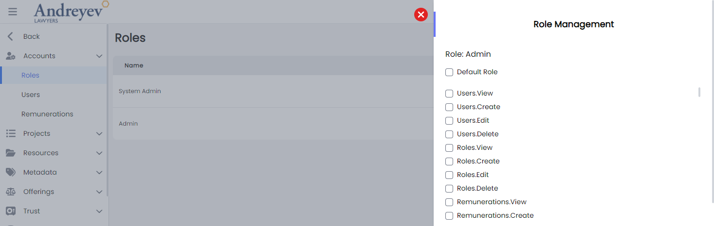
Sprints
CreateSprint
This component customises the modal and the modalForm components to display a modal for creating new sprint.
This component can be used as follows:
<create-sprint
  v-if="state.showCreate"
  @close="state.showCreate = false"
/>
The following is a visual screenshot of the modal: 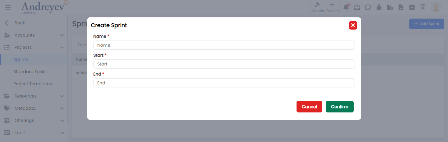
Standard-tasks
CreateStandardTask
This component customises the modal and the modalForm components to display a modal for creating new standard task.
This component can be used as follows:
<create-standard-task
  v-if="state.showCreate"
  @close="state.showCreate = false"
/>
The following is a visual screenshot of the modal: 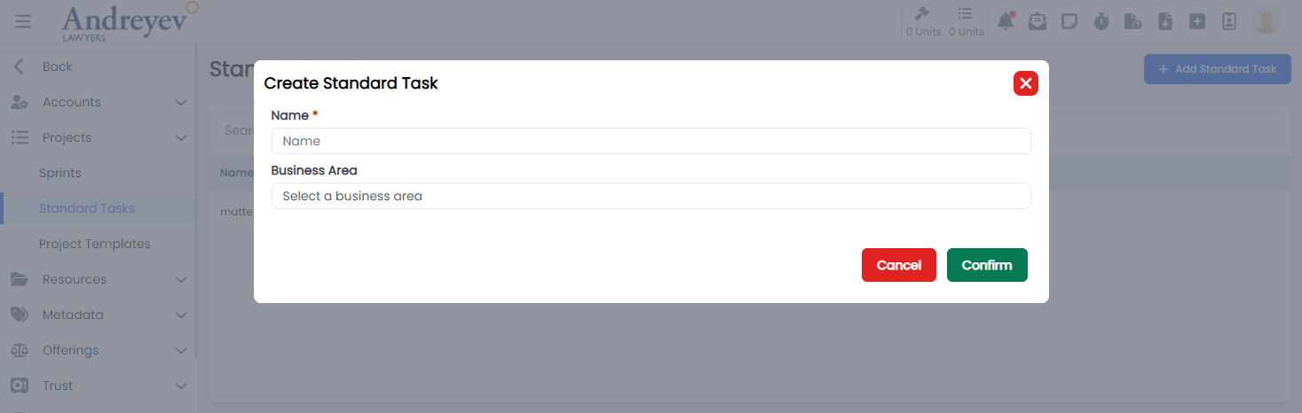
InlineStandardTaskStep
This component creates and displays each Inline Standard Task Steps, integrating the EditInlineInput component to allow inline editing functionality, an option to select and choose resources to be included in the task step using the ResourceSelector, ResourceUrlSelector and SyntaqResourceSelector.
This component can be used as follows:
<inline-standard-task-step
  :standard-task-id="id"
  :standard-task-step="value"
  class="class"
  :key="value.id"
  :is-steps-check-list="state.isStepsCheckList"
/>
The following is a visual screenshot of the component: 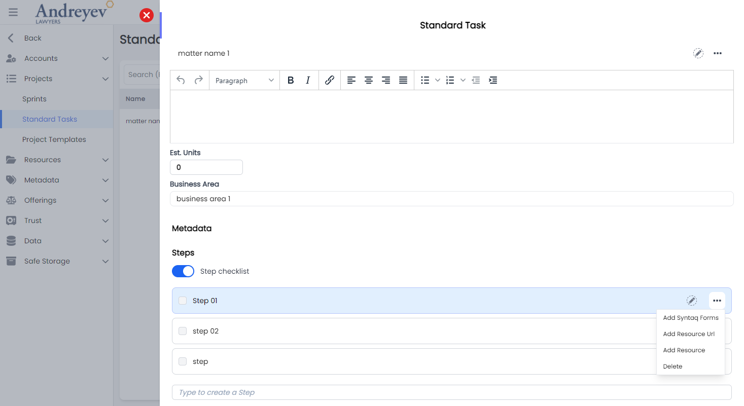
StandardTask
This component sets up the page to display the slideOver window for editing the project template task, including the InlineInput and InlineStandardTaskStep components.
This component can be used directly as a router view:
component: () =>
  import(
    "@/components/ui/admin/standard-tasks/StandardTask.vue"
  ),
The following is a visual screenshot of the component: 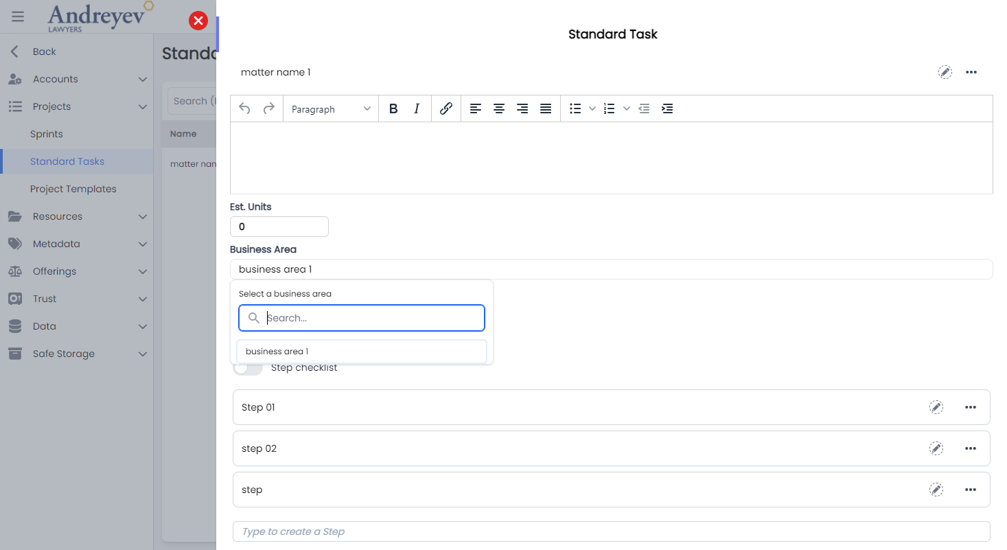
StandardTaskMetadata
This component is created using the dynamicInput component to allow inline editing functionality for task metadata.
This component can be used as follows:
<standard-task-metadata
  :id="id"
/>
The following is a visual screenshot of the component: 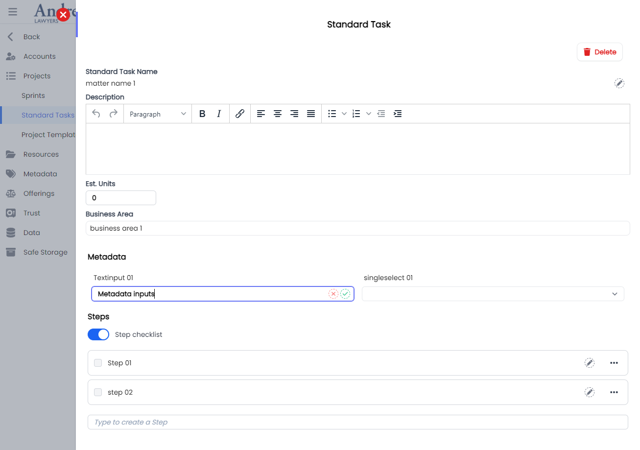
Trusts
CreateTrustAccount
This component customises the modal and the modalForm components to display a modal for creating new trust account.
This component can be used as follows:
<create-trust-account
  v-if="state.showCreate"
  @close="state.showCreate = false"
/>
The following is a visual screenshot of the modal: 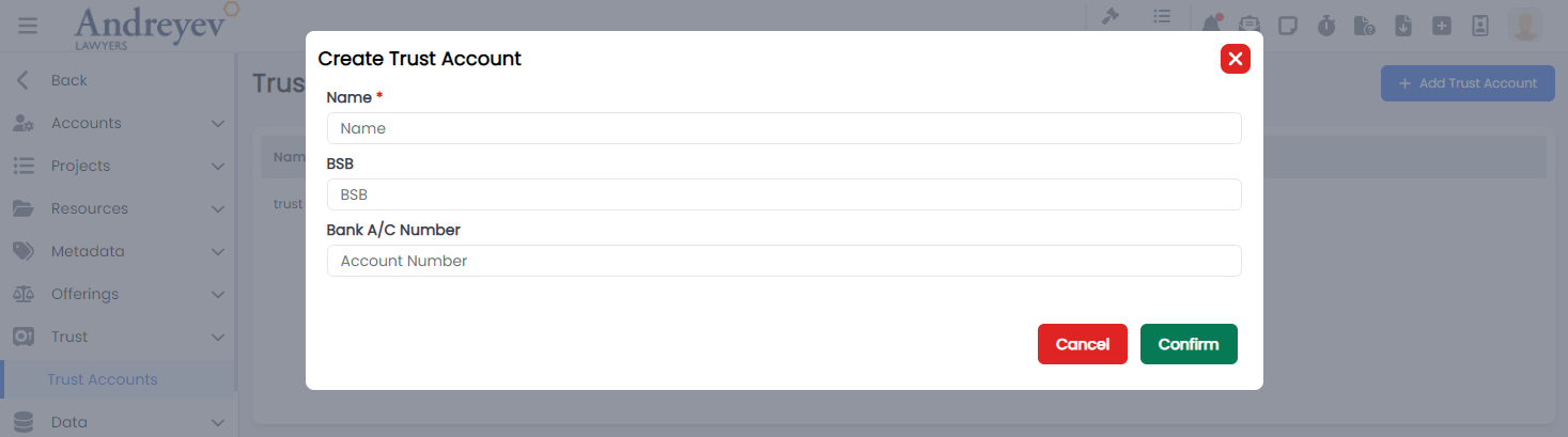
Users
ChangePassword
This component customises the modal and the modalForm components to display a modal for changing password.
This component can be used as follows:
<change-password
  v-if="stateUser.showCreate"
  @close="stateUser.showCreate = false"
  :id="id"
/>
The following is a visual screenshot of the modal: 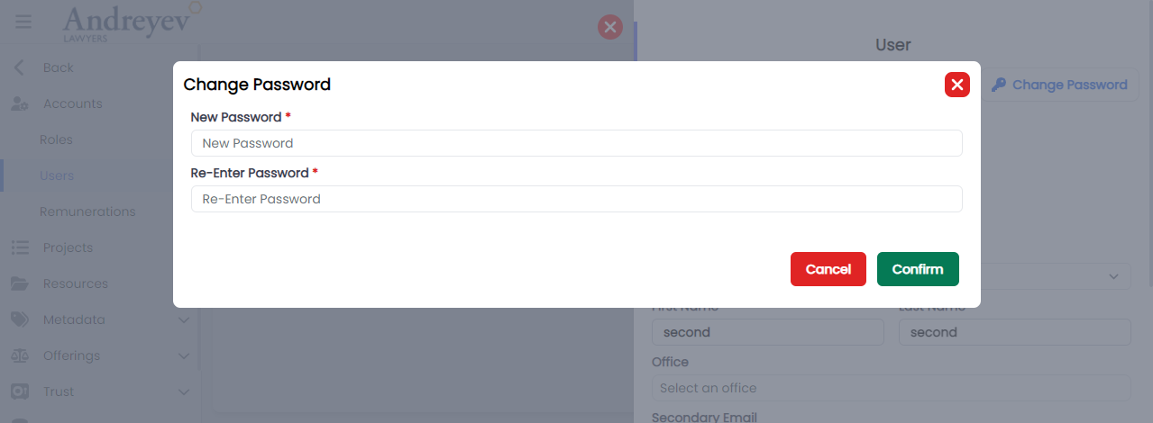
CreateRemuneration
This component customises the modal and the modalForm components to display a modal for creating new Remuneration.
This component can be used as follows:
<create-remuneration
  v-if="state.showCreate"
  @close="state.showCreate = false"
/>
The following is a visual screenshot of the modal: 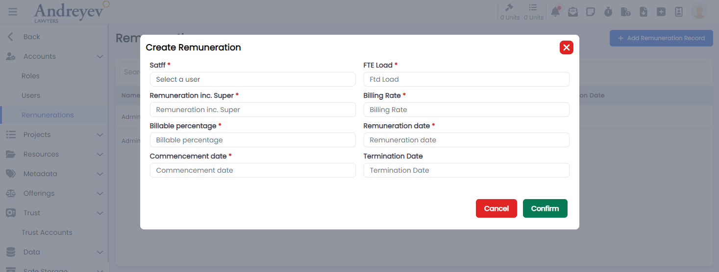
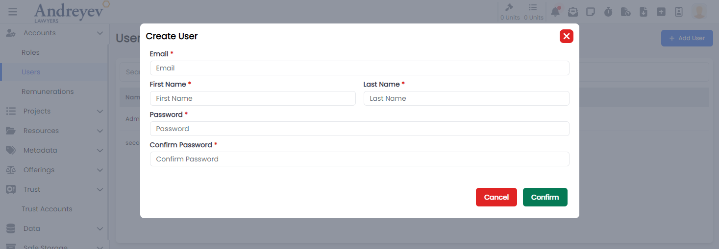
CreateUser
This component customises the modal and the modalForm components to display a modal for creating new user.
This component can be used as follows:
<create-user
  v-if="state.showCreate"
  @close="state.showCreate = false"
/>
The following is a visual screenshot of the modal: