UI User Components
This Is a brief overview of the UI User Components being used in the system today.
GlobalModals
This file includes all commonly used modals in the ALP system to allow easier access to the modals.
This component dynamically renders a different child component based on the value of currentModalComponent.
currentModalComponent is a computed property that uses the Vuex store's ModalType enum to determine which child component to render. The enum defines a list of different modal types, each corresponding to a specific child component.
When a modal is triggered, a mutation is dispatched to the Vuex store to set the active modal type. The currentModalComponent computed property then updates based on the new state in the store, causing the appropriate child component to be rendered inside the modal window.
This can be used as follows:
<template>
  <div>
    <a @click="showModal(ModalType.CreateContact, {})">
      <font-awesome-icon icon="fa-solid fa-id-card fa-2xl">
      </font-awesome-icon>
      Create Contact
    </a>

    <global-modals />
  </div>
</template>

<script>
import { useStore } from "vuex";
import GlobalModal from "@/components/GlobalModal.vue";

export default {
  components: {
    GlobalModal,
  },
  setup() {
    const store = useStore();

    function showModal(type: ModalType, props: Record<string, unknown>) {
      store.dispatch(ModalStore.actions.SHOW_MODAL, {
        modal: type,
        props
      });
    }
  }
}
Clients
CreateClient
This is a modal using modalform to customise for creating a new Client.
This can be used according to GlobalModals.
The following is a visual of this component at work. 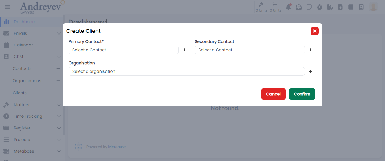
Contacts
CreateContact
This is a modal using modalform to customise for creating a new Contact.
This can be used according to GlobalModals.
The following is a visual of this component at work. 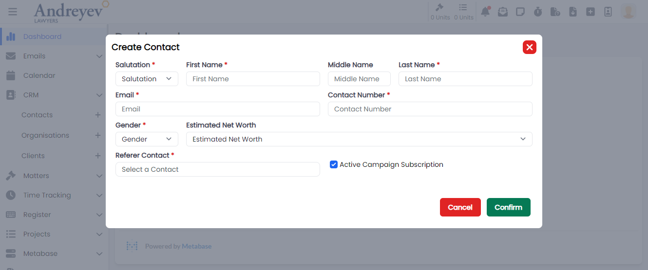
ShowACUnsubscribe
This is a modal using modalform to customise for unsubscribing newsletters for a contact providing reasons.
This can be used according to GlobalModals.
The following is a visual of this component at work. 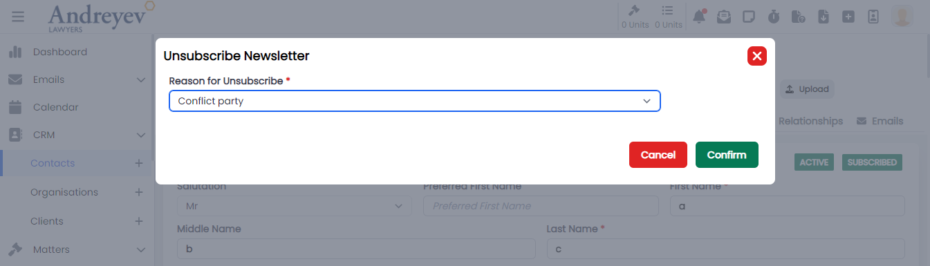
Directory
EmailGroup
This component is for fetching and displaying Email Groups, with group name and description of the group. This component enables adding of whole group to email recipient.
This component can be used as follows:
<email-group
    v-if="state.selectedOption == 'groups'"
    :search = "state.search"
/>
The following is a visual of this component at work. 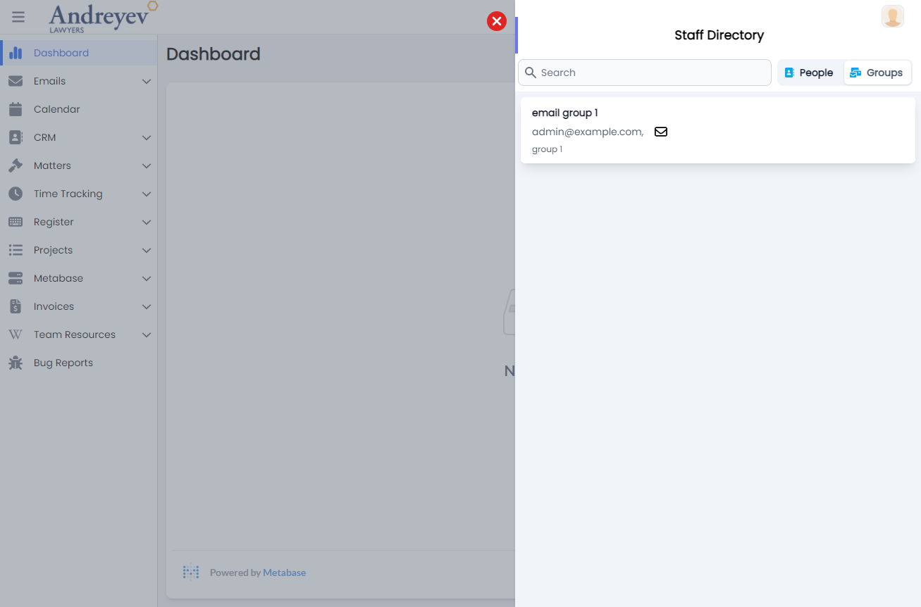
People
This component is for fetching and displaying People, with Name, Rate, Email and description of person. This component enables adding People to email recipient.
This component can be used as follows:
<people
    v-if="state.selectedOption == 'people'"
    :search = "state.search"
/>
The following is a visual of this component at work. 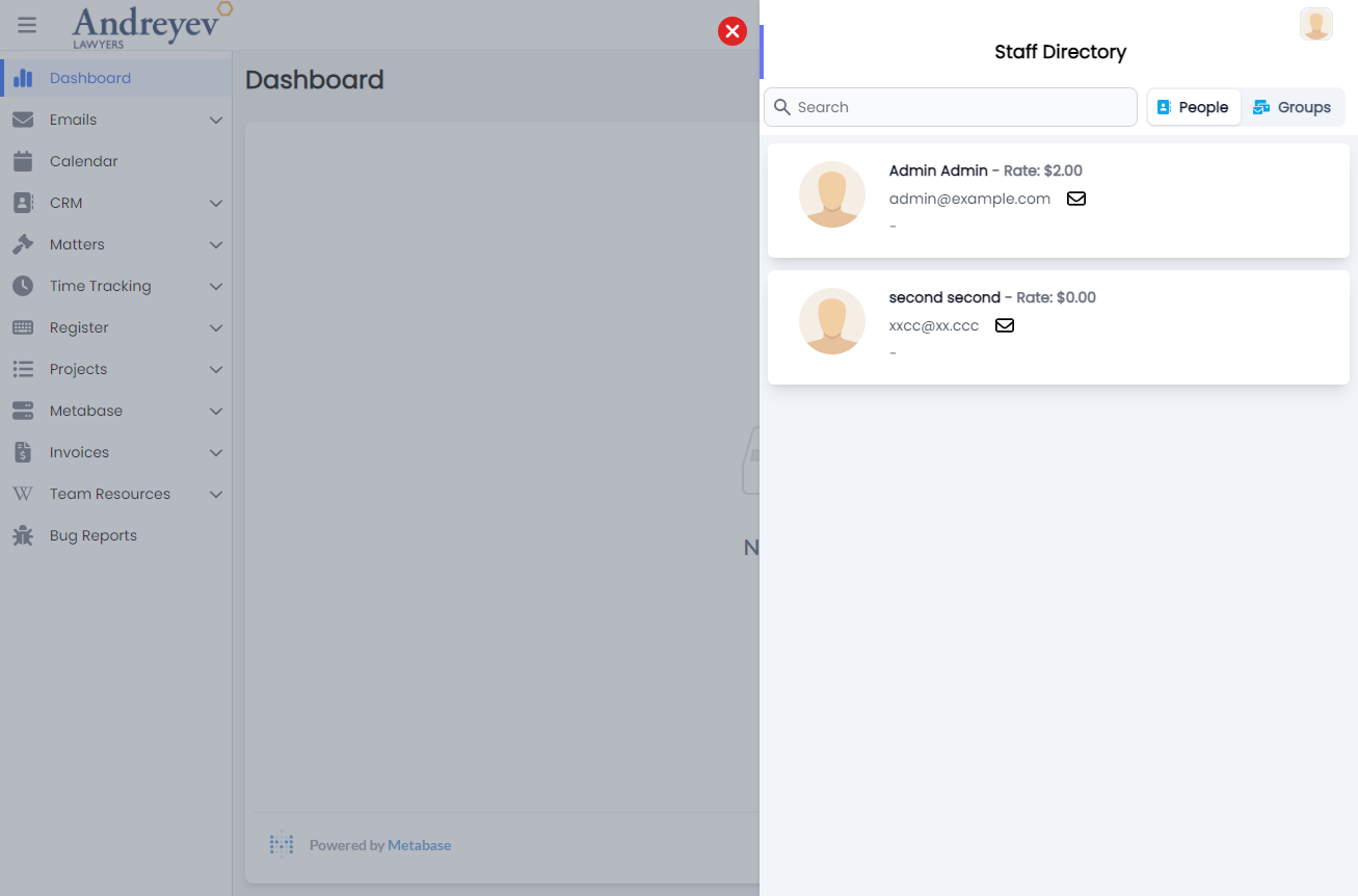
Documents
DocumentList
This component customises the Document window and DocumentActions to list a table of documents.
This component can be used as follows:
<document-list
  class="flex-1 mt-2"
  :loading="loading"
  :uploading="state.uploading"
  :documents="items"
  :documents-count="count"
  :can-create="can('ContactDocument.Create')"
  :can-edit="can('ContactDocument.Edit')"
  :can-delete="can('ContactDocument.Delete')"
  @fetch="fetch"
  @upload="uploadContactDocuments"
  @create-from-resource="createFromResource"
  :contactId = id
/>
The following is a visual of this component at work. 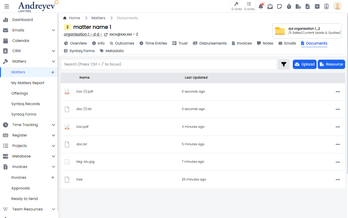
Document
This component customises the SlideOver window for managing a document draft histories.
This component can be used as follows:
<document
  v-if="state.selectedDocumentId"
  :key="state.selectedDocumentId"
  :id="state.selectedDocumentId"
  :can-edit="canEdit"
  :can-delete="canDelete"
  @updated="fetchDocuments"
  @close="
    () => {
      state.selectedDocumentId = null;
      $emit('closed')
    }
  "
/>
The following is a visual of this component at work. 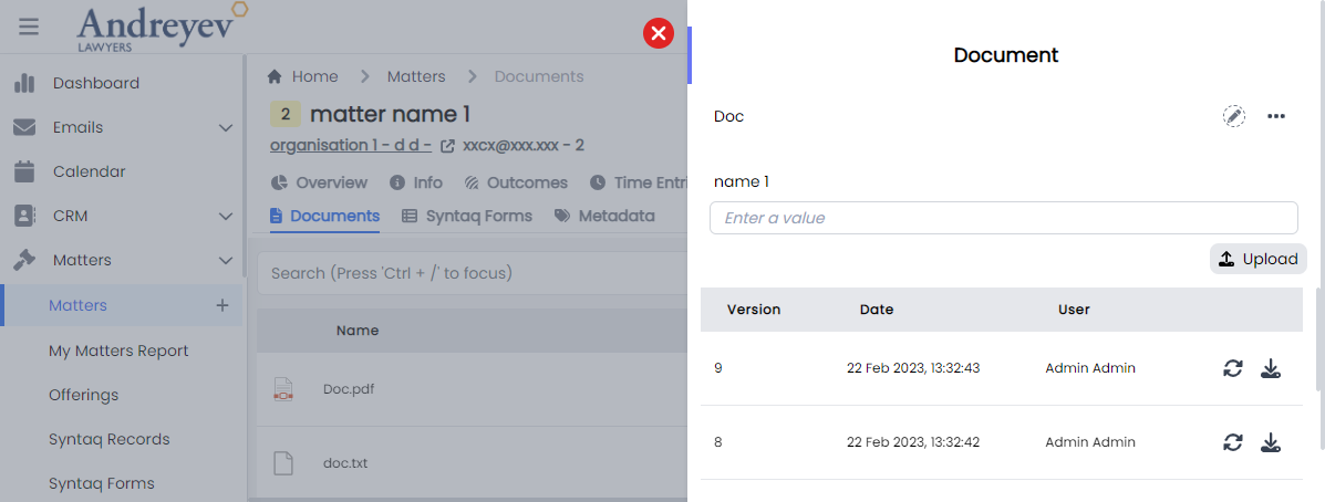
DocumentActions
This component is for listing each document in the document list, with actions like download, add to reminder, RequestDocumentReview, attach to email and more.
This component can be used as follows:
<document-actions
  :document="item.document"
  :can-edit="false"
  :can-delete="false"
  :can-add-reminder="false"
  :can-request-review="false"
  @updated="fetchDocument"
  @deleted="$emit('close')"
/>
The following is a visual of this component at work. 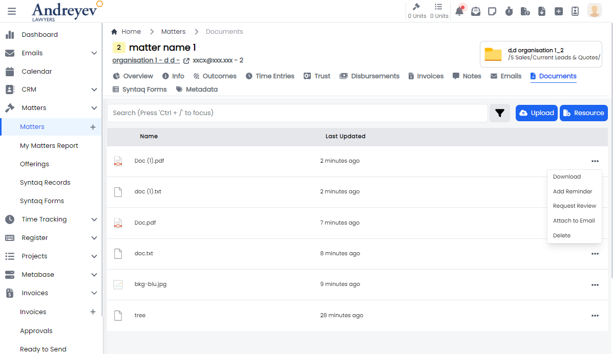
DocumentFilters
This component customises the SlideOver window for managing filters in document viewing.
This component can be used as follows:
<document-filters
  v-if="state.showDocumentFilters"
  class="z-50"
  v-model:matchAny="state.matchAny"
  v-model:filterParameters="state.filterParameters"
  @close="state.showDocumentFilters = false"
/>
The following is a visual of this component at work. 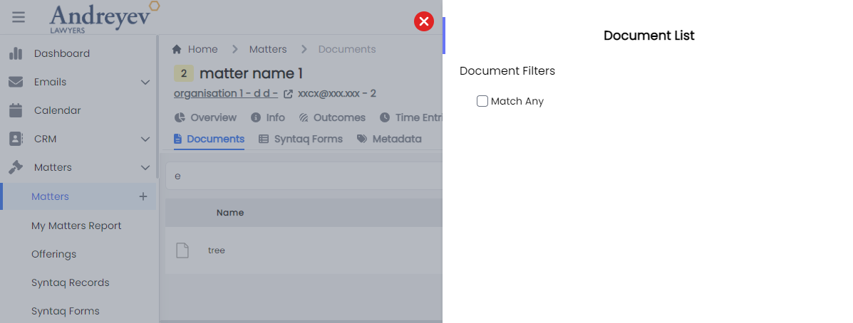
Possible Bug 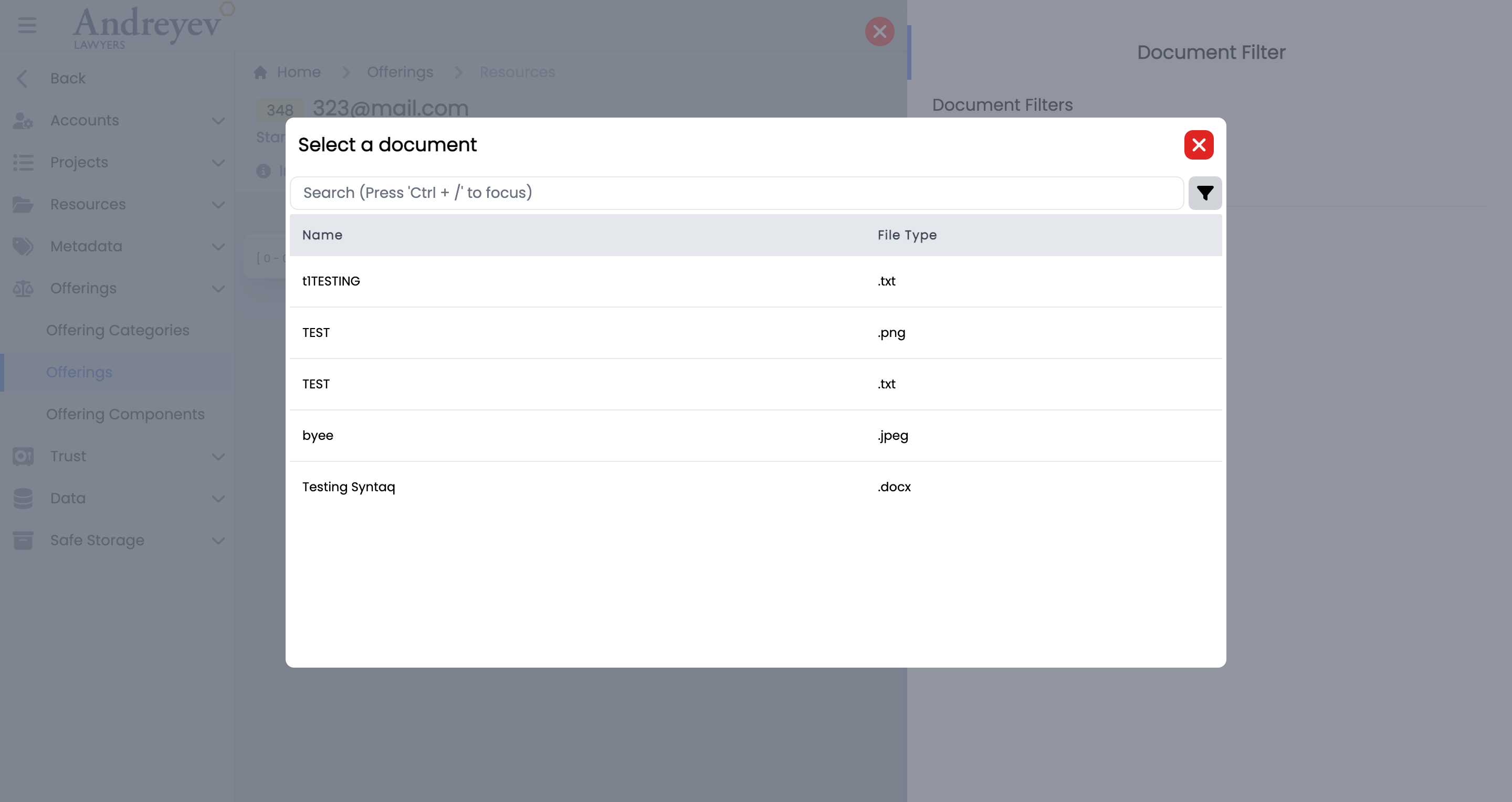
ActiveDocuments
This component shows a floating container of the active documents, displays 'No Active Document Found' when empty.
This component can be used as follows:
<active-documents v-if="tab == 'active'" />The following is a visual of this component at work. 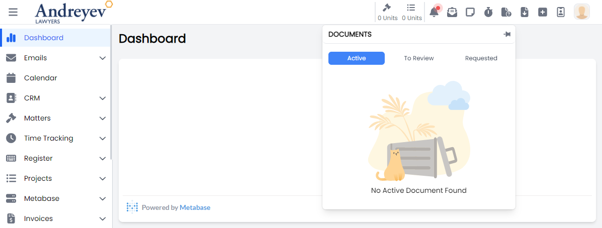
RequestDocumentReview
This is a modal using modalform to customise for requesting a Staff for a document review with an included message.
This can be used according to GlobalModals.
The following is a visual of this component at work. 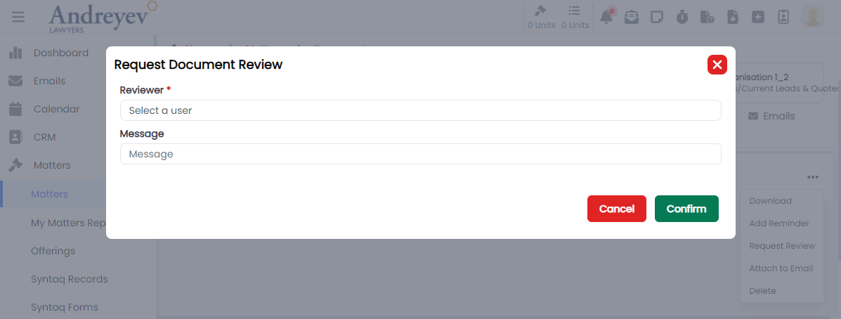
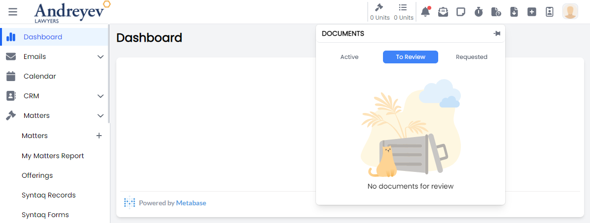
ReceivedDocumentReviewRequests
This component is to display a floating container to show the received requests for document reviews as a reviewer.
This component can be used as follows:
<received-document-review-requests v-if="tab == 'received'" />The following is a visual of this component with documents and while empty. 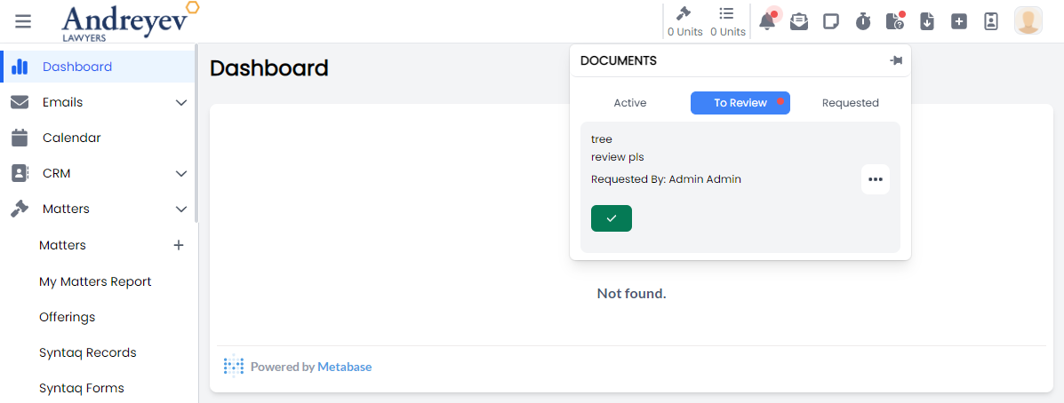
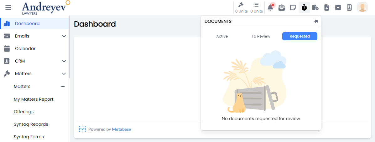
RequestedDocumentReviewRequests
This component is to display a floating container to show the requested document reviews and their status.
This component can be used as follows:
<requested-document-review-requests v-if="tab == 'requested'" />The following is a visual of this component with documents and while empty. 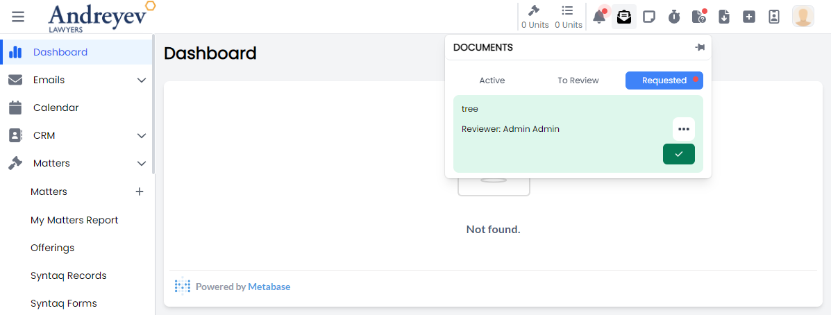
CompleteDocumentReview
This is a modal using modalform to customise for completing document review providing a message.
This can be used according to GlobalModals.
The following is a visual of this component at work. 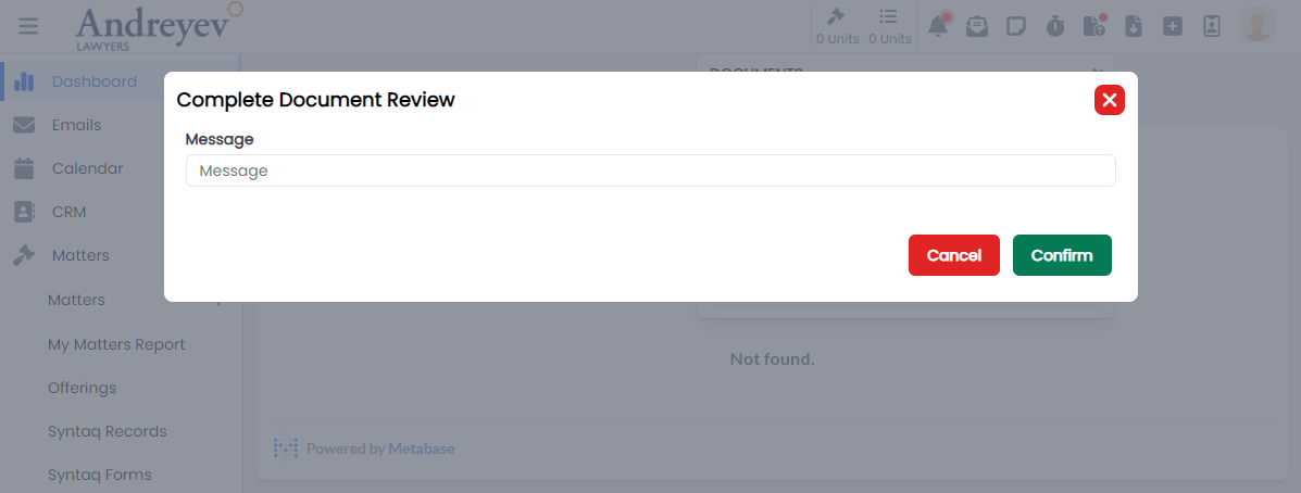
ResourceSelector
This component is to display a resource selector with search bar and filtering, using modal.
This component can be used as follows:
<resource-selector
  v-if="resourceState.showResourceSelector"
  @create="addDocumentResource($event)"
  @close="resourceState.showResourceSelector = false"
/>
The following is a visual of this component at work. 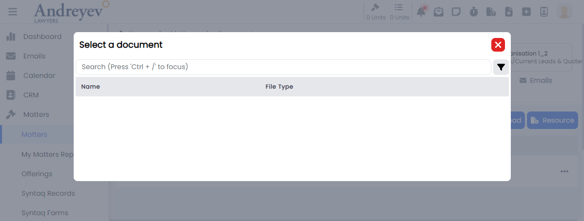
SyntaqResourceSelector
This component is to display a Syntaq resource selector with a search bar, using modal.
This component can be used as follows:
<syntaq-resource-selector
  v-if="resourceState.showSyntaqSelector"
  @create="addSyntaqFormResource($event)"
  @close="resourceState.showSyntaqSelector = false"
/>
The following is a visual of this component at work. 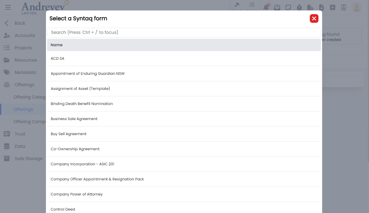
Emails
EmailList
This component is for displaying the list of emails, with a search and filter function. It also includes a multi-select function that allows actions to emails to be done in batches.
This component can be used as follows:
<email-list
  class="w-full"
  :getter="EmailStore.getters.GET_INBOX_EMAILS"
  :query="EmailStore.getters.GET_INBOX_EMAILS"
  :multiselectTrigger="true"
  :selectedEmail="true"
  @selected="$router.push({ name: 'Inbox Email', params: $event })"
  @click="selectMethod($event)"
/>
The following is a visual of this component at work. 
EmailDisplay
This component is to display a email in a container, including options for assigning email to matter/project, convert to pdf, and other common email options.
This component can be used as follows:
<email-display
  v-if="!email?.threadEmail.length"
  can-import
  :email="email"
  :email-type="'Matter'"
  :entity-number = id
  @download-attachment="downloadAttachment"
  @import-attachment="importAttachment"
  @preview-attachment="previewAttachment"
  @close="$emit('close')"
/>
The following is a visual of this component at work. 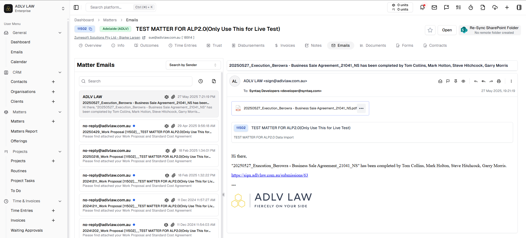
Feedback
CreateBugReport
This is a modal using modalform to customise for creating a bug report with description, priority drop down selection and file uploads.
This can be used according to GlobalModals.
The following is a visual of this component at work. 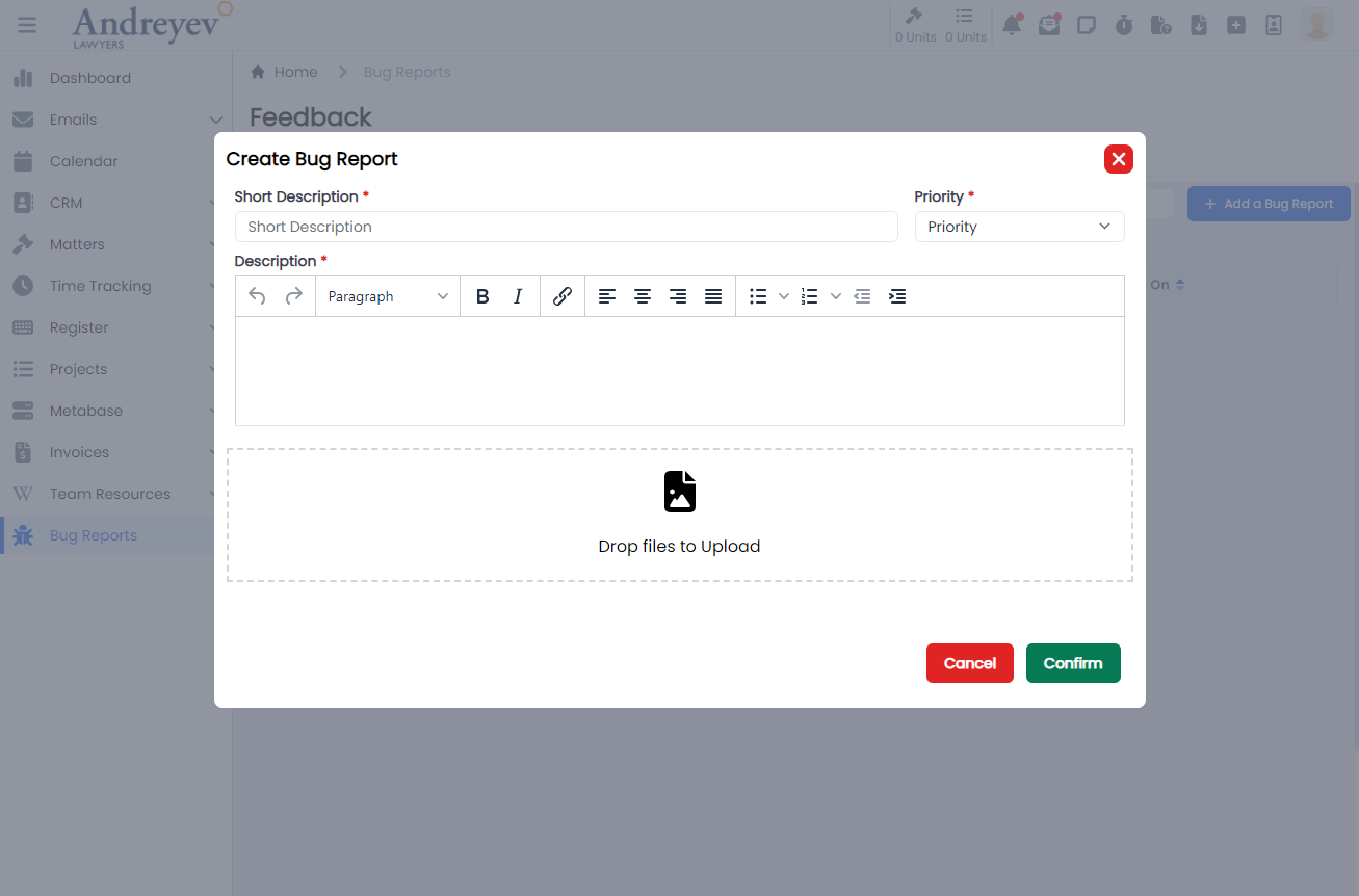
CreateSuggestion
This is a modal using modalform to customise for submitting a suggestion with description, type drop down selection and file uploads.
This can be used according to GlobalModals.
The following is a visual of this component at work. 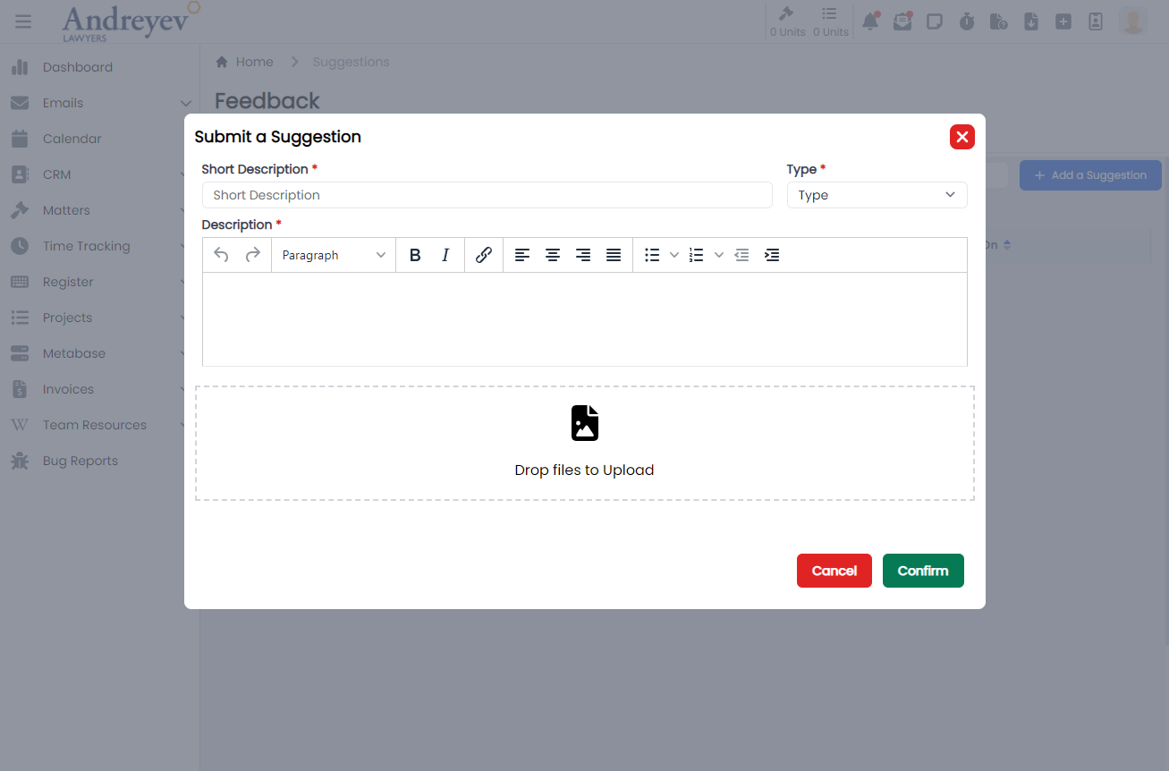
UploadDocument
This component is for the 'drag and drop' file upload function of the two components above, CreateBugReport and CreateSuggestion.
This is used as follows:
<UploadDocument @drop.prevent="drop" />Invoices
CreateFixedPriceItem
This is a modal using modalform to customise for creating fixed price items.
This component can be used as follows:
<create-fixed-price-item
  v-if="state.showCreateFixedPriceItem"
  :id="id"
  @close="state.showCreateFixedPriceItem = false"
/>
The following is a visual of this component at work. 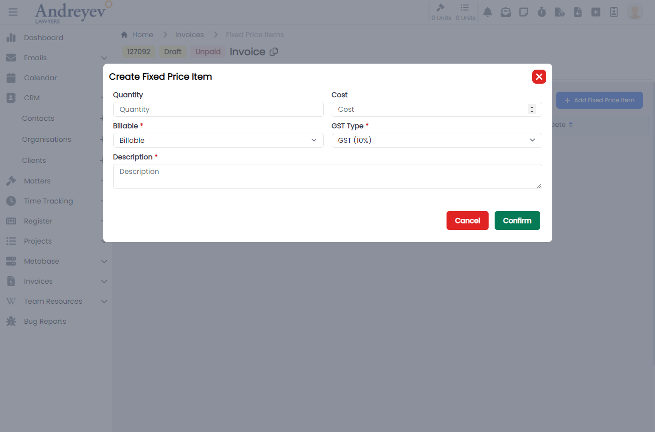
CreateInvoice
This is a modal using modalform to customise for creating a new invoice.
This can be used according to GlobalModals.
The following is a visual of this component at work. 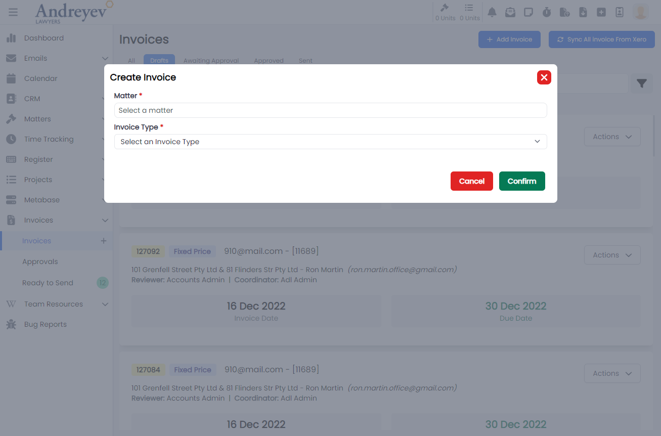
EditInvoiceNote
This is a modal using modalform to customise for updating existing invoice notes.
This can be used according to GlobalModals.
The following is a visual of this component at work. 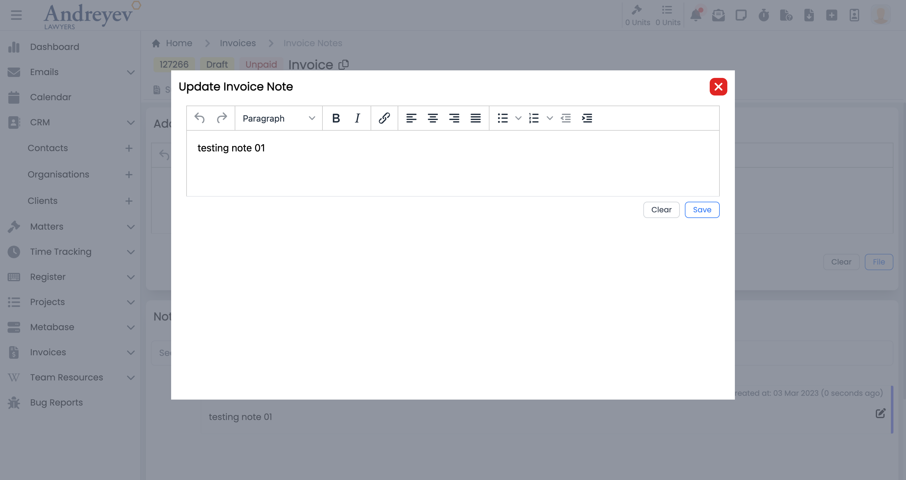
InlineInvoice
This component is to display an invoice in a line for a page of list of invoices. This line of invoice uses colored badges to differentiate type and status of the invoice. This component also allows downloading as pdf, sending reminders and more.
This component can be used as follows:
<inline-invoice
  class="mb-3 transition duration-200 shadow-lg"
  v-for="item in items"
  :key="item.id"
  :invoice="item"
  @load-more="fetch"
/>
The following is a visual of this component at work. 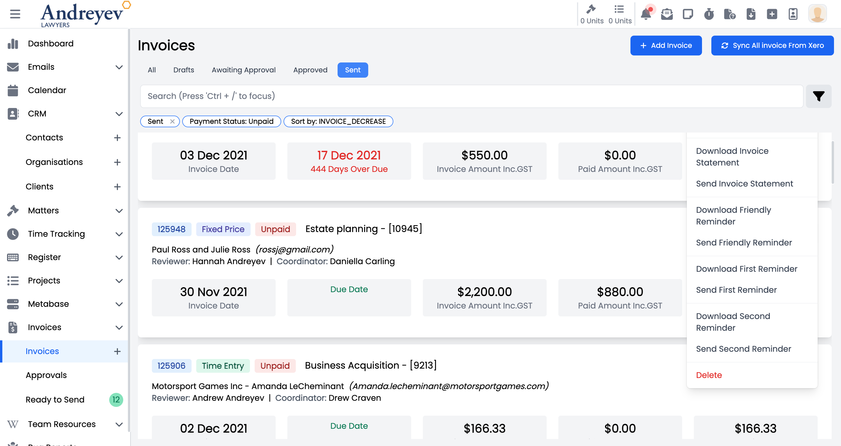
InvoiceDisbursementSelector
This component customises the SlideOver window for selecting a disbursement.
This component can be used as follows:
<invoice-disbursement-selector
  v-if="state.showDisbursementSelector"
  :key="$route.params.id"
  :id="id"
  @close="state.showDisbursementSelector = false"
/>
The following is a visual of this component at work. 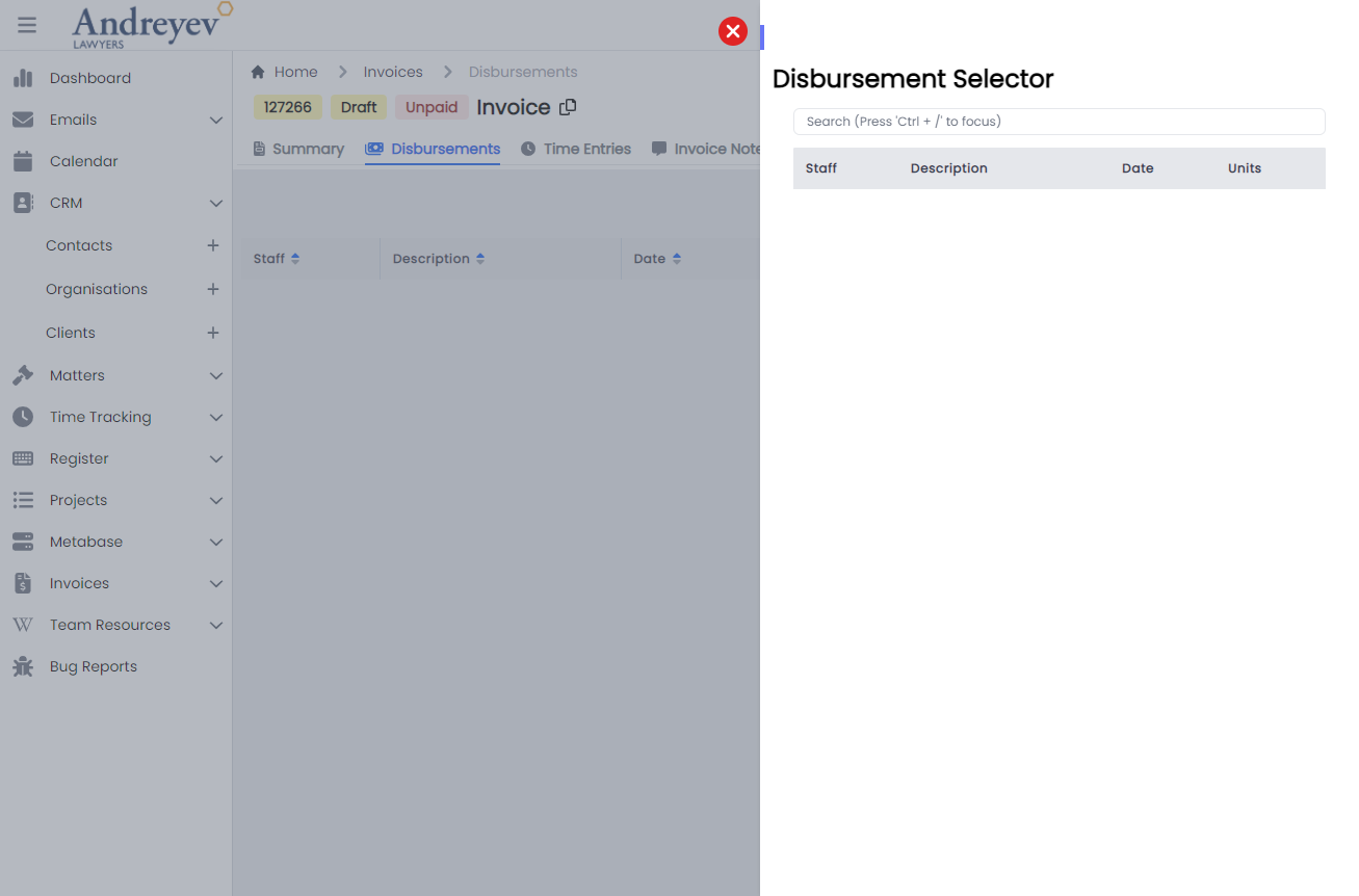
InvoiceTimeEntrySelector
This component customises the SlideOver window for managing time entries to include in the invoice.
This component can be used as follows:
<invoice-time-entry-selector
  v-if="state.showTimeEntrySelector"
  :key="$route.params.id"
  :id="id"
  @close="state.showTimeEntrySelector = false"
/>
The following is a visual of this component at work. 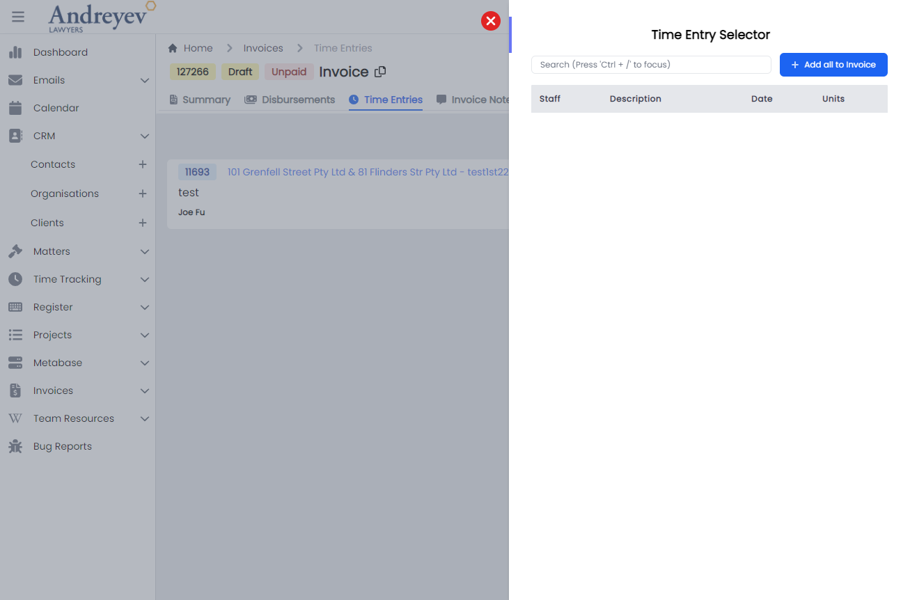
UpdateInvoiceDate
This is a modal using modalform to customise for updating invoice date.
This component can be used as follows:
<update-invoice-date
  v-if="state.showUpdateInvoiceDate"
  :id="invoice.id"
  @close="state.showUpdateInvoiceDate = false"
/>
The following is a visual of this component at work. 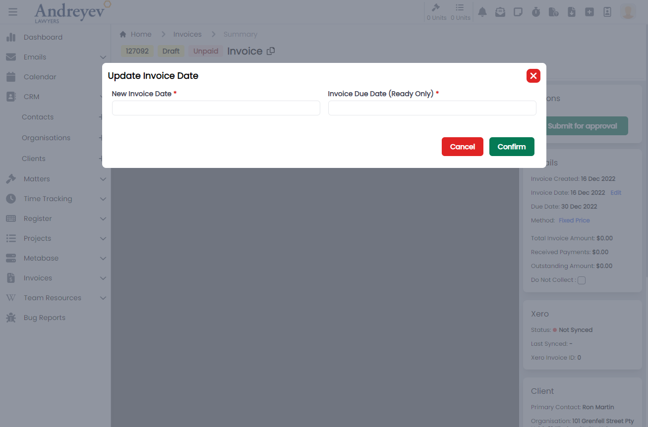
Layout
ActionMultiselect
Deprecated
AdminMenu
This component is to display the admin side menu, with toggle to hide sub sections, and most importantly, navigation links to the sections pages using NavLink.
This component can be used as follows:
<admin-menu
  v-else-if="state.showMenu === 'admin'"
  class="w-full"
  @navigated="state.expanded = false"
/>
The following is a visual of this component at work. 
SlideOver
This component can be used as follows:
<slide-over
  heading="Matter Filters"
  v-if="viewState.showMatterFilters"
  @close="viewState.showMatterFilters = false"
>
</slide-over>
The following is a visual of this component at work. 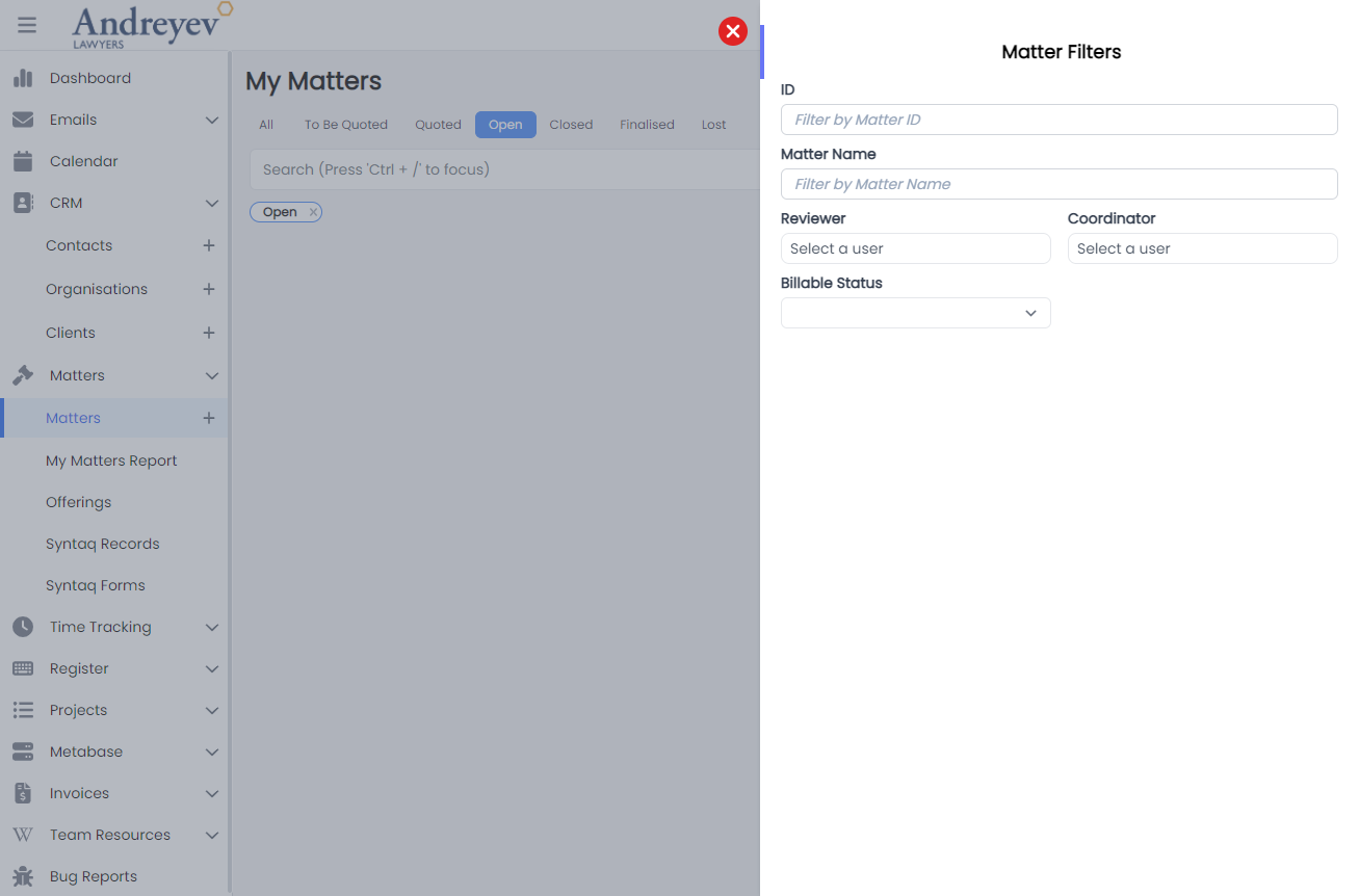
ComponentSlideOver
This component is similar to that of SlideOver, with slight changes to color and side of the slide over window.
Refer to SlideOver for usage example.
ProjectTaskSlideOver
This component is similar to that of SlideOver, with slight changes to color and side of the slide over window.
Refer to SlideOver for usage example.
The following is a visual of this component at work. 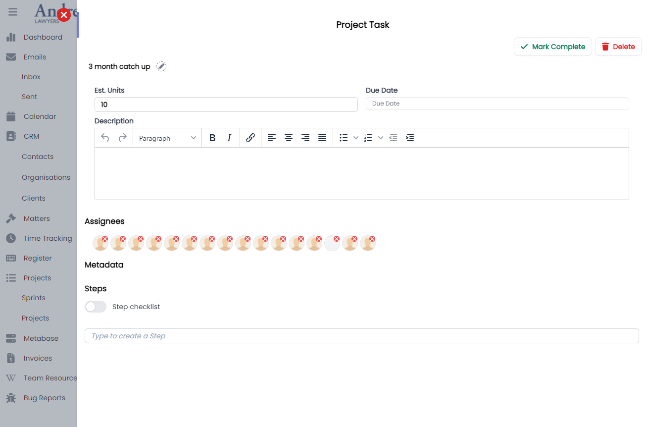
Detail
This component renders a container to contain details in a box with grey background.
This component can be used by just wrapping the contents just like that of a div component.
The following is a visual of this component at work. 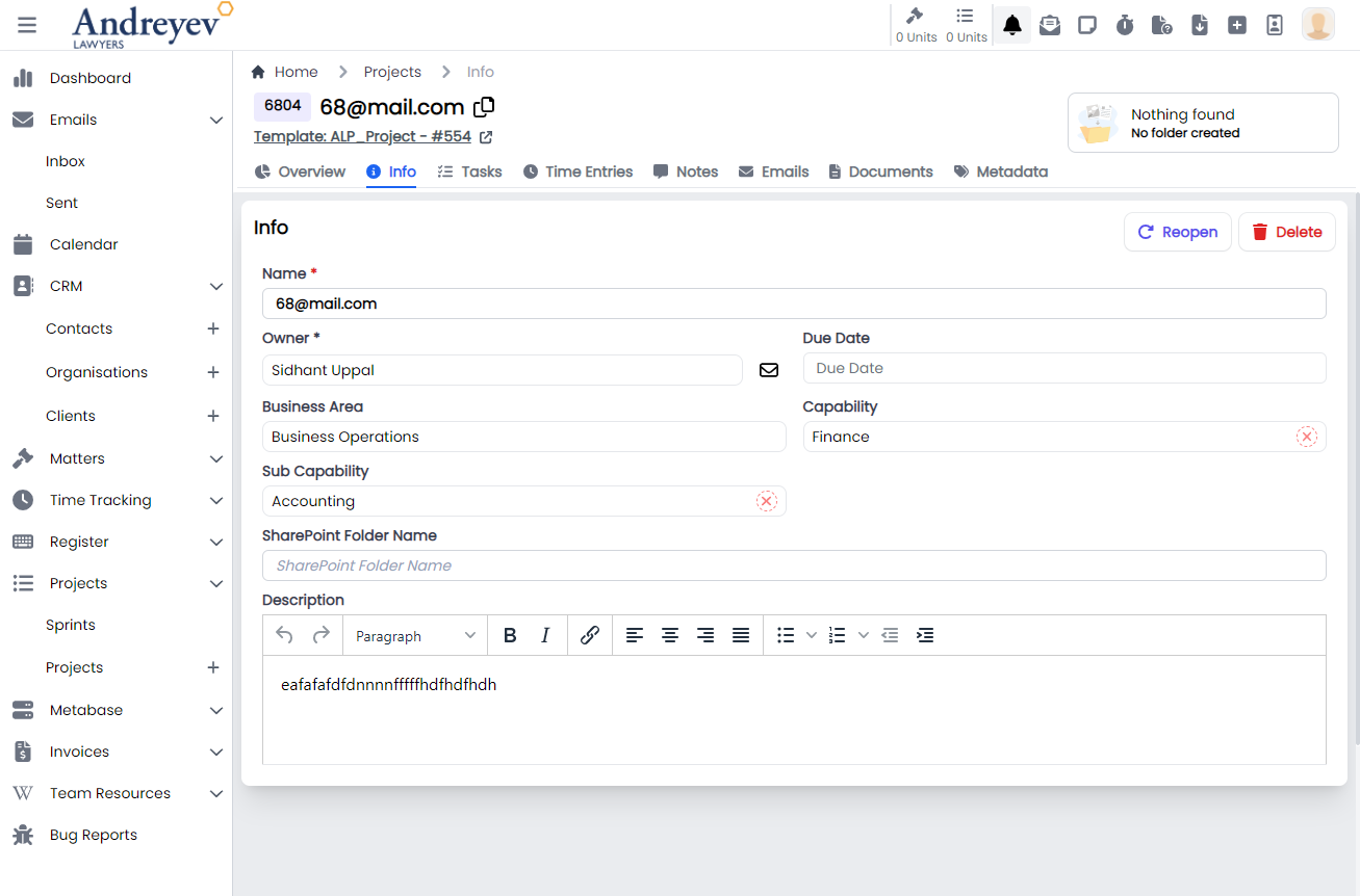
MasterDetail
This component is for rendering the breadcrumbs of the currently displayed page in the main container. This is very useful in helping the user visualise and navigate This is usually used by wrapping the whole page.
This component can be used by just wrapping the contents just like that of a div component.
The following is a visual of this component at work. 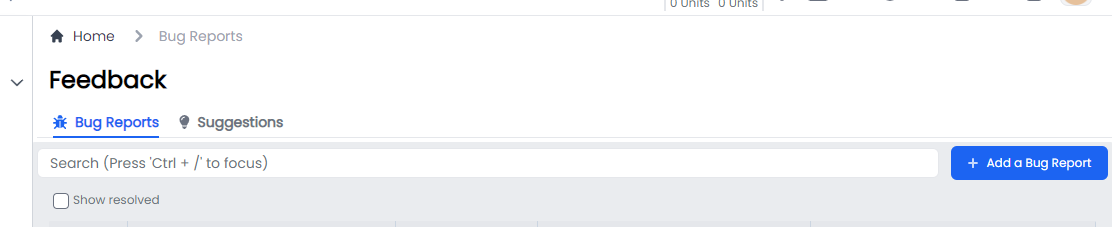
MainMenu
This component is to render the whole main menu on the left side of the page.
This component can be used as follows:
<main-menu
    :hideMenu="msg"
    v-if="state.showMenu === 'main'"
    @navigated="navigated"
/>
The following is a visual of this component at work. 
DocumentMenu
This component is to render the menu for documents that includes ActiveDocuments,ReceivedDocumentReviewRequests and RequestedDocumentReviewRequests.
This component can be used as follows:
<document-menu v-else-if="state.showMenu == 'documents'" />The following is a visual of this component at work. 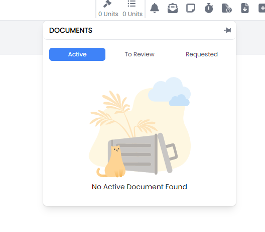
DownloadMenu
This component is to render the downloading menu to list current downloading jobs.
This component can be used as follows:
<download-menu v-else-if="state.showMenu == 'downloads'" />The following is a visual of this component at work. 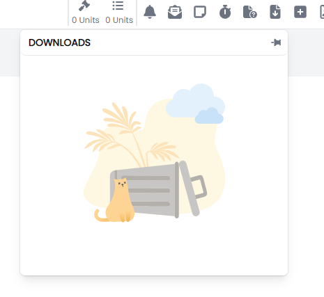
EmailMenu
This component is to render the new email floating page when clicking the top menu email option.
This component can be used as follows:
<email-menu v-else-if="state.showMenu === 'emails'" />The following is a visual of this component at work. 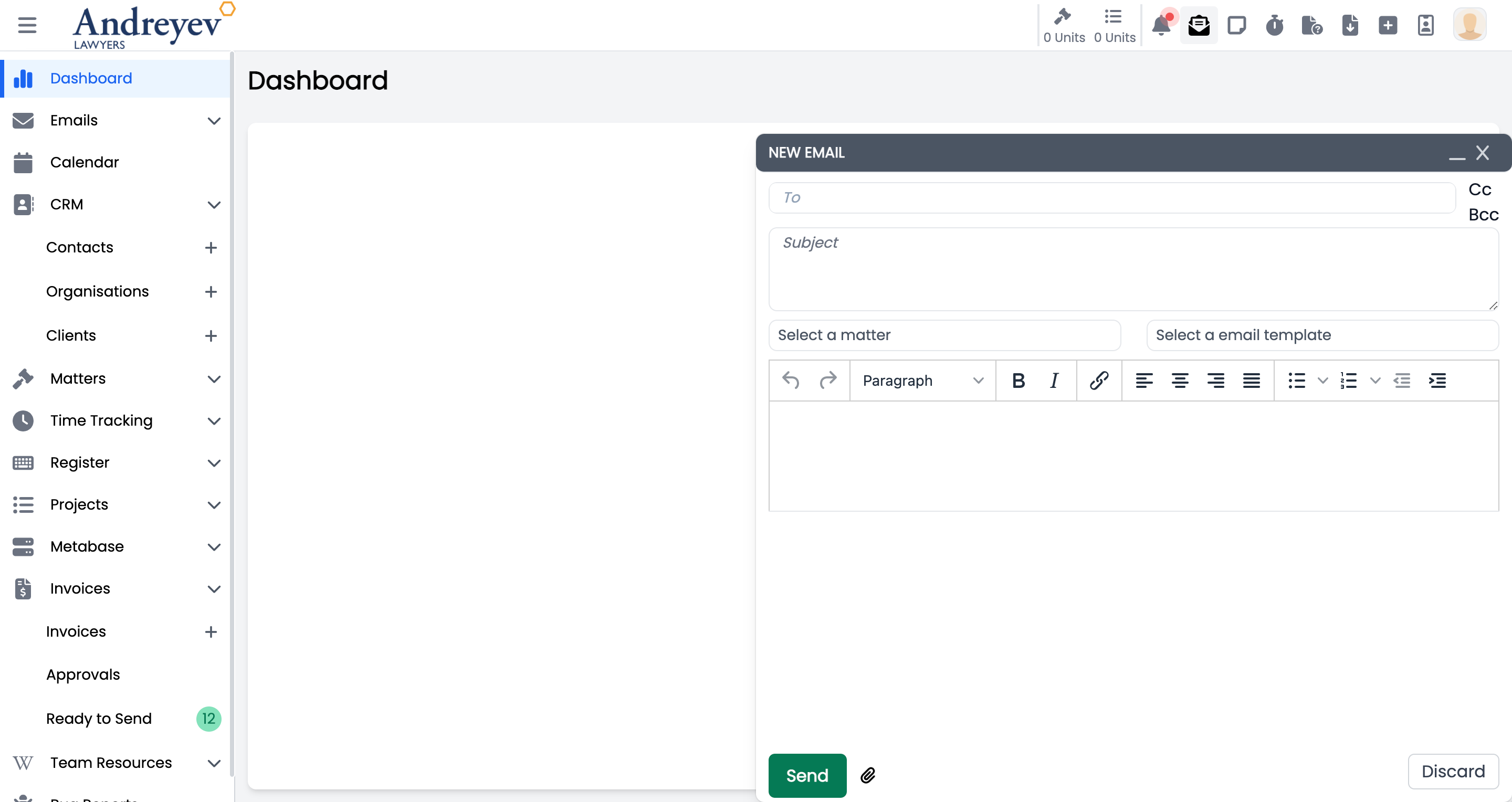
NotificationMenu
This component is to render the floating notification menu window.
This component can be used as follows:
<notification-menu v-else-if="state.showMenu === 'notifications'" />The following is a visual of this component at work. 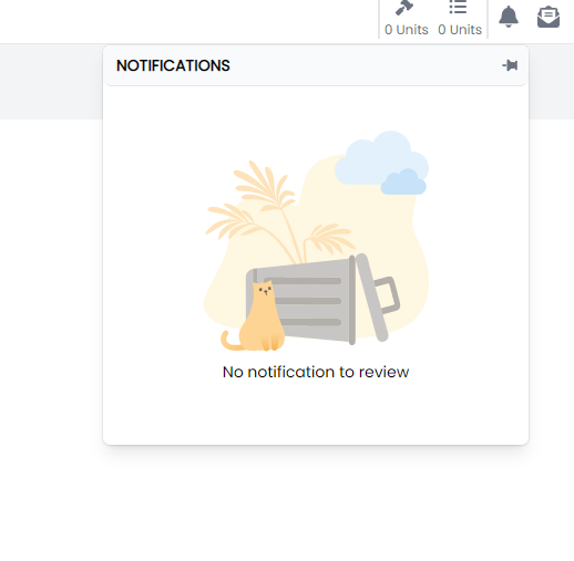
ReminderMenu
This component is to render the floating reminder menu window.
This component can be used as follows:
<reminder-menu v-else-if="state.showMenu === 'reminders'" />The following is a visual of this component at work. 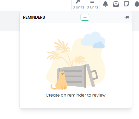
TimerMenu
This component is to render the floating timer menu window.
This component can be used as follows:
<timer-menu v-else-if="state.showMenu === 'timers'" />The following is a visual of this component at work. 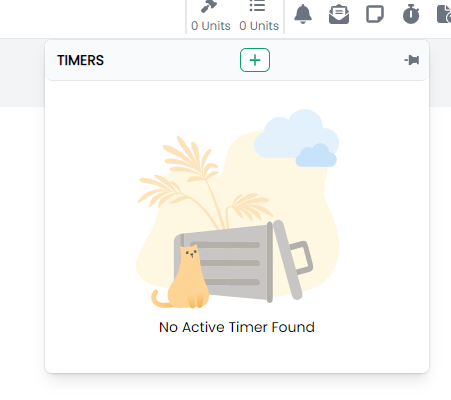
StaffDirectory
This component customises the SlideOver window for rendering the staff directory.
This component can be used as follows:
<staff-directory
  :isOpen="open"
  :isLockIcon="true"
  :currentLockState="state.isStaffDirectory"
  :lockIconClick="handleStaffDirectoryLockIconClick"
/>
The following is a visual of this component at work. 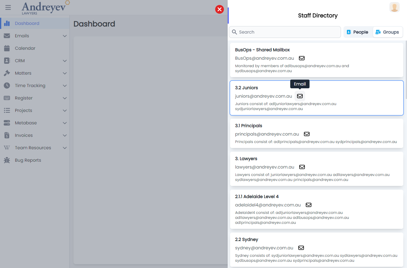
SideBar
This component is used to render the group of menu items on the top right hand corner, including DocumentMenu,DownloadMenu,EmailMenu,NotificationMenu, ReminderMenu, , and TimerMenuStaffDirectory.
This component can be used as follows:
<side-bar
  :handleHover="handleExpand"
  :handleMouseLeave="handleClose"
  class="md:flex flex-shrink-0 flex-grow-0"
  :msg="state.msg"
  :showAdminMenu="state.isShowAdminMenu"
  :handleMobileviewNatigation="handleMobileviewNatigation"
/>
The following is a visual of this component at work. 
Layout
This component renders the overall page for the main layout, with the top and side navigation. This consists of the MainMenu for the side navigation; SideBar used for the top navigation menu.
This component can be used as follows:
  redirect: { name: "Dashboard" },
  component: () => import("@/components/ui/layout/Layout.vue"),
The following is a visual of this component at work. 
FeedbackButton
Deprecated
NavBar
Deprecated
Switched to sidebar
QuickLinks
Deprecated
MailRegister
CreateIncomingMail
This is a modal using modalform to customise for registering new incoming mail.
This can be used according to GlobalModals.
The following is a visual of this component at work. 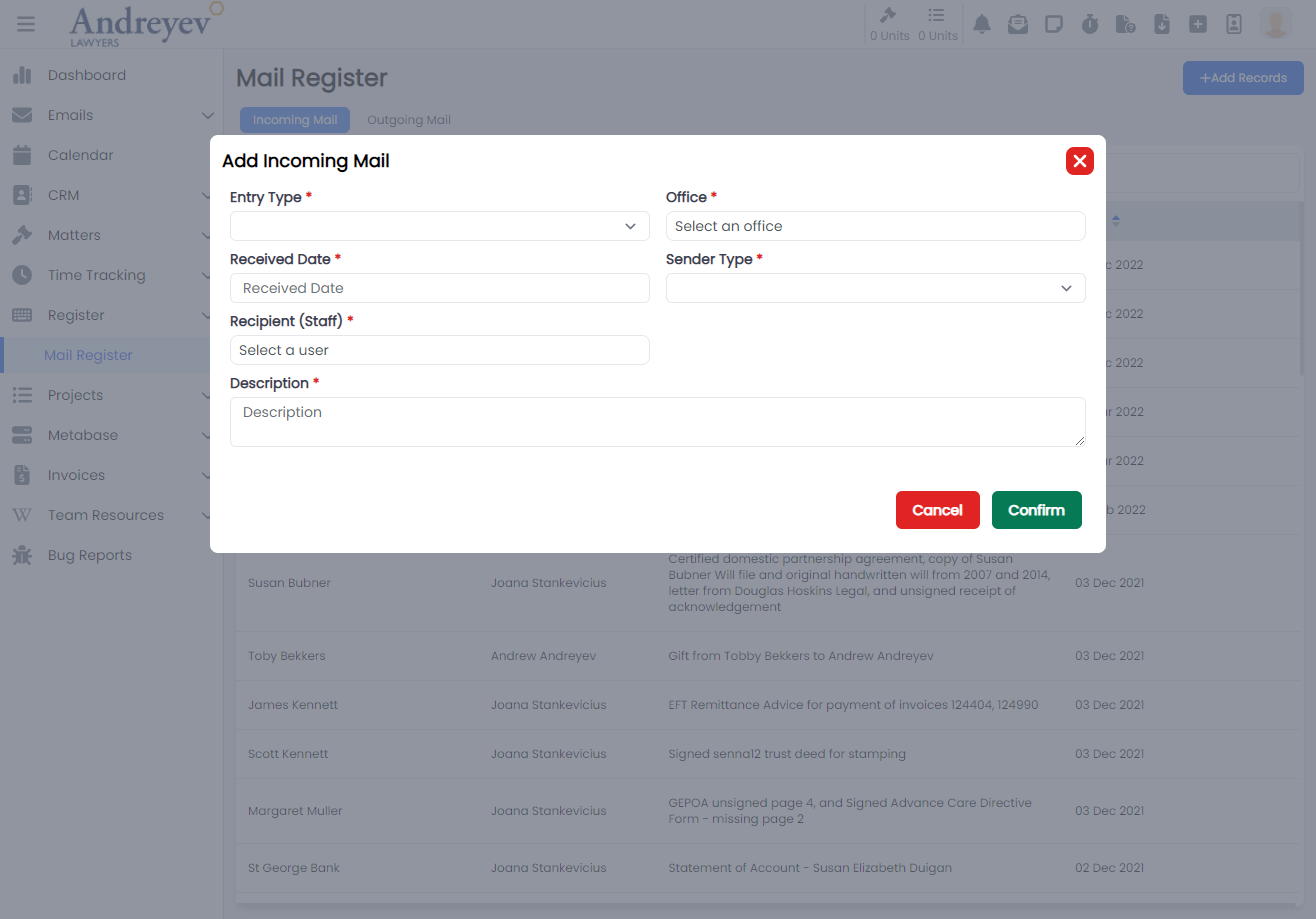
CreateOutgoingMail
This is a modal using modalform to customise for registering outgoing mail.
This can be used according to GlobalModals.
The following is a visual of this component at work. 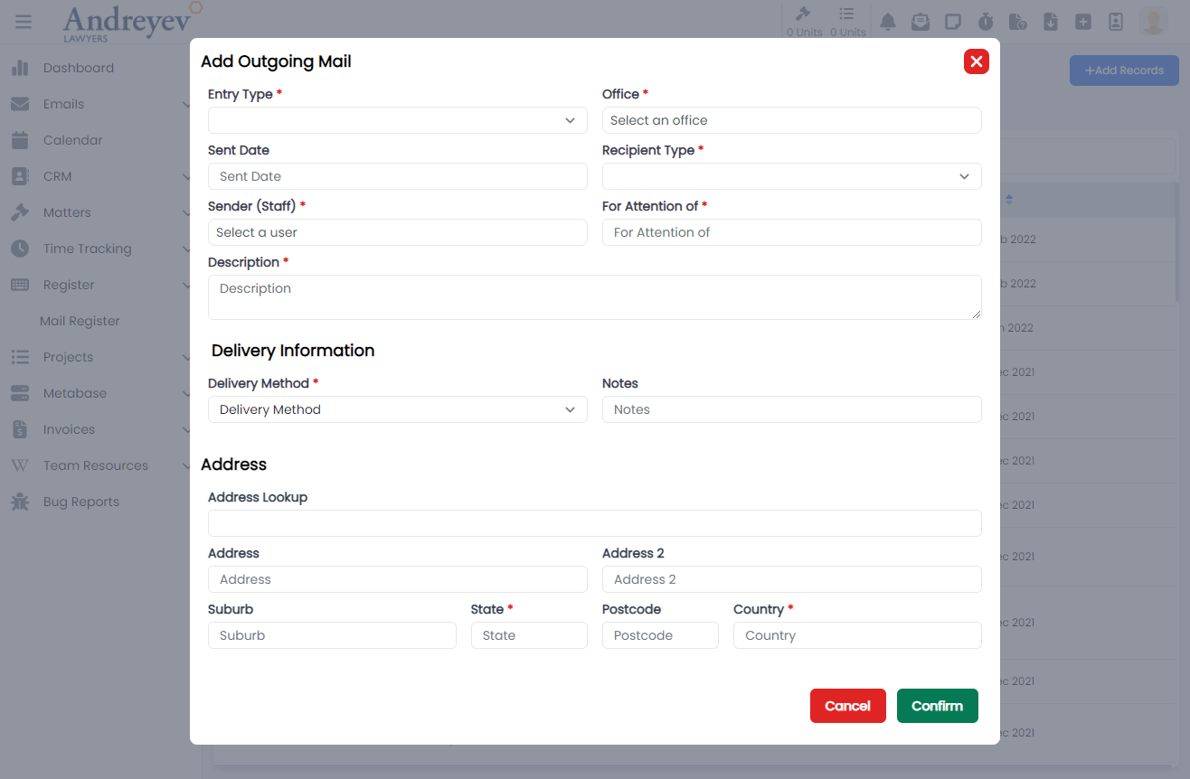
Matters
AddMatterNote
This is a modal using modalform to customise for adding a new matter note.
This can be used according to GlobalModals.
The following is a visual of this component at work. 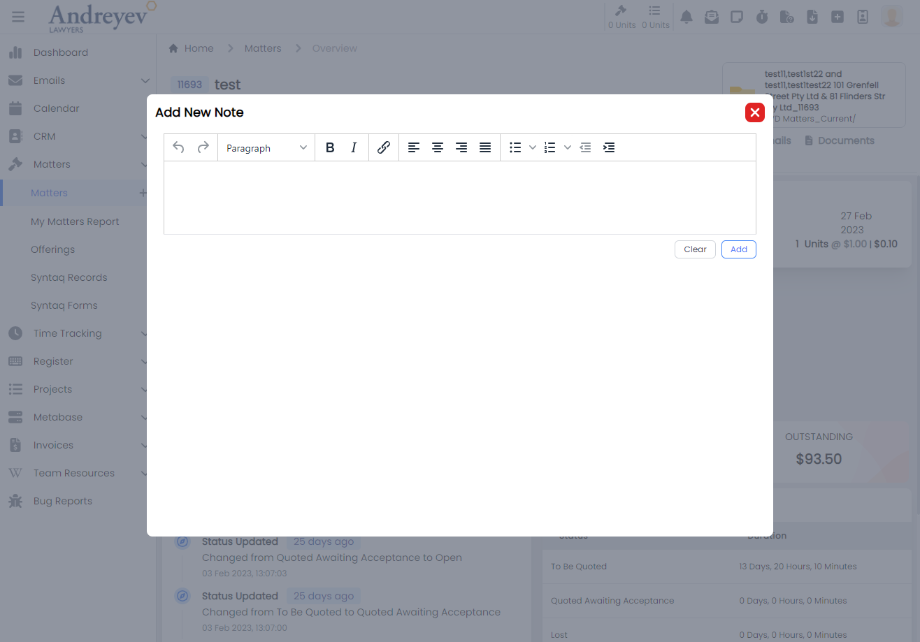
AddMatterOutcome
This component renders a modal component for selecting an outcome to add to the matter according to the type of matter.
This component can be used as follows:
<add-matter-outcome
  v-if="state.showAddOutcomes"
  :id="id"
  @close="state.showAddOutcomes = false"
/>
The following is a visual of this component at work. 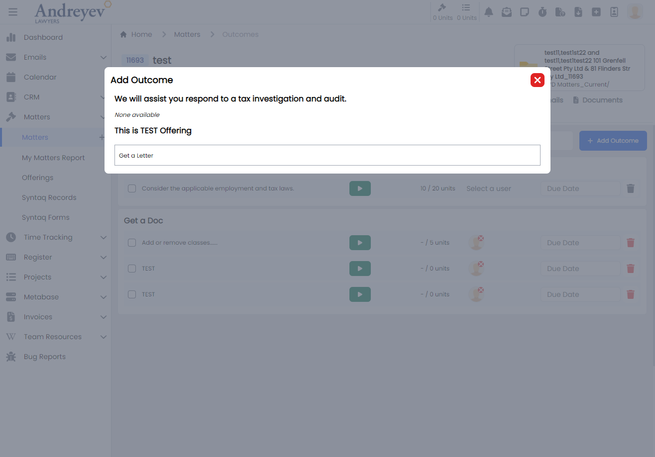
AssignEmailToMatter
This is a modal using modalform to customise for assigning email to chosen matter.
This can be used according to GlobalModals.
The following is a visual of this component at work. 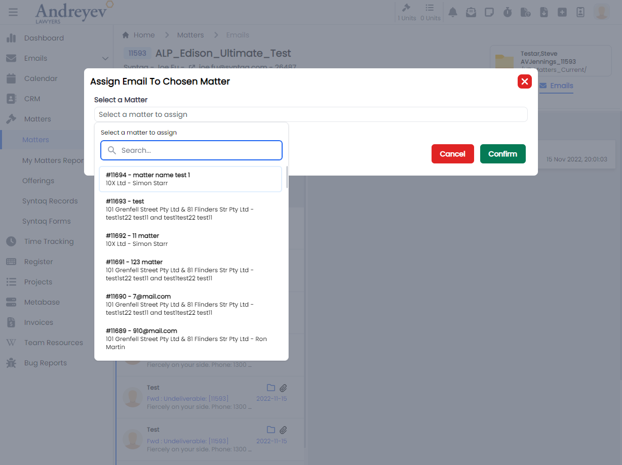
CreateDisbursement
This component renders a modal using modalform, for filling in form to create a disbursement.
This component can be used as follows:
<create-disbursement
  :matter-id="id"
  v-if="state.showCreate"
  @close="state.showCreate = false"
/>
The following is a visual of this component at work. 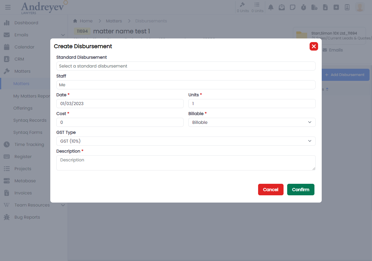
CreateMatter
This is a modal using modalform to customise for creating a new matter.
This can be used according to GlobalModals.
The following is a visual of this component at work. 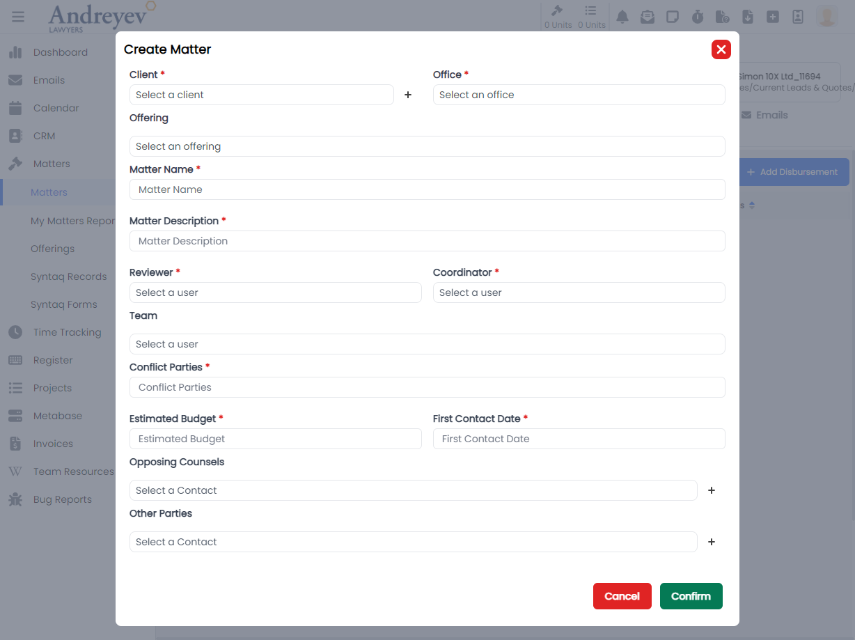
CreateTrustTransactionRequest
This component renders a modal using modalform, for creating a Trust Transaction Request.
This component can be used as follows:
<create-trust-transaction-request
  v-if="state.showCreate"
  :id="id"
  @close="state.showCreate = false"
/>
The following is a visual of this component at work. 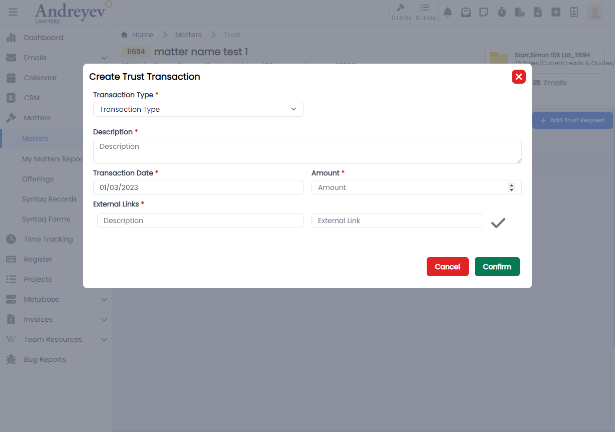
EditContactNote
This is a modal using modalform to customise for editing an existing contact note.
This can be used according to GlobalModals.
The following is a visual of this component at work. 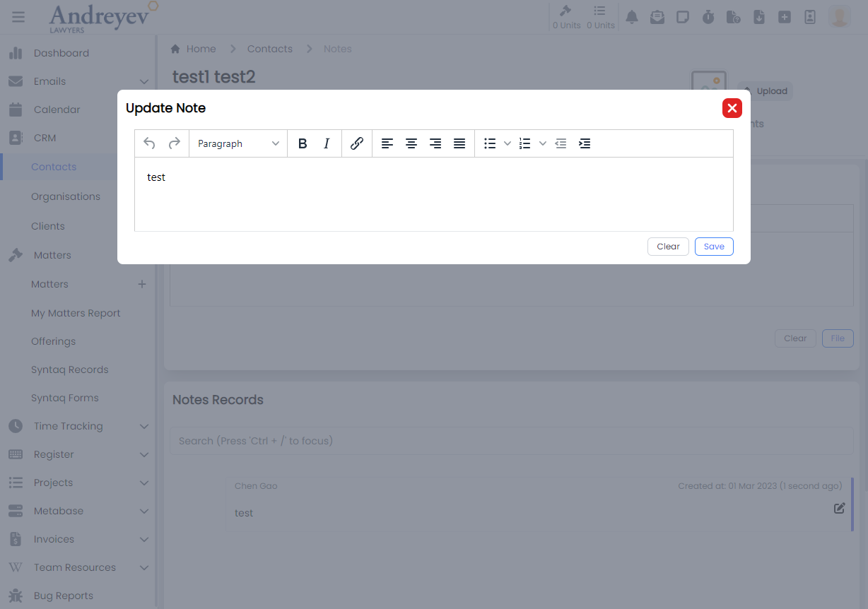
EditMatterNote
This is a modal using modalform to customise for editing an existing matter note.
This can be used according to GlobalModals.
The following is a visual of this component at work. 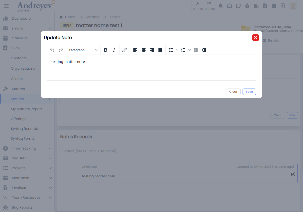
InlineMatter
This component is to display a Matter in a line for a page of list of Matters in "My Matters Report". This line of Matter renders an overview of the matter, including MatterId in coloured badge, latest note of matter, status of matter and more.
This component can be used as follows:
<inline-matter
  class="mb-3 transition duration-200 shadow-lg"
  v-for="item in items"
  :key="item.id"
  :matter="item"
/>
The following is a visual of this component at work. 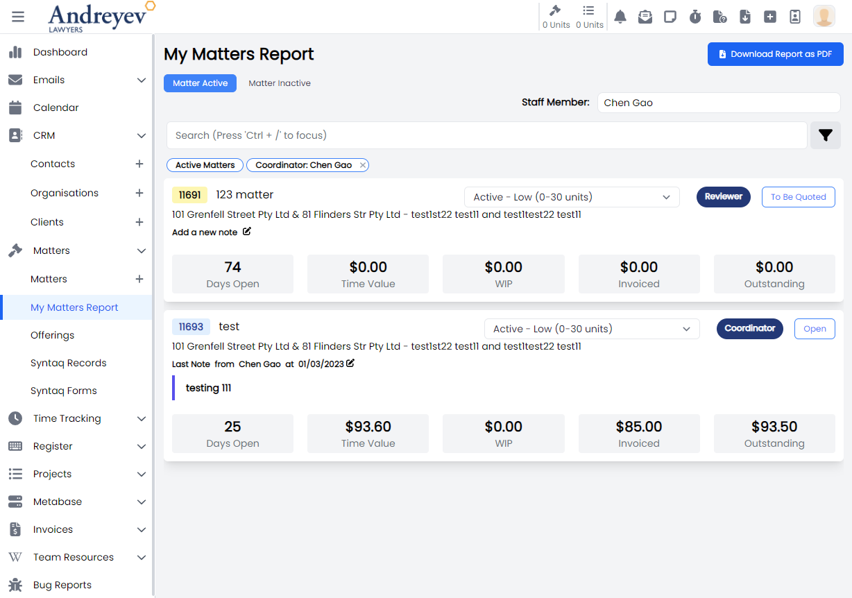
InlineMatterComponent
This component renders the inline matter outcome component as shown in the visual below. This component includes a multiUserSelector to assign the component to a staff member, timer to record time entries as well as a dueDate for the component.
This component can be used as follows:
<inline-matter-component
  v-for="component in components"
  :key="component.id"
  class="mb-1 transition duration-200"
  :matter-id="matterId"
  :outcome-id="outcome.id"
  :component="component"
  @updated="$emit('updated')"
/>
The following is a visual of this component at work. 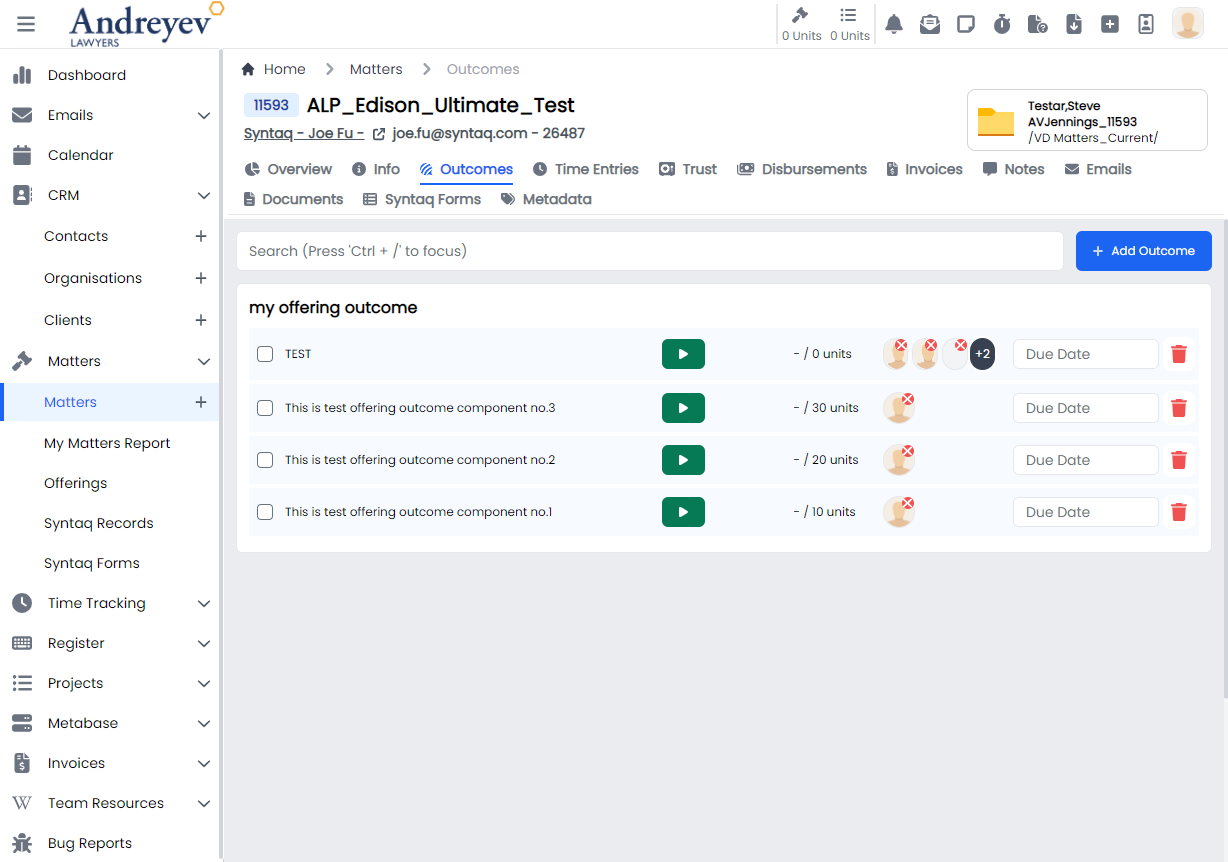
InlineMatterOutcome
This component renders a container to hold the InlineMatterComponent according to their outcomes.
This component can be used as follows:
<inline-matter-outcome
  class="my-1 mx-2 transition duration-200"
  v-for="item in matterOutcomes"
  :key="item.id"
  :matter-id="id"
  :outcome="item"
/>
The following is a visual of this component at work. 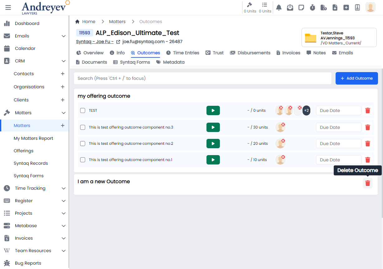
MatterComponentTimeEntries
This component renders a modal using modalform for creating time entries for a matter outcome component.
This component can be used as follows:
<matter-component-time-entries
  :matter-id="id"
  :outcome-id="outcomeId"
  :id="componentId"
/>
The following is a visual of this component at work. 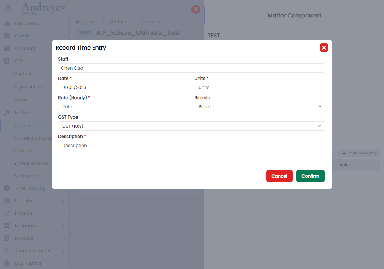
MatterTimeEntriesForMatter
This component renders the page under each matter that shows all of the matter time entries of the matter.
This component can be used as follows:
<matter-time-entries-for-matter
  v-if="state.selectedType == 'matter'"
  :id="id"
  :invoiced="state.invoiced"
  :billable-type="state.billableType"
  :user="state.user"
  :search="state.search"
  @selected="getSelectedTimeEntry($event)"
/>
The following is a visual of this component at work. 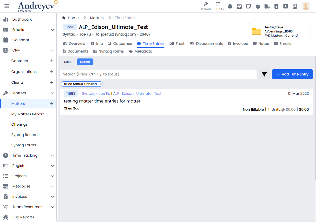
SalesTimeEntriesForMatter
This component renders the page under each matter that shows all of the sales time entries of the matter.
This component can be used as follows:
<sales-time-entries-for-matter
  v-if="state.selectedType == 'sales'"
  :id="id"
  :user="state.user"
  :search="state.search"
  @selected="getSelectedTimeEntry($event)"
/>
The following is a visual of this component at work. 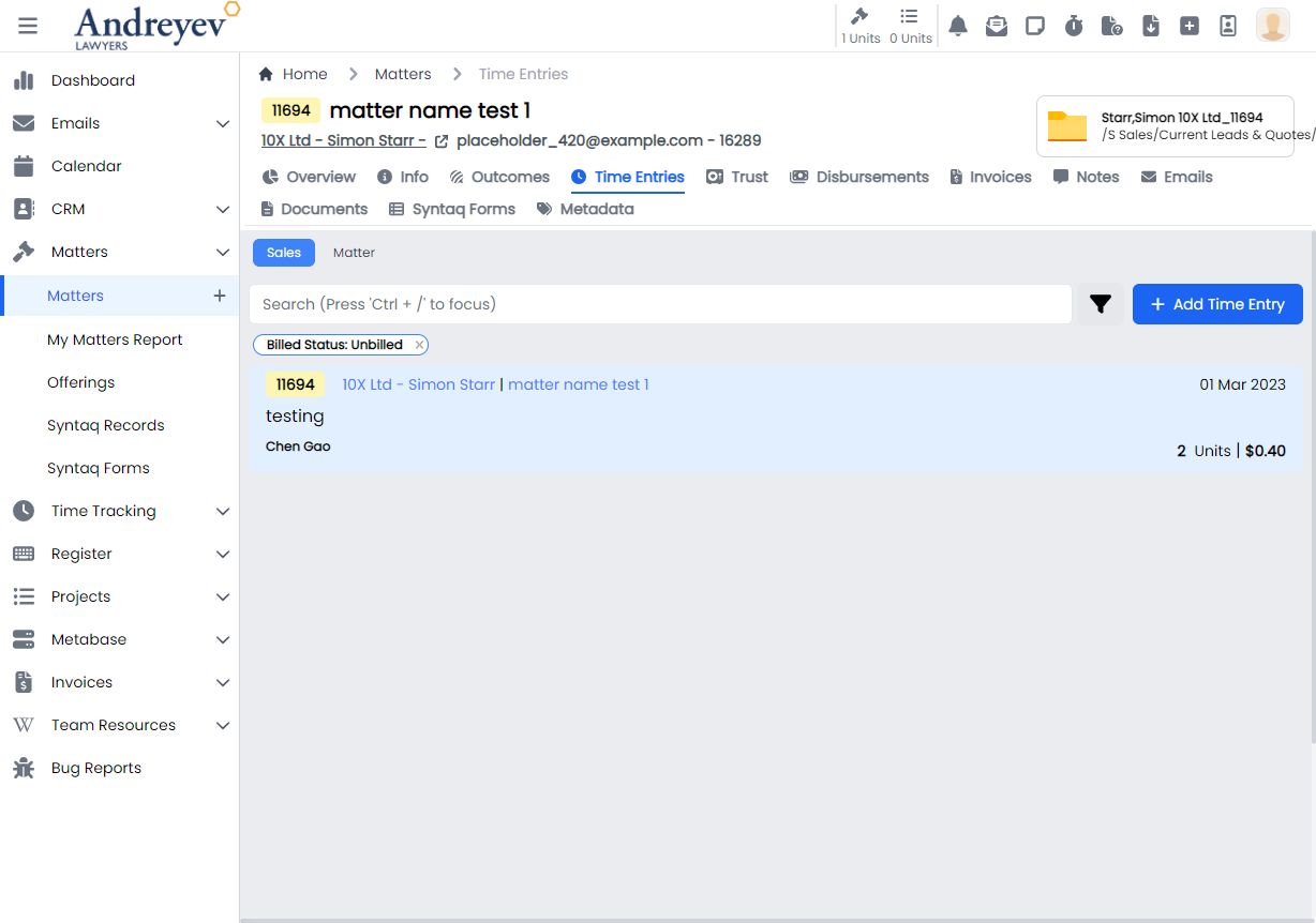
MatterTrustRequests
This component renders the page under each matter that shows all of the trust requests of the matter.
This component can be used as follows:
<matter-trust-requests
  v-if="state.selectedType == 'requests'"
  :id="id"
/>
The following is a visual of this component at work. 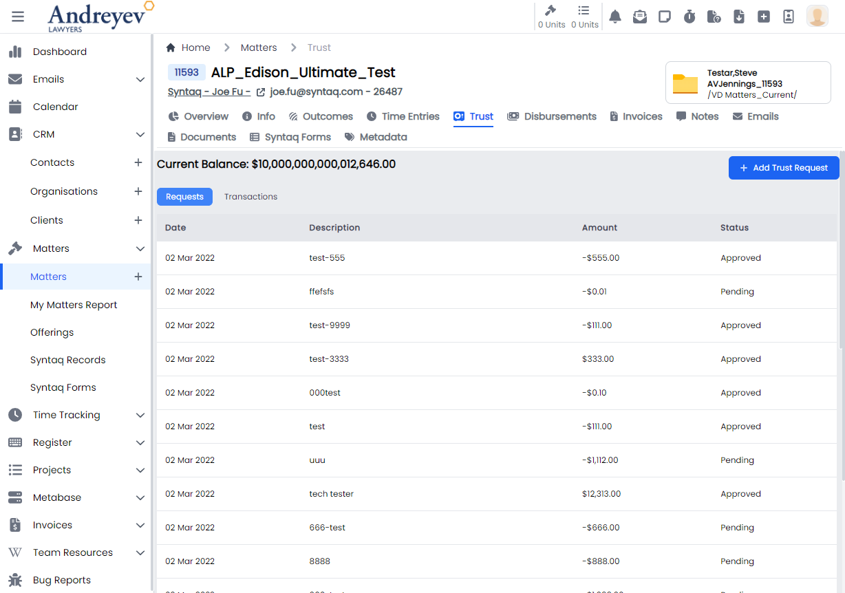
MatterTrustTransactions
This component renders the page under each matter that shows all of the trust transactions of the matter.
This component can be used as follows:
<matter-trust-transactions
  v-if="state.selectedType == 'transactions'"
  :id="id"
/>
The following is a visual of this component at work. 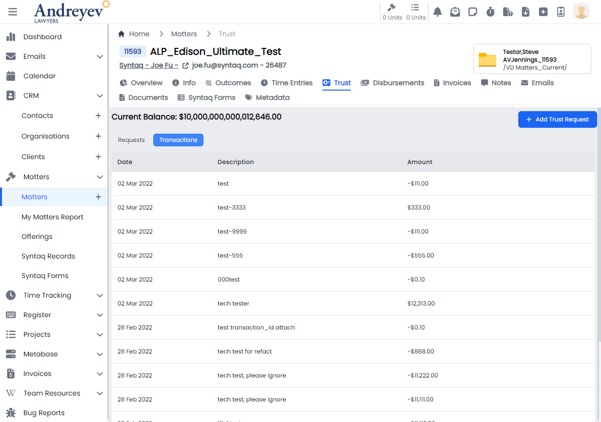
ReassignEmails
Deprecated
UpdateMatterStatus
This is a modal using modalform to customise for updating status of a matter.
This can be used according to GlobalModals.
The following is a visual of this component at work. 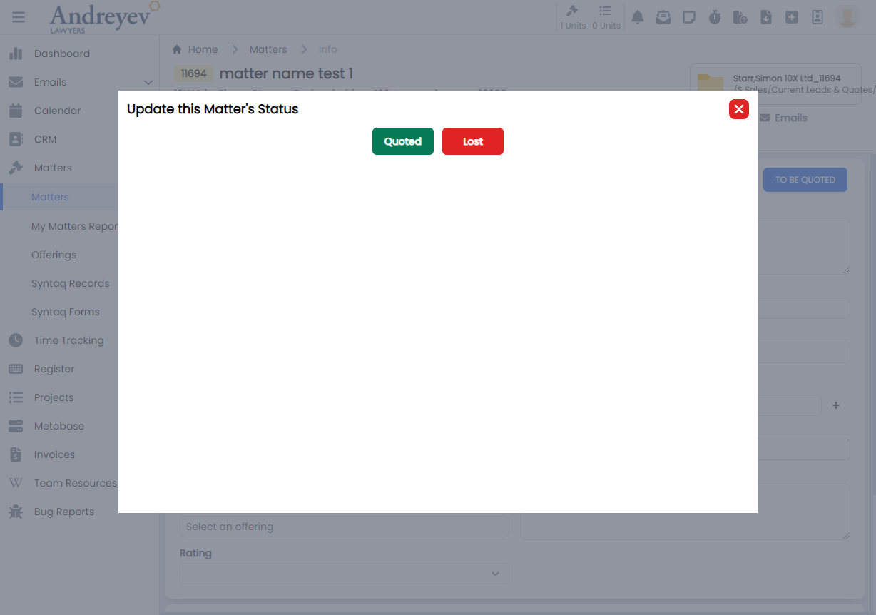
Offerings
InlineOfferingComponent
This component renders the inline offering component under an offering outcome.
This component can be used as follows:
<inline-offering-component
  v-for="component in components"
  :key="component.id"
  :offering-id="id"
  :outcome-id="outcome.id"
  :component="component"
/>
The following is a visual of this component at work. 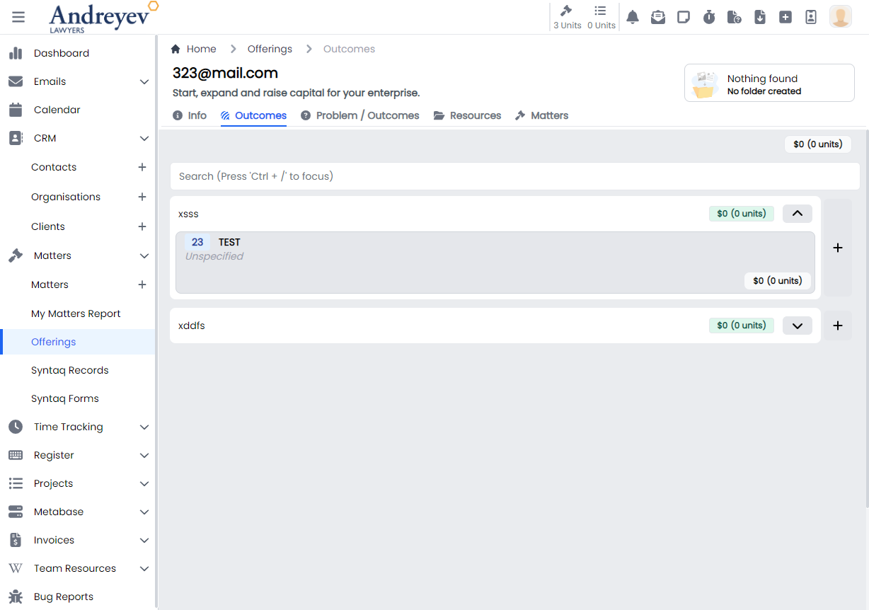
InlineOfferingOutcome
This component renders the inline offering outcome under an offering.
This component can be used as follows:
<inline-offering-outcome
  class="flex-1"
  :class="{
    'border-green-300 bg-opacity-25 bg-green-300 hover:bg-red-100 hover:border-red-300':
    isSelected(item)
  }"
  :id="id"
  :outcome="item"
  @selected="selectOutcome"
/>
The following is a visual of this component at work. 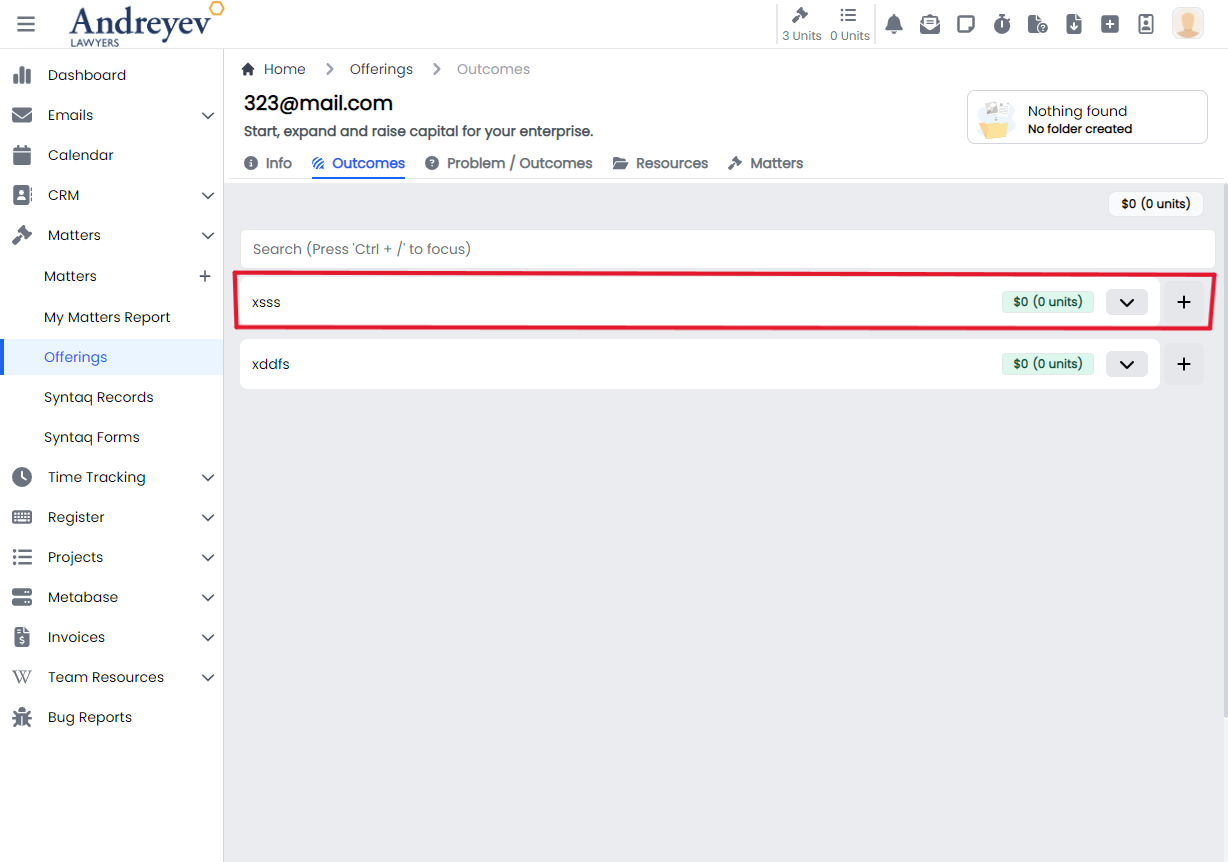
InlineOfferingOutcomeObjectionGuarantee
Deprecated
InlineOfferingProblemOutcome
This component renders the inline offering problem outcome under an offering.
This component can be used as follows:
<inline-offering-problem-outcome
  v-for="problemOutcome in problemOutcomes.filter(
    (o) => o.type == type.value
  )"
  :key="problemOutcome.id"
  :id="id"
  :problem-outcome="problemOutcome"
  disabled
/>
The following is a visual of this component at work. 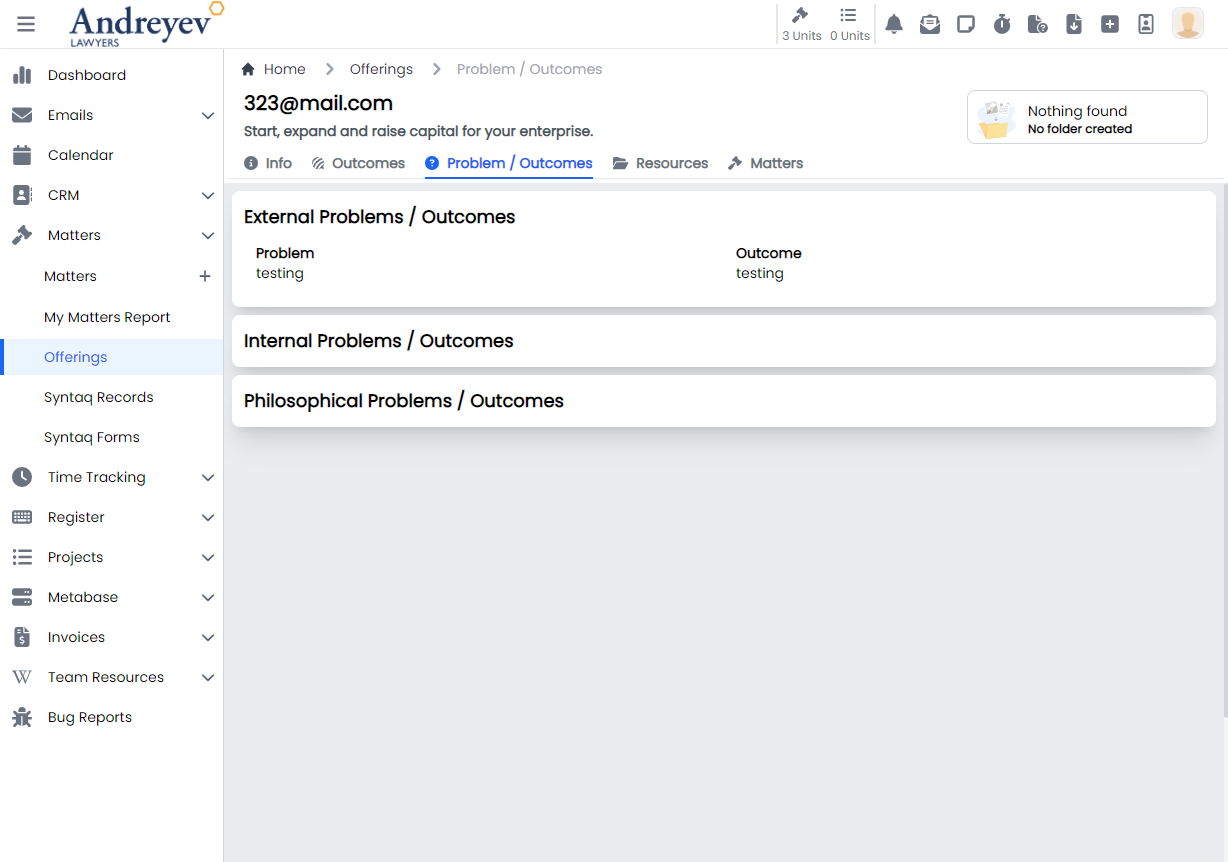
Organisations
CreateOrganisation
This is a modal using modalform to customise for creating a new organisation.
This can be used according to GlobalModals.
The following is a visual of this component at work. 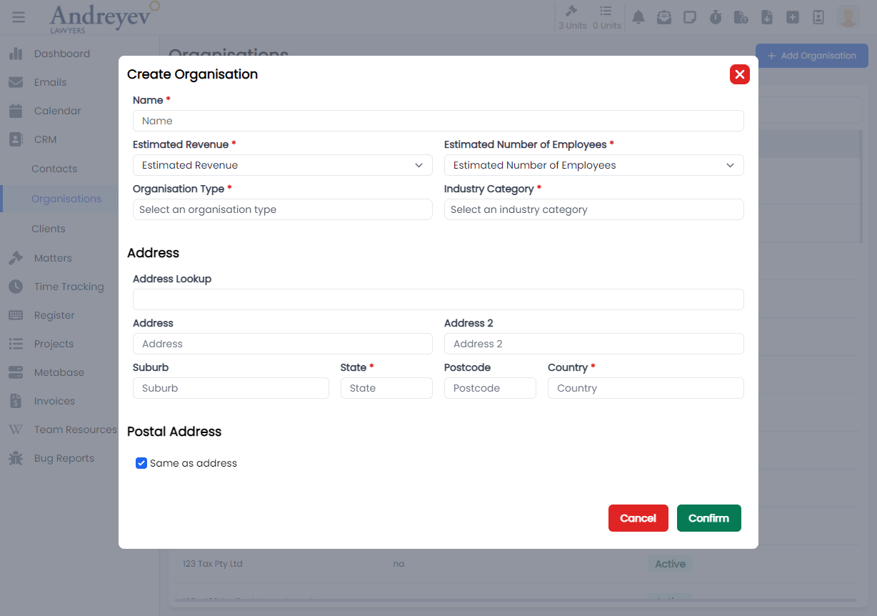
EditOrganisationNote
This is a modal using modalform to customise for editing an existing organisation note.
This can be used according to GlobalModals.
PqeAdjustment
CreatePQEAdjustment
This is a modal using modalform to customise for creating PQE adjustment.
This can be used according to GlobalModals.
The following is a visual of this component at work. 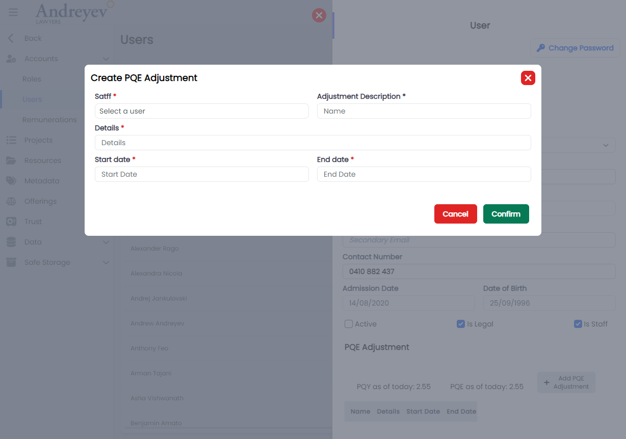
Projects
AssignEmailToProject
This is a modal using modalform to customise for assigning email to chosen project.
This can be used according to GlobalModals.
The following is a visual of this component at work. 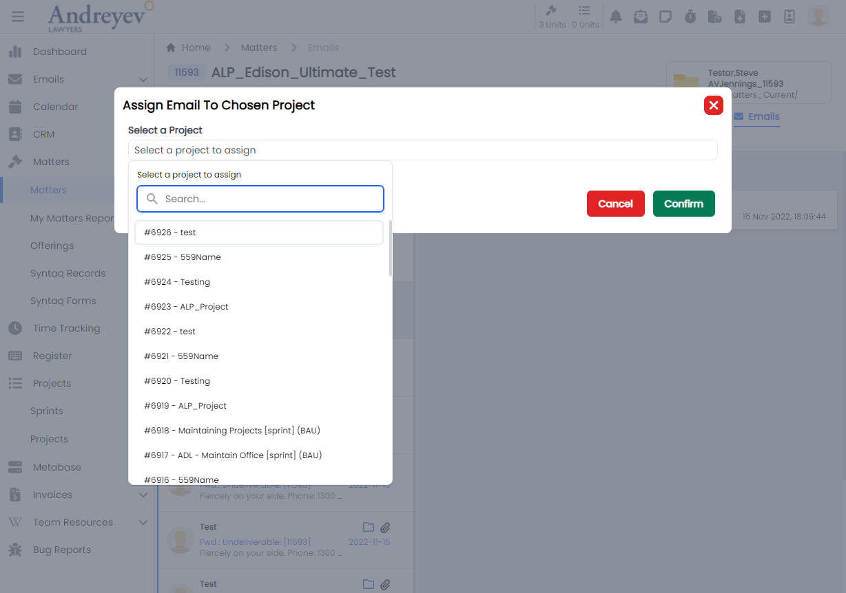
CreateProject
This is a modal using modalform to customise for creating a new project.
This can be used according to GlobalModals.
The following is a visual of this component at work. 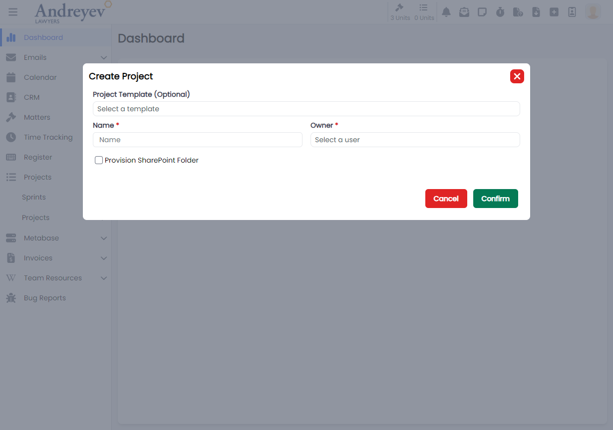
CreateProjectTask
This is a modal using modalform to customise for creating a new project task.
This can be used according to GlobalModals.
The following is a visual of this component at work. 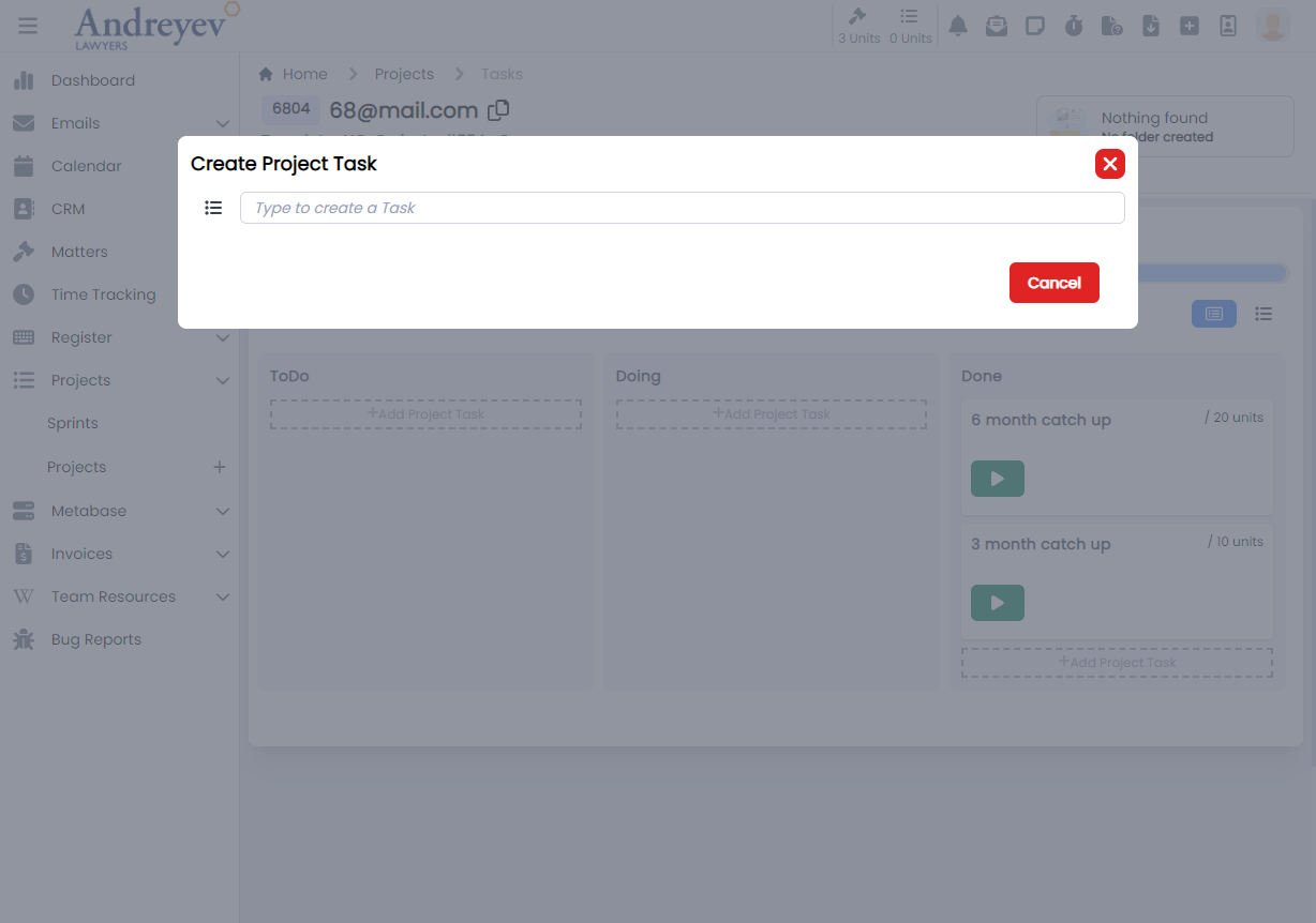
EditProjectNote
This is a modal using modalform to customise for editing an existing project note.
This can be used according to GlobalModals.
The following is a visual of this component at work. 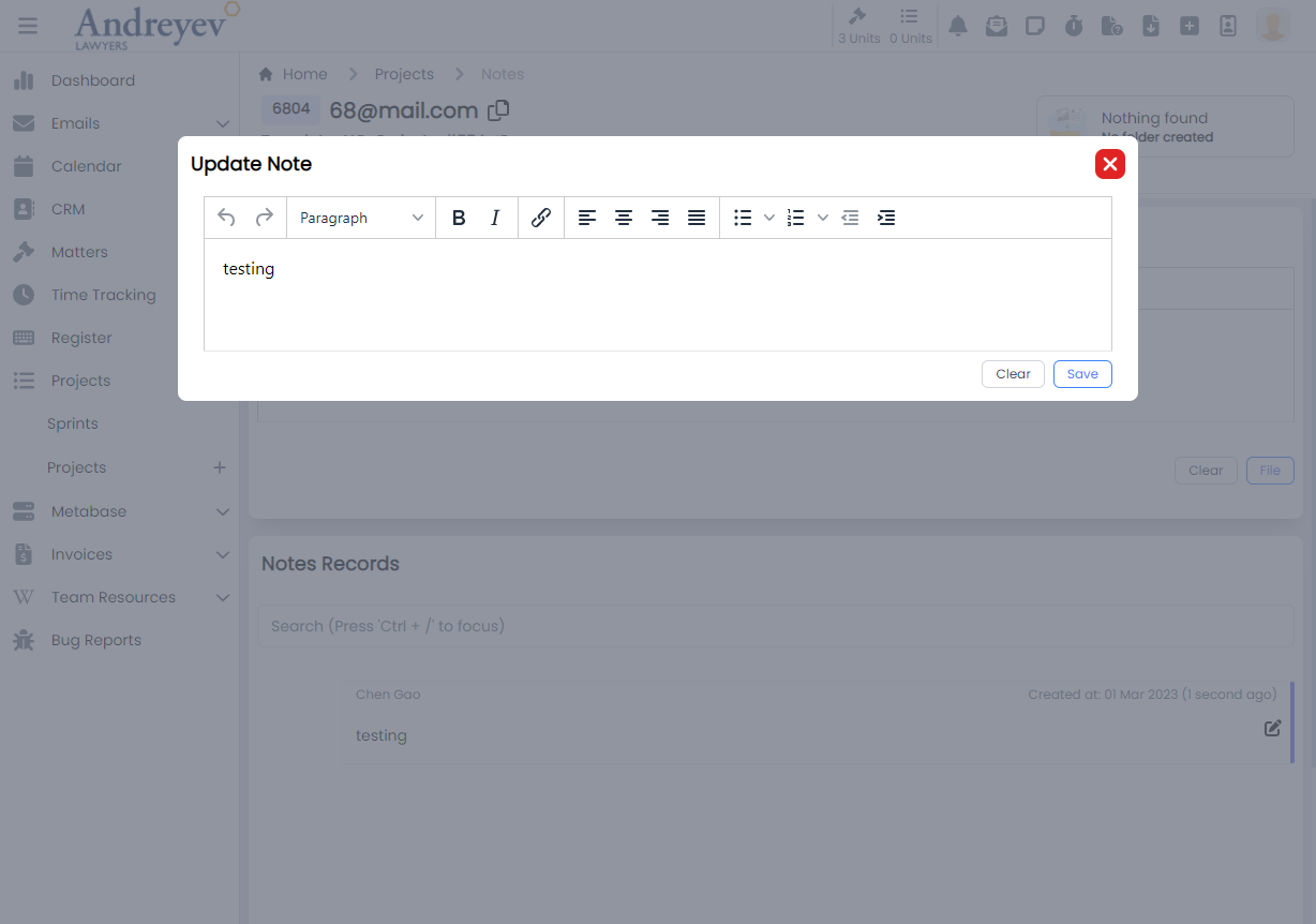
InlineProject
This component renders each inline projects under my projects. This includes function for inline editing of names, owners, tasks and other functions such as changing status of the project.
This component can be used as follows:
<inline-project
  class="mb-3 mx-1 transition duration-200 shadow-lg"
  :project="value"
  @task-selected="taskSelected(value.id, $event)"
/><inline-project-task
class="mt-1 transition duration-200"
v-for="item in projectTasks"
:key="item.id"
:project-id="project.id"
:project-task="item"
@selected="$emit('task-selected', item.id)"
@updated="fetchProjectTasks"
/><inline-project-task-card
:project-id="id"
:project-task="value"
@updated="fetchProjectTasks"
@card-clicked="cardClicked"
>
</inline-project-task-card>The following is a visual of this component at work. 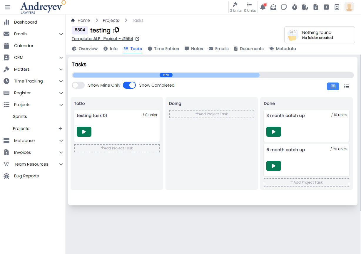
InlineProjectTaskStep
This component renders an inline task step under the ProjectTask that allows adding of resources.
This component can be used as follows:
<inline-project-task-step
  :project-id="projectId"
  :project-task-id="id"
  :project-task-step="value"
  class="flex items-center"
  :key="value.id"
  :is-steps-check-list="state.isStepsCheckList"
  @updated="$emit('stepUpdated')"
/>
The following is a visual of this component at work. 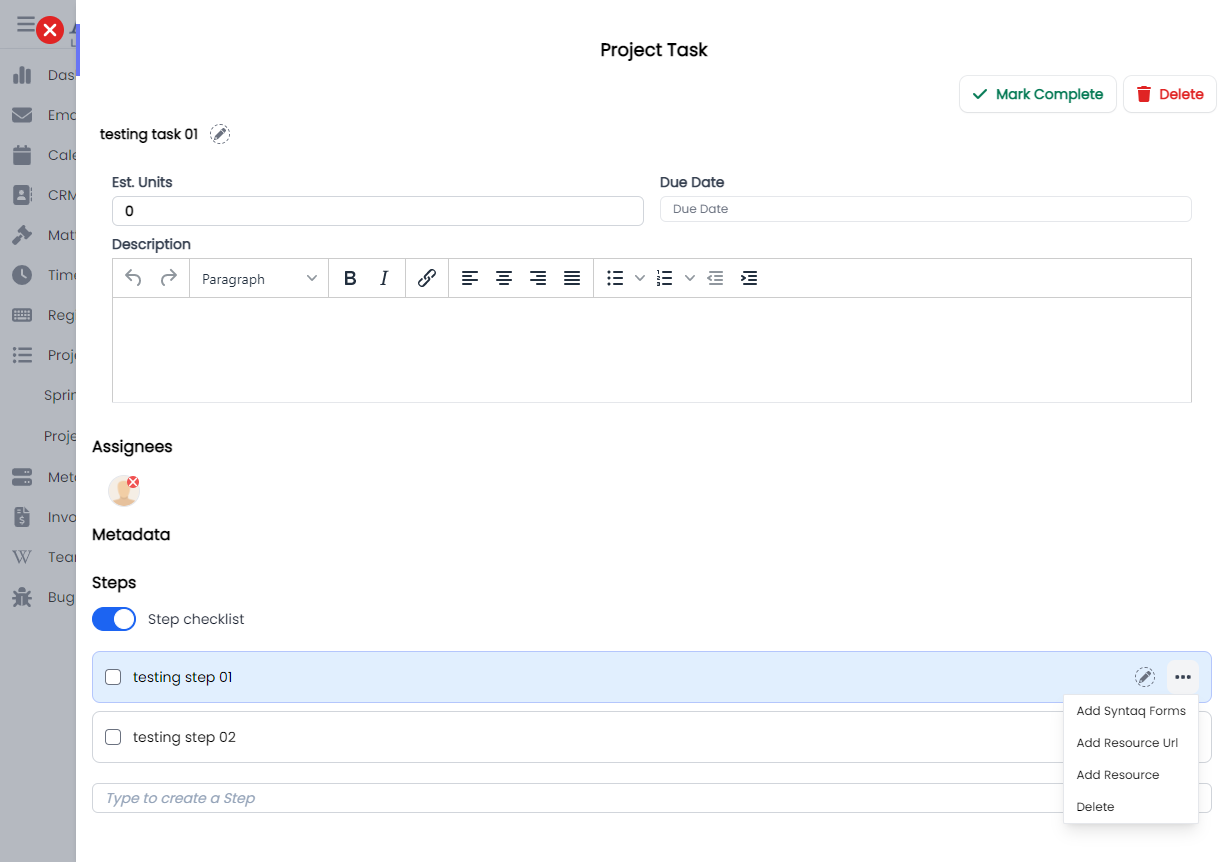
ProjectTask
This component customises the ProjectTaskSlideOver window for managing permissions in the system of a role.
This component can be used as follows:
<project-task
  v-if="state.selectedProjectId && state.selectedTaskId"
  :key="state.selectedTaskId"
  :project-id="state.selectedProjectId"
  :id="state.selectedTaskId"
  @close="taskSelected(null, null)"
/>
The following is a visual of this component at work. 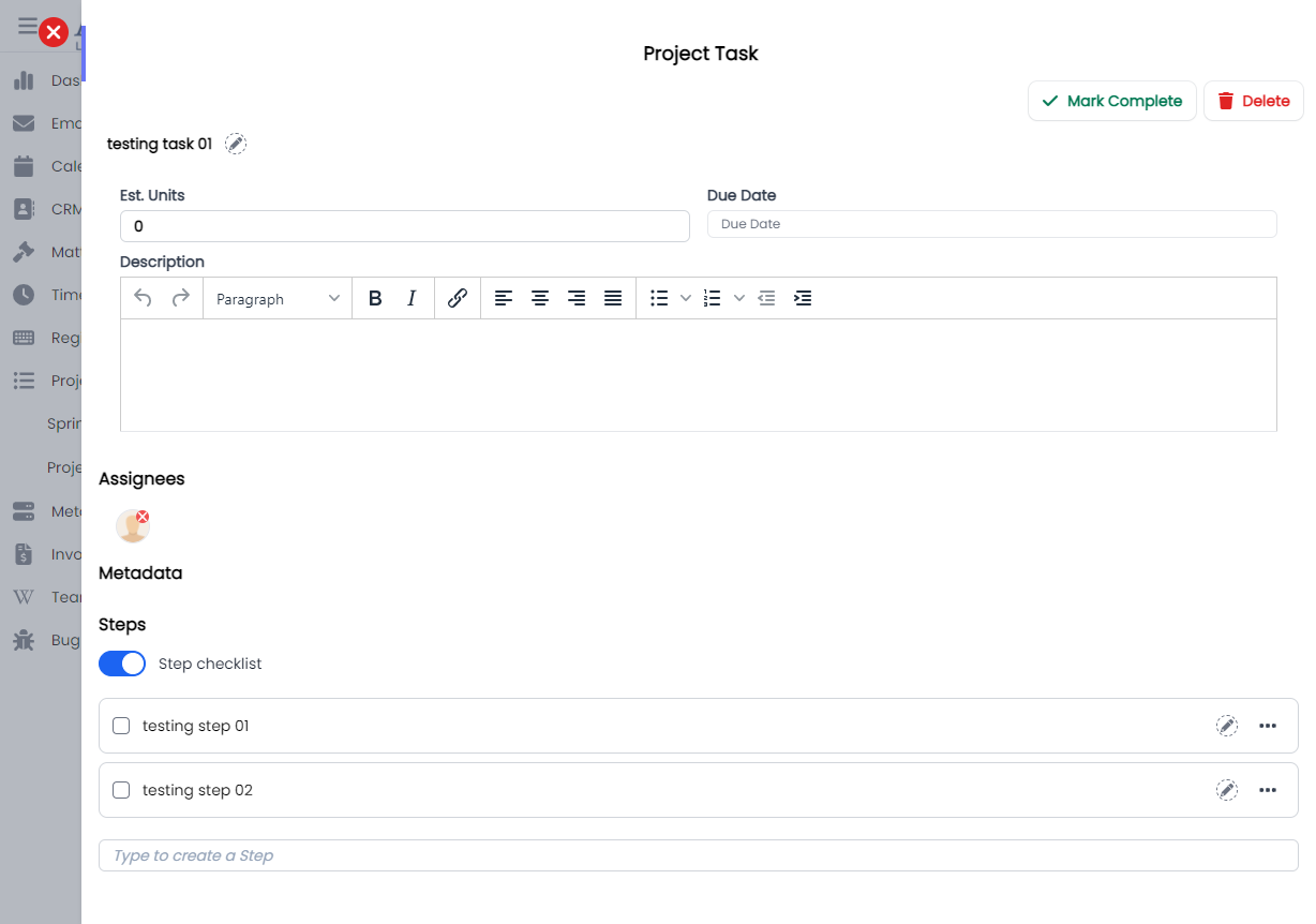
ProjectTaskMetadata
This component renders the metadata section in the ProjectTask.
This component can be used as follows:
<project-task-metadata :project-id="projectId" :id="id" />The following is a visual of this component at work. 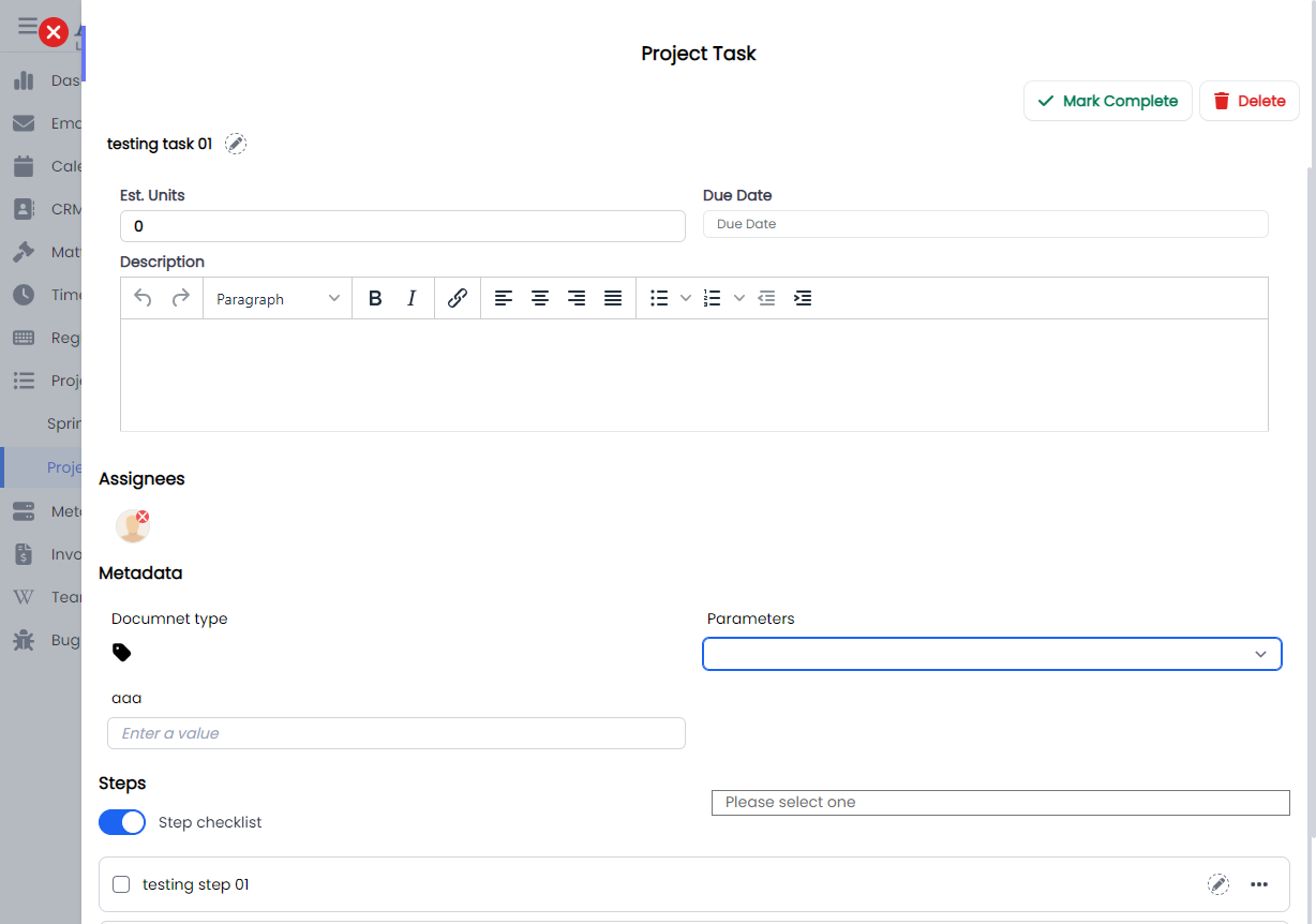
ProjectTimeEntriesForProject
This component renders a modal using modalform, for filling in form to create a time entry for project, under Projects > Time entries.
This component can be used as follows:
<project-time-entries-for-project
  :id="id"
  :user="state.user"
  :search="state.search"
  @selected="getSelectedTimeEntry($event)"
/>
The following is a visual of this component at work. 
Relationships
CreateOrganisationRelationship
This component renders a modal using modalform, for creating a new organisation relationship.
This component can be used as follows:
<create-organisation-relationship
  v-if="state.showCreateRelationshipModal"
  :id="id"
  @close="closeCreate()"
/>
The following is a visual of this component at work. 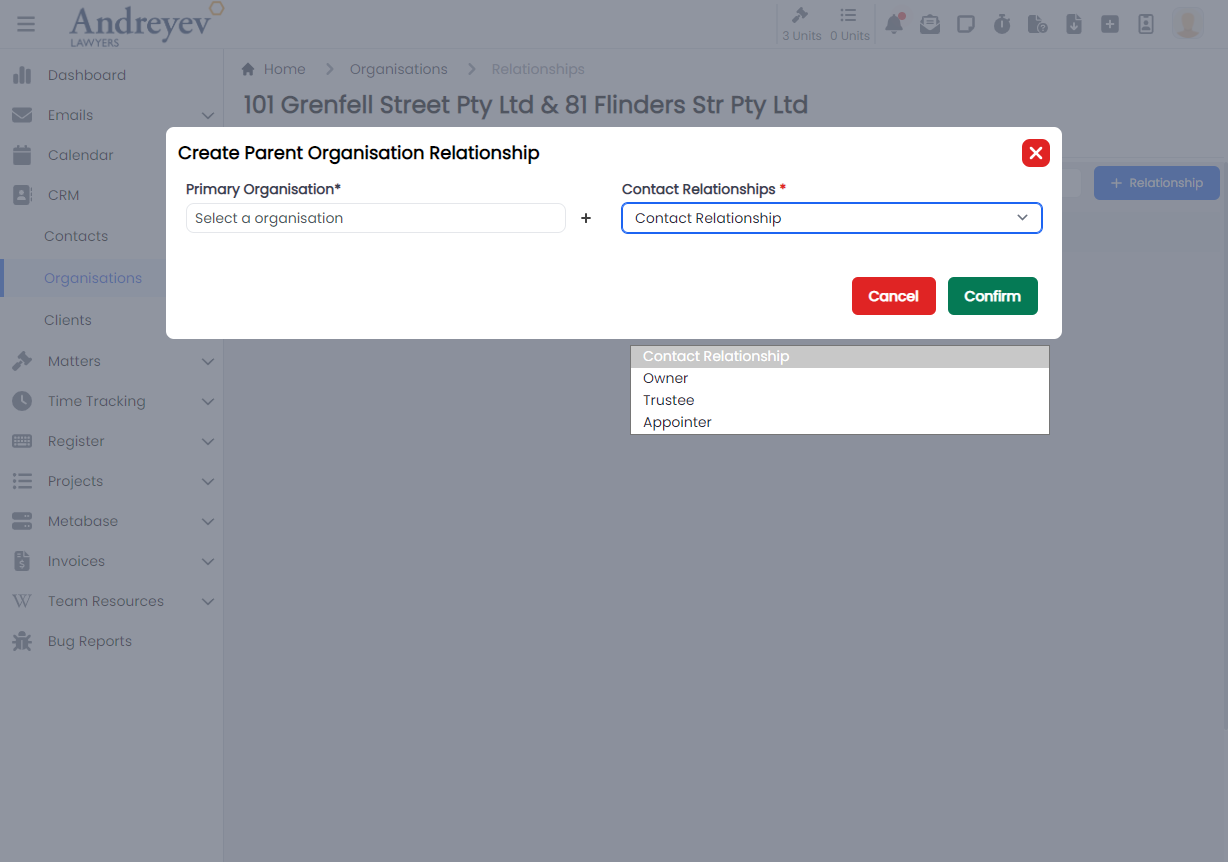
CreateRelationship
This is a modal using modalform to customise for filling in contact relationships, Family, Referrer and Professional.
This can be used according to GlobalModals.
The following is a visual of this component at work. 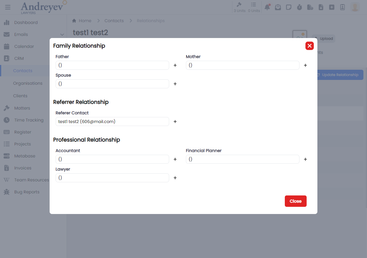
Reminders
CreateReminder
This is a modal using modalform to customise for creating a new reminder with a Due Date and Resource selector.
This can be used according to GlobalModals.
The following is a visual of this component at work. 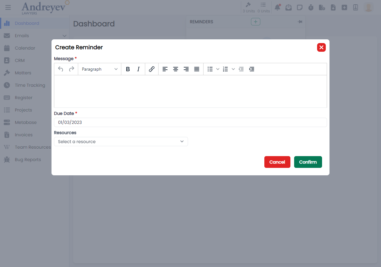
Resource-urls
ResourceUrlSelector
This component renders a modal for selecting a resource URL.
This component can be used as follows:
<resource-url-selector
  v-if="resourceState.showUrlSelector"
  @selected="addUrlResource($event)"
  @close="resourceState.showUrlSelector = false"
/>
The following is a visual of this component at work. 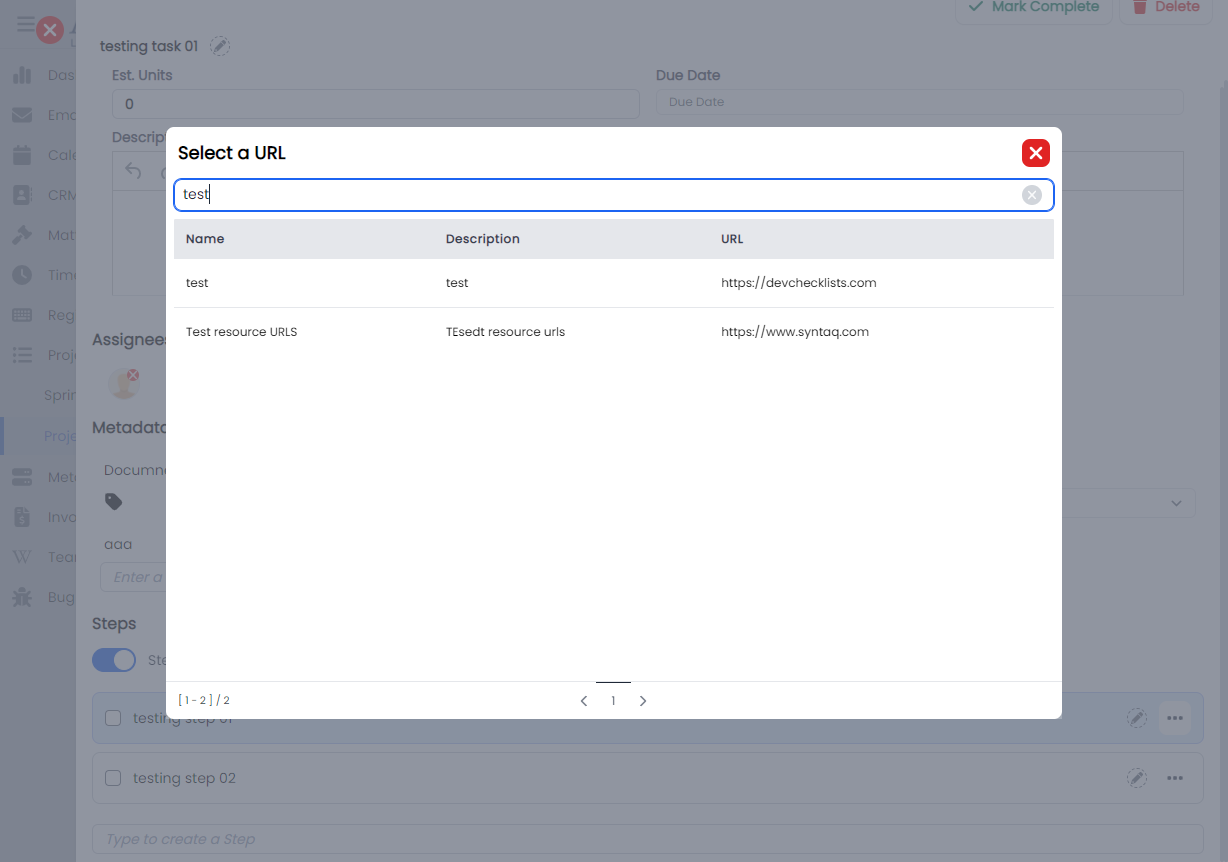
SafeStorage
CreateContactSafeStorage
This component renders a modal using modalform, for creating a safe storage for a contact.
This component can be used as follows:
<create-contact-safe-storage
  v-if="state.showCreate"
  :contact_id="id"
  @close="state.showCreate = false"
/>
The following is a visual of this component at work. 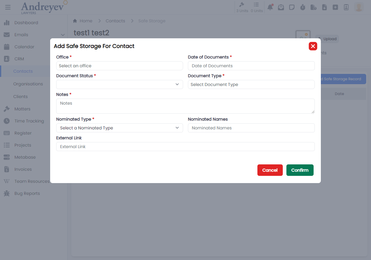
CreateOrganisationSafeStorage
This component renders a modal using modalform, for creating a safe storage for an organisation.
This component can be used as follows:
<create-organisation-safe-storage
  v-if="state.showCreate"
  :organisation_id="id"
  @close="state.showCreate = false"
/>
The following is a visual of this component at work. 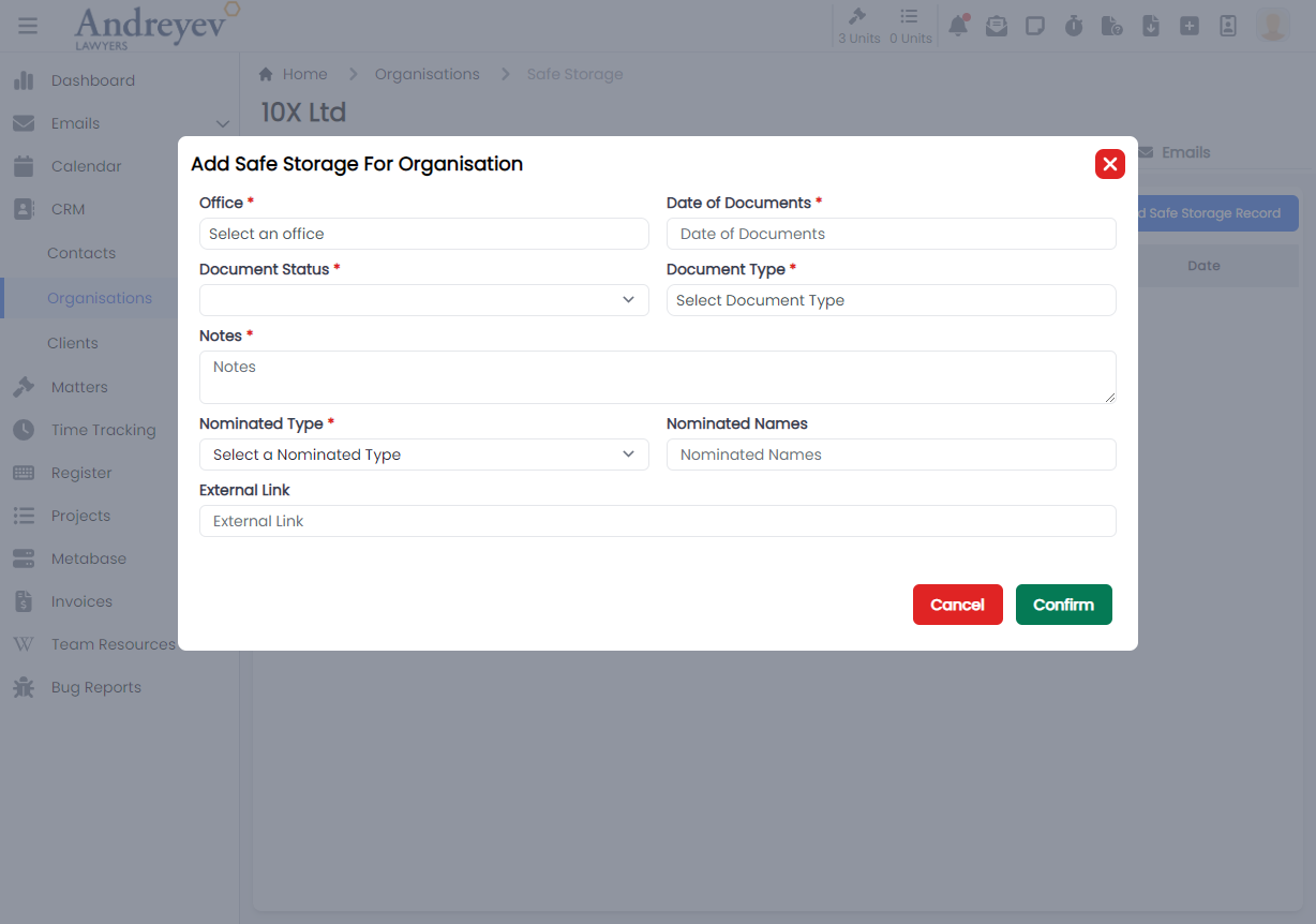
Time-tracking
CreateTimeEntry
This is a component calling CreateTimeEntryForm into a modal to customise for creating a new time entry.
This can be used according to GlobalModals.
The following is a visual of this component at work. 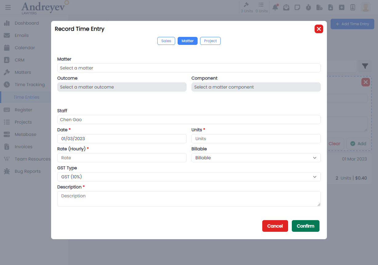
CreateTimeEntryForm
This component consists of the form to fill for CreateTimeEntry using the modalform component.
CreateTimeEntryForMatter
This is a component calling CreateTimeEntryFormForMatter into a modal to customise for creating a new time entry for matter as well as for sales.
This can be used according to GlobalModals.
The following is a visual of this component at work. 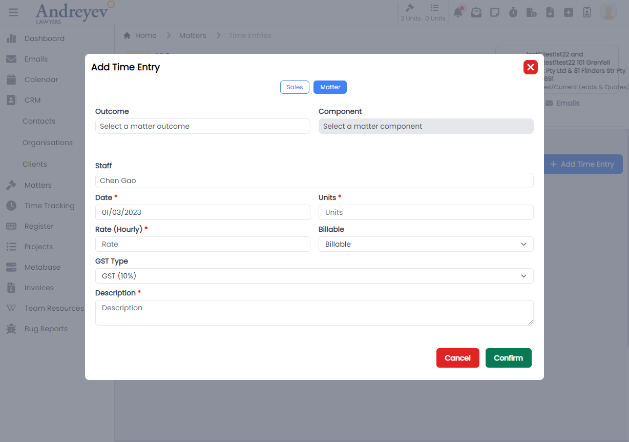
CreateTimeEntryFormForMatter
This component consists of the form to fill for CreateTimeEntryForMatter using the modalform component. This component consists of both forms for matter and for sales.
CreateTimeEntryForProject
This is a component calling CreateTimeEntryFormForProject into a modal to customise for creating a new time entry inside a project.
This can be used according to GlobalModals.
The following is a visual of this component at work. 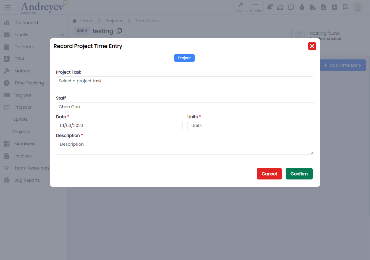
CreateTimeEntryFormForProject
This component consists of the form to fill for CreateTimeEntryForProject using the modalform component.
InlineAddMatterTimeEntries
This component renders a inline adding of time entry for matter. This component is under "Time Tracking" > "Time Entries" section. It adopts the inline creating instead of the modal in the CreateTimeEntryForMatter.
This component can be used as follows:
<inline-add-matter-time-entries
  :start-date="startDate"
  :end-date="endDate"
/>
The following is a visual of this component at work. 
InlineAddProjectTimeEntries
This component renders a inline adding of time entry for project. This component is under "Time Tracking" > "Time Entries" section. It adopts the inline creating instead of the modal in the CreateTimeEntryForProject.
This component can be used as follows:
<inline-add-project-time-entries
  :start-date="startDate"
  :end-date="endDate"
/>
The following is a visual of this component at work. 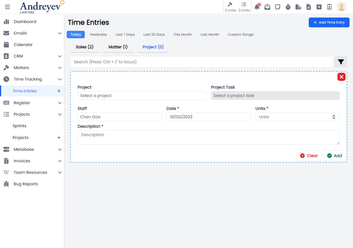
InlineAddSalesTimeEntries
This component renders a inline adding of time entry for sales. This component is under "Time Tracking" > "Time Entries" section. It adopts the inline creating instead of the modal in the CreateTimeEntryForMatter.
This component can be used as follows:
<inline-add-sales-time-entries
  :start-date="startDate"
  :end-date="endDate"
/>
The following is a visual of this component at work. 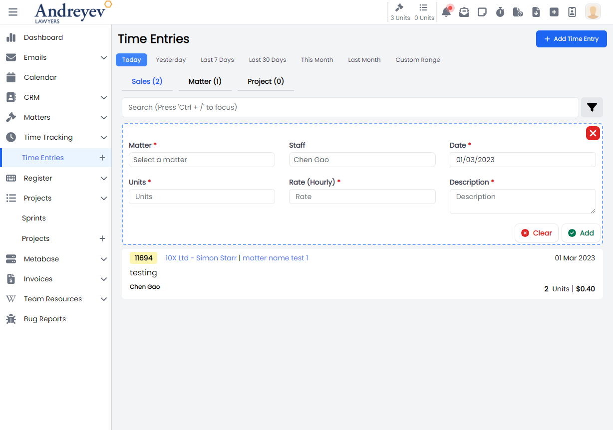
InlineMatterTimeEntries
This component renders each inline matter time entries under "Time Tracking" > "Time Entries" > "Matter" section.
This component can be used as follows:
<inline-matter-time-entries
  class="mb-1 transition duration-200 mx-2"
  v-for="item in items"
  :key="item.id"
  :matterTimeEntry="item"
  @load-more="fetch"
  @selected="$emit('selected', $event)"
/>
The following is a visual of this component at work. 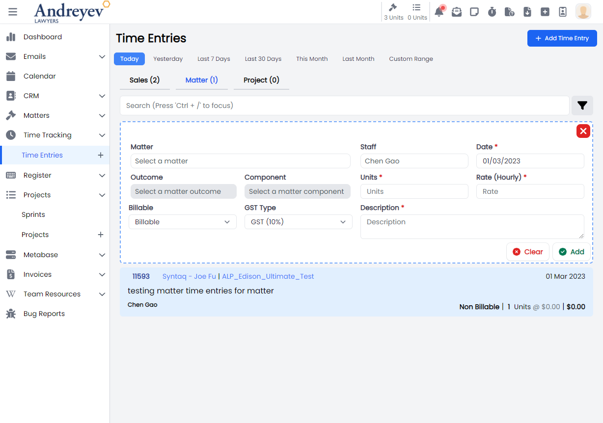
InlineProjectTimeEntries
This component renders each inline matter time entries under "Time Tracking" > "Time Entries" > "Project" section.
This component can be used as follows:
<inline-project-time-entries
  class="mb-1 transition duration-200 mx-2"
  v-for="item in items"
  :key="item.id"
  :projectTimeEntry="item"
  @load-more="fetch"
  @selected="$emit('selected', $event)"
/>
The following is a visual of this component at work. 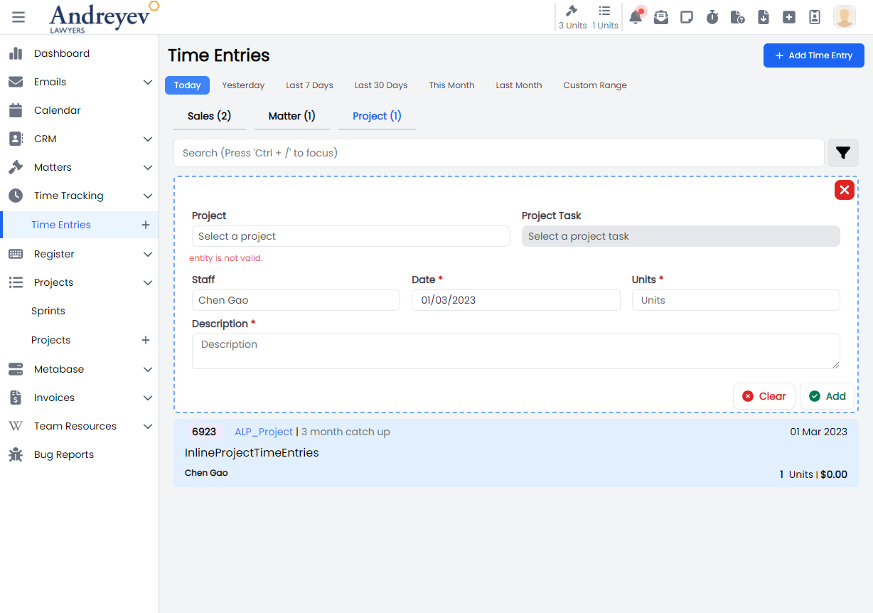
InlineSalesTimeEntries
This component renders each inline matter time entries under "Time Tracking" > "Time Entries" > "Sales" section.
This component can be used as follows:
<inline-sales-time-entries
  class="mb-1 transition duration-200 mx-2"
  v-for="item in items"
  :key="item.id"
  :salesTimeEntry="item"
  @load-more="fetch"
  @selected="$emit('selected', $event)"
/>
The following is a visual of this component at work. 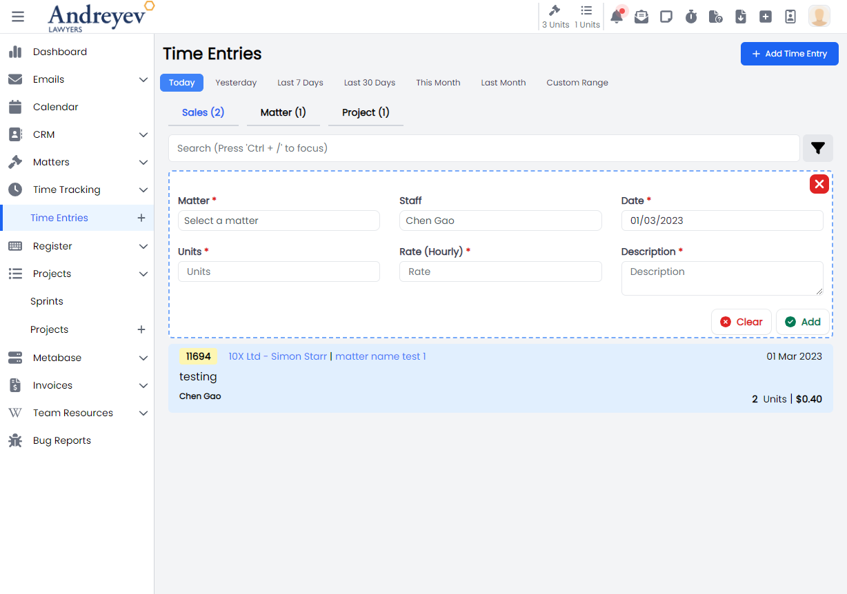
MatterTimeEntries
This component renders the page for matter time entries that includes both the InlineAddMatterTimeEntries for adding new matter time entry as well as the InlineMatterTimeEntries.
This component can be used as follows:
<matter-time-entries
  v-if="state.selectedType == 'matter'"
  :search="state.search"
  :start-date="startDate"
  :end-date="endDate"
  :invoiced="state.invoiced"
  :billable-type="state.billableType"
  :matter="state.matter"
  :user="state.user"
  @selected="getSelectedTimeEntry($event)"
/>
The following is a visual of this component at work. 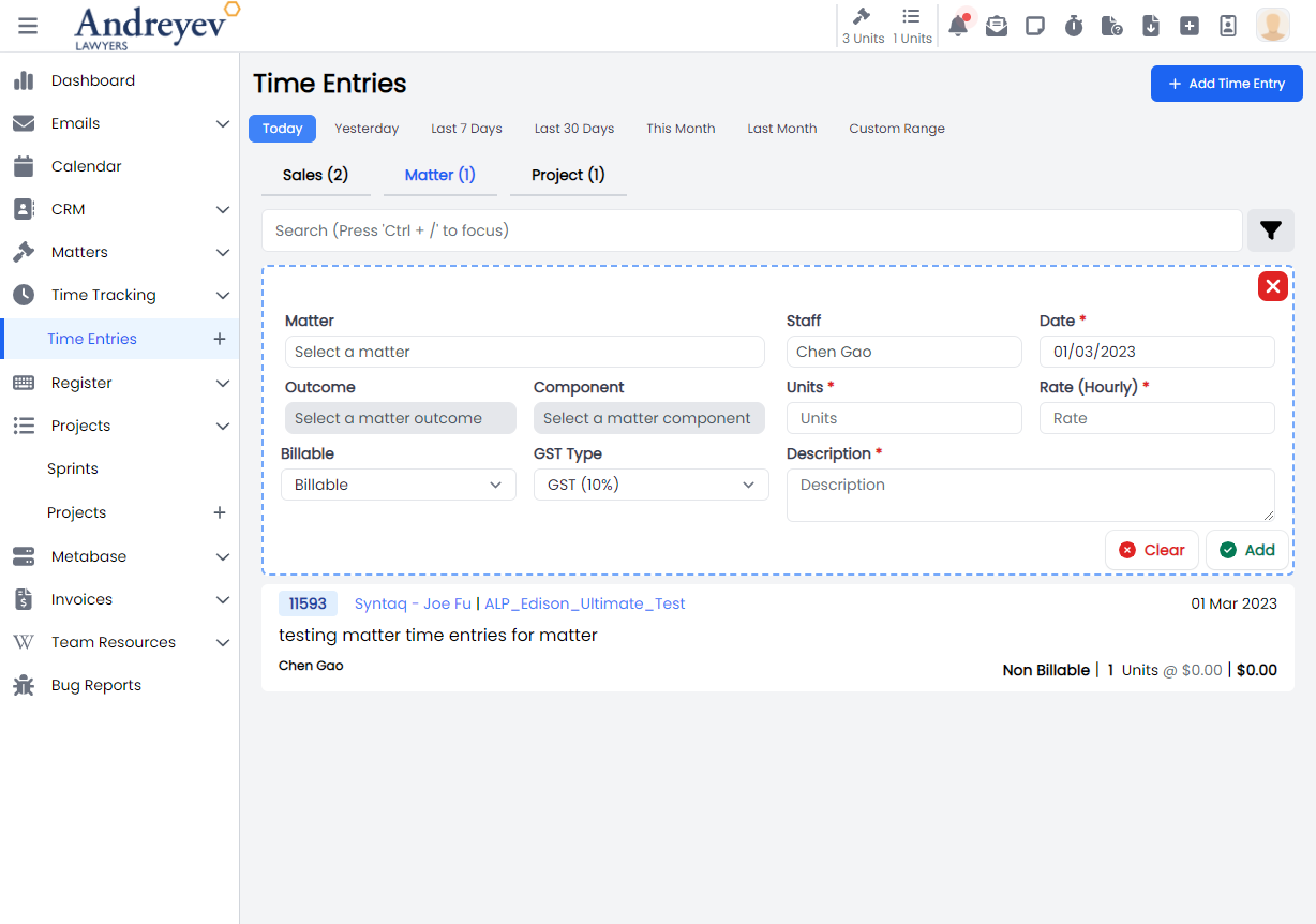
InlineAddMatterTimeEntries + InlineMatterTimeEntries
ProjectTimeEntries
This component renders the page for project time entries that includes both the InlineAddProjectTimeEntries for adding new project time entry as well as the InlineProjectTimeEntries.
This component can be used as follows:
<project-time-entries
  v-if="state.selectedType == 'project'"
  :search="state.search"
  :start-date="startDate"
  :end-date="endDate"
  :user="state.user"
  @selected="getSelectedTimeEntry($event)"
/>
The following is a visual of this component at work. 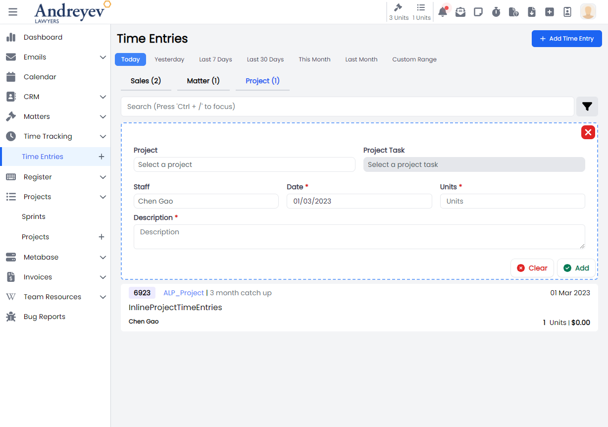
SalesTimeEntries
This component renders the page for matter time entries that includes both the InlineAddSalesTimeEntries for adding new matter time entry as well as the InlineSalesTimeEntries.
This component can be used as follows:
<sales-time-entries
  v-if="state.selectedType == 'sales'"
  :search="state.search"
  :start-date="startDate"
  :end-date="endDate"
  :matter="state.matter"
  :user="state.user"
  @selected="getSelectedTimeEntry($event)"
/>
The following is a visual of this component at work. 
SubmitTimer
This is a modal using modalform to customise for submitting a new time log.
This can be used according to GlobalModals.
The following is a visual of this component at work. 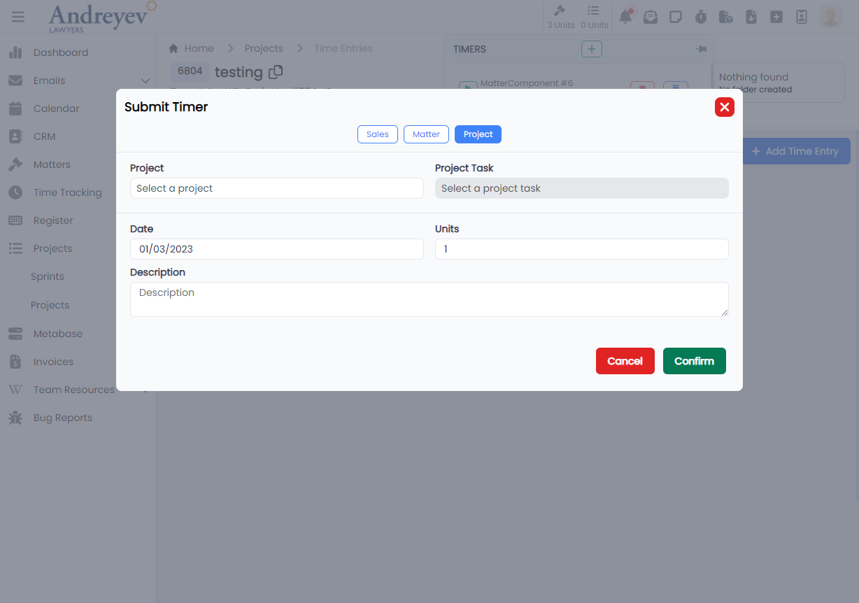
TimerMatterSelector
Deprecated
Using matter-selector-field matter-component-selector-field directly in SubmitTimer
TimerProjectTaskSelector
Deprecated
Using project-task-selector-field directly in SubmitTimer